-
I want to thank all the members that have upgraded your accounts. I truly appreciate your support of the site monetarily. Supporting the site keeps this site up and running as a lot of work daily goes on behind the scenes. Click to Support Signs101 ...
You are using an out of date browser. It may not display this or other websites correctly.
You should upgrade or use an alternative browser.
You should upgrade or use an alternative browser.
first wrap
- Thread starter Hog Wild graphics
- Start date
Jillbeans
New Member
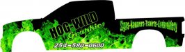
Unskew the name. Lettering in white. Black on black and flames on flames doesn't stand out at all.
Un-stretch the stuff on the bed, maybe just keep it straight and white too.
Unslant phone number.
Fix your Gr spacing on graphics.
A cartoon of an insane looking pink pig might be nice.
Love....Jill
Un-stretch the stuff on the bed, maybe just keep it straight and white too.
Unslant phone number.
Fix your Gr spacing on graphics.
A cartoon of an insane looking pink pig might be nice.
Love....Jill
Craig Sjoquist
New Member
Jill put it best.
. But to not get the bashing in the future buy and read ...Mike Stevens Mastering layout ... after you have read that a few times and well understand and in practice. Then read... Dan Antonelli 2 books... and you will understand advertising layout design a great deal better and it will be more natural in doing.
. But to not get the bashing in the future buy and read ...Mike Stevens Mastering layout ... after you have read that a few times and well understand and in practice. Then read... Dan Antonelli 2 books... and you will understand advertising layout design a great deal better and it will be more natural in doing.
Craig Sjoquist
New Member
 ,Jill put it best.
. But to not get the bashing in the future buy and read ...Mike Stevens Mastering layout ... after you have read that a few times and well understand and in practice. Then read... Dan Antonelli 2 books... and you will understand advertising layout design a great deal better and it will be more natural in doing.
HulkSmash
New Member
I expect a lot of bashing since other post thats pretty much all I got.
HWG
http://signs101.com/forums/showthread.php?t=79491
can you honestly blame anyone? Take what was said in that thread, and apply it to this one. same stuff
John Butto
New Member
Maybe you ought to look into becoming a fireman, after looking at your other thread and this one you are into all kinds of blue, orange, green flames. On the other hand, it does get your attention.
HulkSmash
New Member
On the other hand, it does get your attention.
I'm not sure it'll get positive attention.
John Butto
New Member
Maybe from the authorities if suspicious fires stat to break out.
Hog Wild graphics
New Member
A friend on mine that was in my shop over the holidays actually posted that one. He enlarged our temp sign over building.
The post were I was discussing outsourcing logo/sign designs I got blasted on publicly but also receive many private message interest that I appreciate.
I know I'm not an expert but when I change the lettering to white it looks like cheap vinyl lettering on a black truck. Guessing I should look at a fill that completely covers vehicle then add the lettering so you can tell its fully wrapped.
Again thanks for the opinions
Custom_Grafx
New Member
Being your first wrap, how about you do it with something like a matte black? That way you don't have to worry about patterns and matching panels etc.
Then, say on the doors, you can put your logo in a nice green, using cut vinyl. Simple, effective, and proves you can wrap a car.
As a first wrap, you may have some issues matching flames up, and making this look 'right'.
Then, say on the doors, you can put your logo in a nice green, using cut vinyl. Simple, effective, and proves you can wrap a car.
As a first wrap, you may have some issues matching flames up, and making this look 'right'.
Jillbeans
New Member
It would still stand out and look better than what you did, and adding a translucent natural drop shadow would help to make it look even more realistic.know I'm not an expert but when I change the lettering to white it looks like cheap vinyl lettering on a black truck.
Hog Wild graphics
New Member
Jillbeans
New Member
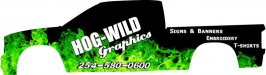
Try using the same font for your laundry list (Impact?) as you used for Hog Wild. Staggering them like that ruins their flow.
If you hate white, by all means use an inline shade to make the letters look set in to the truck.
I'd try that on the name and a white to slime green fade on the Graphics.
Phone number would look better in Impact too, unslanted, moved up and to the right.
Again, a natural drop shadow would look cool.
GRAFIKWORX
New Member
Oh Boy ... nothing like going from bad to worse. post #15 is not getting it..!
no balance , nothing Flows. its not appealing at all. it might get attention but a nice flowing design will get better attention..
you should work on your layout in Black and white before even trying in color.
no balance , nothing Flows. its not appealing at all. it might get attention but a nice flowing design will get better attention..
you should work on your layout in Black and white before even trying in color.
Pat Whatley
New Member
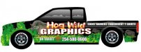
What Jill posted is a major improvement. The way you posted the logo is going to run steeply downhill on the passengers side which is rarely a good thing.
Before you start thinking about wrapping your truck through you really need to spend some serious time working on your logo and your brand identity. Just sticking some letters on a flame background isn't an image, it's a weak crutch. I'm sure your friends will look at it and tell you it's badassed but you might want to get more realistic opinions.
Before you start thinking about wrapping your truck through you really need to spend some serious time working on your logo and your brand identity. Just sticking some letters on a flame background isn't an image, it's a weak crutch. I'm sure your friends will look at it and tell you it's badassed but you might want to get more realistic opinions.
GRAFIKWORX
New Member
petesign
New Member
Don't forget the environment this is going to be working for you... going down the road or parked by the side of a road.... people have a very limited amount of time to get your message. Your turck might look "cool" to you the way you have your text - but the white letters on that busy background JUMP off the side of the truck, you can't miss them. Black letters on black and green, well they get lost. Same thing on your gradient filled letters on the back, they just bleed into the background.
If I went to a shop to talk about getting my vehicle wrapped, and I couldn't read what their own vehicle said - do you think I would buy one?
If I went to a shop to talk about getting my vehicle wrapped, and I couldn't read what their own vehicle said - do you think I would buy one?