-
I want to thank all the members that have upgraded your accounts. I truly appreciate your support of the site monetarily. Supporting the site keeps this site up and running as a lot of work daily goes on behind the scenes. Click to Support Signs101 ...
You are using an out of date browser. It may not display this or other websites correctly.
You should upgrade or use an alternative browser.
You should upgrade or use an alternative browser.
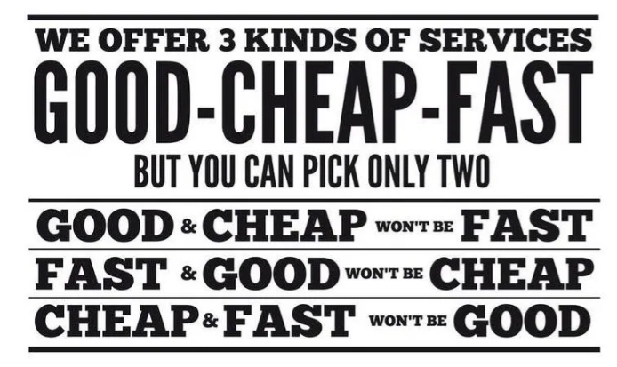
Funny price list, need to hang one up
- Thread starter victor bogdanov
- Start date
Bengt Backhaus
New Member
I have this above my desk. Will probably hang your next to it.

White Haus
Not a Newbie
pretty much............
currently working on a sign for business hours, edit # 9 is the latest version
We would like to see a different shade of black for the hours.........
Let me guess..............this black text is going on glass?

Gino
Premium Subscriber
Don't knock it. Many many years ago, one of the areas biggest local companies brought a job to us. I told them they made some kinda mistake. They had the sign with a gloss black background and the lettering in flat black. The designer, a young girl said that's how she wanted it. I asked her to ask someone else in the office, but this was over 30 years ago and I didn't question things the way I do today, so we made it. The sign was 12' high and 16' wide. During the day, at night time, cloudy days, rainy days, snowy days, sunny days..... just about anytime, you couldn't read it..... at all, unless you were standing right in front of it, looking up at an angle on a bright sunny day. This sign was along a 6 lane highway and a busy intersection. No one.... and I mean no one ever got closer than 100' to it, generally doing 50 or 60 mph.
gnubler
Active Member
currently working on a sign for business hours, edit # 9 is the latest version
I was on around proof #16 or 18 earlier this year for building letters, plain old Palatino font, but she wanted the capital letters 12" tall and then a bunch of variations on the lowercase height...I did one variation to show how her "design" idea destroyed the look of the typeface. Ultimately I fired this customer, it never would have ended.
2B
Active Member
I was on around proof #16 or 18 earlier this year for building letters, plain old Palatino font, but she wanted the capital letters 12" tall and then a bunch of variations on the lowercase height...I did one variation to show how her "design" idea destroyed the look of the typeface. Ultimately I fired this customer, it never would have ended.
There is a joyful sensation when telling a customer YOU ARE FIRED!
gnubler
Active Member
Not really joyful because that's how bad reputation/rumors spread around. I'm sure she's still telling other business owners what an incompetent a$$ I am and to never do business with me.
She finally got her building letters up about a month ago....five months after I fired her. Wonder what poor sign shop got sucked into that one.
She finally got her building letters up about a month ago....five months after I fired her. Wonder what poor sign shop got sucked into that one.
Medina Signs
Old Member
We used to call it negative space in a Yellow Page ad... a lot of yellow around a small ad would draw the eye to your ad. So maybe that's what they were thinking when this sign was made. So, "when looking for our office" just look for the black rectangle, "That's Us!"
Johnny Best
Active Member
If I went to the Bunny Ranch I would pick #1 Good, Cheap, Won't be fast.I have this above my desk. Will probably hang your next to it.
View attachment 163097

