• I want to thank all the members that have upgraded your accounts. I truly appreciate your support of the site monetarily. Supporting the site keeps this site up and running as a lot of work daily goes on behind the scenes. Click to Support Signs101 ...

Good fonts with low anchors

Gnomic

New Member
Hi

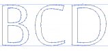
How can i find fonts with a low number of anchor?
Trying to make a collection of fonts, thats best for the plotter, so it doesnt have to to do so much work.
I know the attached image is the worst case and im not looking for decent fonts, but the best there is.

Edit: By Anchor i mean these points thats the cutter has jump between: http://ptgmedia.pearsoncmg.com/images/art_wood6_pentool/elementLinks/wood6_fig02.jpg

Anything helps, thanks :)
 

Attachments

  • badfont_Sakkal-Majalla.jpg
    badfont_Sakkal-Majalla.jpg
    45.4 KB · Views: 125

Marlene

New Member
it shouldn't be that much of an issue for most plotters. what type of fonts are you using that are that messy? are they good fonts or oens found online for free? the free ones tend to be messy. if it really is a problem youcould node edit the copy you send to plot but seems like it would take more time than any extra plotter time. I would suggest using fonts good from a good supplier
 

James Burke

Being a grandpa is more fun than working
Fewer anchor points = jagged letters.

The only issue I seem to have with a Gerber GS (no on-board ram) is large curves. There is a slight delay while the data buffers, but it doesn't take all that long. I would rather sacrifice a bit of time for good, smooth lettering.

JB
 

James Burke

Being a grandpa is more fun than working
your example is far from worst case as far as number of nodes is concerned

The example shown is surely an easy one. I've found that nodes typically multiply whenever text is imported after it has been converted to curves (outlines).


JB
 

Techman

New Member
Purchase professional quality fonts from a professional quality font maker and there will be a minimum of nodes to worry about. Avoid the free font places and you will be happy.

Font made for the print world (often found on free sites) have thousands of nodes. There was no need to worry about vector machines such as cnc or vinyl cutters..
 

The Vector Doctor

Chief Bezier Manipulator
Fewer anchor points = jagged letters.

The only issue I seem to have with a Gerber GS (no on-board ram) is large curves. There is a slight delay while the data buffers, but it doesn't take all that long. I would rather sacrifice a bit of time for good, smooth lettering.

JB

Can you explain further?? A good letter O can be done with 8 anchors, 4 for the inside and 4 for the outside circle/oval. I always trace letters and shapes with as few anchors as possible for smooth curves
 

James Burke

Being a grandpa is more fun than working
Can you explain further?? A good letter O can be done with 8 anchors, 4 for the inside and 4 for the outside circle/oval. I always trace letters and shapes with as few anchors as possible for smooth curves

I agree, using curves is best. I use AutoCAD ("start, end, direction arc")to trace and I rely heavily on using curves instead of a multitude of short segments.

The process of reducing nodes, for sake of "fewer nodes" doesn't yield the same effect.


JB
 
Top