• I want to thank all the members that have upgraded your accounts. I truly appreciate your support of the site monetarily. Supporting the site keeps this site up and running as a lot of work daily goes on behind the scenes. Click to Support Signs101 ...

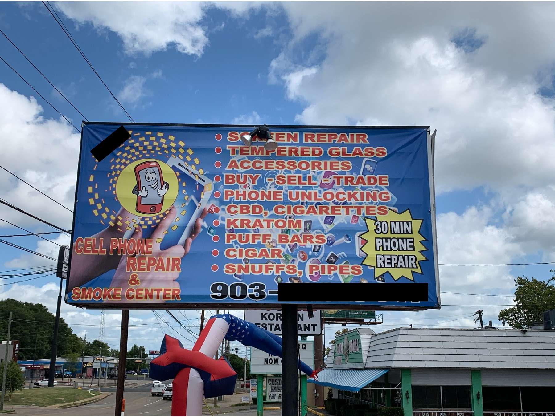
He called me for help with his sign

Texas_Signmaker

Very Active Signmaker
The guy admitted this sign doesn't work and wants it more simple... On the plus side though, he said it already has lights. (And yes, this was originally an illuminated cabinet.. you can still see the changeable copy tracks under the banner) This is two doors up from the permit office... someone is not doing their job.
retertfd.jpg
 

RaymondLoewy

Pretty fly for a Sign Guy
That sign is so horrible I am surprised it is in ingles/english.
I look forward to seeing what you replace with it - you should have no fear of it doing any worse than what they approved last time.
 

Bobby H

Arial Sucks.
When someone chooses the default Arial sign design look there's nothing like taking the theme all the way by squeezing and stretching the ugly default type. Extra points for doing additional squeezing and stretching after the multiple outline effects are added. That way nothing is uniform in appearance. I guess that bullet list of services is sort of left justified. Sort of. Red type on a blue background with white outlines around the lettering? That's a master example on how to make some lettering not legible -especially when the color combination is back-lit at night.
 

RaymondLoewy

Pretty fly for a Sign Guy
When someone chooses the default Arial sign design look there's nothing like taking the theme all the way by squeezing and stretching the ugly default type. Extra points for doing additional squeezing and stretching after the multiple outline effects are added. That way nothing is uniform in appearance. I guess that bullet list of services is sort of left justified. Sort of. Red type on a blue background with white outlines around the lettering? That's a master example on how to make some lettering not legible -especially when the color combination is back-lit at night.
My predecessor always used the default Myriad Pro that is auto for adobe and refused or didn't know how to eliminate hyphenating.

I regularly fluxing the shit our of kerning and type width when I have to deal with the font, due to a Dunning -Kruger marking manger I try to give respect, though I don't work for her.
 

CanuckSigns

Active Member
8 posts to go from a joke post about sign design to a political thread, I wish I could say I thought that was a new record but I know it's not.

In the words of Donald Trump SAD!
 

Texas_Signmaker

Very Active Signmaker
Raymond has not contributed much in the way of quality to these fourms since "he's" been here. I suspect its a banned member who has come back undercover... or maybe Decalman under a new name. Either way his behavior is pretty odd
 

GAC05

Quit buggin' me
With a product /service range from 30-minute repairs to snuffs this should be an easy one for you to hit out of the park Tex.
 

James Burke

Being a grandpa is more fun than working
The light is blocking their "Semen Repairs" service.

And I don't care what anybody says...there's still not going to be enough room to list the free rectal / pelvic exams....


JB
 
Last edited:

visual800

Active Member
I can only hope when the sign co that originaly did this fought tooth and nail and tried to explain to this ingrate that saying everything you offer is not a good thing. Also since customer said "it has lights" also means ballast and wiring is shot to hell and most bulb sockets dont work, lol....just get ready to install another banner on it
 

jimbug72

New Member
What does he need you to do besides fix that piece bent out of place in the top right corner? Other than that I don't see anything wrong with that sign!

Kudos to the sign company that said, "Yes, I can do all of these things for you." Followed by, "Permits? We don't need no stinking permits!!!"
 
Top