-
I want to thank all the members that have upgraded your accounts. I truly appreciate your support of the site monetarily. Supporting the site keeps this site up and running as a lot of work daily goes on behind the scenes. Click to Support Signs101 ...
You are using an out of date browser. It may not display this or other websites correctly.
You should upgrade or use an alternative browser.
You should upgrade or use an alternative browser.
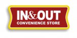
Help... In and Out Convenient Store
- Thread starter Marco
- Start date

Fred Weiss
Merchant Member
I thought the generic name was "convenience" store.
TDFcustomSL
New Member

Techman
New Member
IS this a test?
There is already an In N Out convenience store group..
http://o1.aolcdn.com/dims-shared/di...torage/patch/974a344da55714f5d691561812cd0ecf
There is already an In N Out convenience store group..
http://o1.aolcdn.com/dims-shared/di...torage/patch/974a344da55714f5d691561812cd0ecf

HulkSmash
New Member
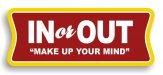
View attachment 84677
New Logo for Convenient Store... your input, any other ideas please. Color scheme not final.
yikes, nothing good about it, start from scratch.
Jillbeans
New Member
I feel that you posted this same query a few years ago.
Anyway, those colors are really weak, the fonts are lackluster, and I do believe Fred is right.
Also, the oval border is totally not needed.
I like qmr's quickie way better than yours, it has punch and it's cleaner looking.
Love....Jill
Anyway, those colors are really weak, the fonts are lackluster, and I do believe Fred is right.
Also, the oval border is totally not needed.
I like qmr's quickie way better than yours, it has punch and it's cleaner looking.
Love....Jill
Gino
Premium Subscriber
Your attempts so far, looks like something you'd see at a gas station, back in the 60's or something before they even had convenience stores.
Yes, they are convenience stores because they are a convenience for you, although they might be at a convenient location for you.... at the same time.
Yes, they are convenience stores because they are a convenience for you, although they might be at a convenient location for you.... at the same time.
Circleville Signs
New Member
That made my head hurt.
SignManiac
New Member
J Hill Designs
New Member
As I posted above.. This name "In N Out" is already a major player in the convenience store world. If he uses it they will sue his butt out to the next planet. Why would anyone attempt to use it?
yes, but this one is in AND out =)
Techman
New Member
Verses .... In N Out..yes, but this one is in AND out =)
Let's play "How close can we get without actually stealing it"?
Lets try this one. Tae Bo , or Tie Boux? Which one do you think got their butts sued into oblivion?
It will never fly. The name is so similar that it will draw a court battle. Where are all the copyright police on this one? This one if real is a blatant rip off.
All these nice people are giving their advice on a make believe piece. A complete waste of their time.
Marlene
New Member
I'll betcha for 'Politically Correct' reasons, we can't say what the real reasons of why they want to use someone else's name along with the wrong spelling of the word.
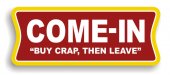
there are a ton a Quick or Kwik or some version of the word quick stops all over and they aren't connected. I think people see these names and just think, what the heck, I'll do it too not thinking that it could be a brand. anyway you look at it, that design posted is horrid. yellow letters on a white background is OK if you really never want anyone ever to be able to read it, even when standing with your face right up against the panel kind of never going to read it is what you intended. just writing it black on white, plain old standard block letters would be better than than what you posted.