-
I want to thank all the members that have upgraded your accounts. I truly appreciate your support of the site monetarily. Supporting the site keeps this site up and running as a lot of work daily goes on behind the scenes. Click to Support Signs101 ...
You are using an out of date browser. It may not display this or other websites correctly.
You should upgrade or use an alternative browser.
You should upgrade or use an alternative browser.
Help on a layout
- Thread starter 1leonchen
- Start date

G-Artist
New Member
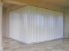
Unfortunately, it doesn't portray the HS product.
Now, if those guys were to use a specific name for their shutter product life
would be simpler.
There you could make two logos. One for the parent co. and one for the product, itself.
Envision if you can - a menacing cloud blowing toward a shutter with the
breeze (plus possible debris?) product being repelled. Toss in a few raindrops
and maybe a lightening bolt or two (to depict a storm) coupled with the shutter name.
That shows/states it all.
A tag line such as "a product of CFC Metals" at the very bottom could be added
that shows the name of the co. who makes them as that co. will be the
name in the phone book.
Encourage them to BRAND the shutter. Sell that brand. Sell, sell sell.
Who they really are isn't all the important. The shutter brand is the be all and end all in the marketplace.
Once you hit them with the approach they will think you a marketing genius.
Oh, and make sure no product ever leaves the factory w/o two stickers, which
you created and sold to them and they are firmly attached at two places
so they can be seen both in normal mode as well as in hurricane mode.
SignManiac
New Member
Unfortunately, it doesn't portray the HS product.
Now, if those guys were to use a specific name for their shutter product life
would be simpler.
There you could make two logos. One for the parent co. and one for the product, itself.
Envision if you can - a menacing cloud blowing toward a shutter with the
breeze (plus possible debris?) product being repelled. Toss in a few raindrops
and maybe a lightening bolt or two (to depict a storm) coupled with the shutter name.
That shows/states it all.
A tag line such as "a product of CFC Metals" at the very bottom could be added
that shows the name of the co. who makes them as that co. will be the
name in the phone book.
Encourage them to BRAND the shutter. Sell that brand. Sell, sell sell.
Who they really are isn't all the important. The shutter brand is the be all and end all in the marketplace.
Once you hit them with the approach they will think you a marketing genius.
Oh, and make sure no product ever leaves the factory w/o two stickers, which
you created and sold to them and they are firmly attached at two places
so they can be seen both in normal mode as well as in hurricane mode.
Good advice!

Craig Sjoquist
New Member
I would go for the clean and simple look like in post #7
excuse but even though yours had some nice ideas but for a 4x4 club
I alway design with starting at what would work for a billboard size it will then be able to scale down to fit in and be readable in a business card size
I also design the reader is viewing this at 50 plus mph.... so simple easy to understand
keeping your at as few as 3 places for the eye


I don't know what your shutters look like but here's an idea anyway.
i like simple but effective
Jillbeans
New Member
Yours looks like something for a chopper company.
The two elements are kind of floating, and it looks as if you've squeezed that bottom font (Wide Latin?) to fit.
The diamond plate and other stuff might look "cool" but it has nothing to do with what that company is offering. If you want a metallic look try using something similar to that middle pic you've posted.
(and you can send that guy to work at my house anytime! hahaha)
Really look at Signmeup's suggestion. You can see instantly what they are offering.
Love....Jill

signmeup
New Member
The backgrounds are too busy. The first one is almost unreadable because there is no contrast between the background and the lettering. The second is more readable but not much. The colours are garish. Try a nicer blue like the one used on this site maybe. And a toned down red. I would drop the swooshes and backgrounds altogether. They are very dated looking.
Circleville Signs
New Member
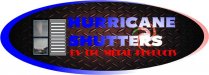
You still aren't making a logo.
Just putting a picture of hurricane shutters in there doesn't make it a logo.
Have you used any kind of design questionnaire with thsi client to even get a feel for where they want to go, what they want to stay away from, etc.?
if not, you need to. if you don't have something, PM me and I will send you what we use.
SignManiac
New Member
I think you need more special effects or fills. These aren't getting the logo across. I would try using fractals because they remind me more of hurricanes.
signgal
New Member
LOL @ maniac... As a Floridian I'd just like to reiterate what's been stressed about simplicity and suggest you give the job to one of the capable professionals on this site. They are more reasonable than you'd think and your customer will be ultra impressed with the results! Big business for you... I told mine I would have the art department work something up for them ") I sounded all big time and everything too!
I sounded all big time and everything too!
I sounded all big time and everything too!JR's
New Member
posted by Signgal LOL @ maniac... As a Floridian I'd just like to reiterate what's been stressed about simplicity and suggest you give the job to one of the capable professionals on this site. They are more reasonable than you'd think and your customer will be ultra impressed with the results! Big business for you... I told mine I would have the art department work something up for them
__________________
right on Neato has my vote and rick.
JR