• I want to thank all the members that have upgraded your accounts. I truly appreciate your support of the site monetarily. Supporting the site keeps this site up and running as a lot of work daily goes on behind the scenes. Click to Support Signs101 ...

Help with font with upper/lower all caps

SoCalN8V

New Member
Help!!! We have a customer who makes me cringe every time I see him walking towards our shop. I call him a "Crazy Maker" because he drives all of us designers nuts with his endless revisions. Don't ask me why we continue to work with him - the boss doesn't think there's a problem (that's for another post, another time).

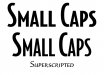
This customer always wants ALL the text in capitals and the first letter of each word a slightly larger cap so that it would LOOK LIKE THIS.

This would not be a problem if there were only a few words but his signs are always very wordy and it takes forever to select all of those letters individually and change the point size on them.

So, is there a san serif font that already does this?

If you can help, you will save my sanity and we may actually make some money on his signs this time.

Thanks in advance.
 

Techman

New Member
NEver Saw One.
But,, all you have to do is look at the paycheck each week. Getting paid by the hour is the redeeming factor.
 

Fred Weiss

Merchant Member
What you're describing is termed Small Caps and there are lots of fonts that offer this as a member of a font family. Many of the larger font families classified as serif include them. It's probably why fonts like Copperplate are overused ... because people like the look of small caps and all or nearly all of the Copperplate versions on the market are small caps.

Unfortunately not very many sans serif families include these versions. Perhaps the most commonly used sans serif small caps font is Engraver's Gothic.

One thing to bear in mind with a true small caps font is that the lower case caps will match the stroke boldness of the upper case caps. When you select a cap and reduce its size (called superscripting) you also reduce the stroke boldness. In the example attached, using Bodega Sans Medium Small Caps, you can see the negative effect of superscripting versus true small caps.
 

Attachments

  • small caps.jpg
    small caps.jpg
    74.8 KB · Views: 98

bob

It's better to have two hands than one glove.
A perfectly reasonable request. It's used so often it even has a name, 'Small Caps'. While there are some faces that use small caps as lowercase, there's no problem in rolling your own. You really should know how to do this.

In Corel, set the copy in normal title case. The do Text->Character Formatting->Uppercase and select Small Caps. Corel shifts the lower case letters into uppercase and then sizes them to the X height of the type face.

Flexi doesn't seem to be as civilized as Corel. In Flexi set the copy in all uppercase, select the Text tool, select the text to be small caps, and then use the Design Central Text tab to adjust the height to a pleasing value. As far as determining the actual x height of a particular face, as far as I know that information is not readily available. You should be able to figure out how to extrapolate it. Hint: x height is the height of a lower case 'x'.

If you're perplexed that the stroke width on the small caps rendered this way are slightly smaller than the actual caps, just add stroke or outline, depending, to suit. Most people never notice.
 

SoCalN8V

New Member
Oh Bob! I may have to kiss you! I just did it and it took me only 5 minutes to change 3 signs.

:thankyou: :thankyou: :thankyou: :thankyou: :thankyou: :thankyou: :thankyou: :thankyou: :thankyou:


Did I say, :thankyou: ?
 

OldPaint

New Member
AND THE PROBLEM WITH MOST ....new in the SIGN BUSINESS is......IT AINT PRINTING....where you cap the 1st letter AND USE CRAPPY LOWER CASE.... for all the rest of the letters......ITS A SIGN.....dont fall under PRINTING RULES!!!!
 

Rick

Certified Enneadecagon Designer
All caps are great for directional signs where space is limited to go all caps and signs and banners where you don't have much space for descending letters...ADA signs must be all caps, but with upper/lower all cap typeface breaks up the monotony if you have a lot of signs in one area......logos look great in it too.....it's not a print thing, it actually has some great use for signs.
 

OldPaint

New Member
ALSO.....older sign guys who painted, found it a lot easier to PAINT all caps WHICH in trun produces a much more BOLD READABLE SIGN at distance.
really p.o.s me to see a banner with lower case lettering on it, sorta defeats the purpose OF A IN YOUR FACE BANNER to draw attenion.
bullet line copy needs it also so it more readable.
 
Top