-
I want to thank all the members that have upgraded your accounts. I truly appreciate your support of the site monetarily. Supporting the site keeps this site up and running as a lot of work daily goes on behind the scenes. Click to Support Signs101 ...
You are using an out of date browser. It may not display this or other websites correctly.
You should upgrade or use an alternative browser.
You should upgrade or use an alternative browser.
Help
- Thread starter Williams Signs
- Start date

MikeSTK
Dawns Vinyl Designs
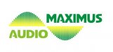
No expert but the speaker, although good concept, looks like a pasted on internet image with the square box around it.
And I am not digging the second line being wider than the first. Sort of throws everything off to my eye. I do like the font though for the first two lines.
Can you maybe take the speaker concept an make it encompass the logo?
Or if you can get it across maybe a side view of a speaker?
Wait! How about 2 speakers facing in on the logo?
Just my one cent.....
Custom_Grafx
New Member
Me also no expert, but I do not like the bottom line. It's a myriad slap on?
iSign
New Member
the curve of the "A" looks like it could easily be mirrored on the left side, as the front of a simple speaker illustration. also, that same curve could emanate from the speaker, like waves radiating from a disturbance in a pond... and those waves could be subtle color knock-outs in the M and the A, radiating across the logo, and aligning with the right side of the "A"
QualitySigns
New Member
Seems to be a lot going on there. Do you need the "MA?" Maybe do something with the speaker. Like MikeSTK says: perhaps you could incorporate the speaker with the name, or something (without the box).
Jillbeans
New Member
I'd make the speaker have the overtones of an Ionic column cornice, lose the MA, make MAXIMUS real big underneath it, and Audio in a clean script underneath.
Then do your subcopy in Essendine.
Or maybe a graphic of a Roman bust wearing headphones instead of the speaker but that might not be what they sell.
Love....Jill
Then do your subcopy in Essendine.
Or maybe a graphic of a Roman bust wearing headphones instead of the speaker but that might not be what they sell.
Love....Jill

thinksigns
SnowFlake

laserman70
New Member
Think
I like that one..
My eye has a hard time with the A overlapping on the maximus Audio
IF it were separated I think thats a winner.
I like that one..
My eye has a hard time with the A overlapping on the maximus Audio
IF it were separated I think thats a winner.
SignStudent
New Member
Did they insist on those colors? Seems too green unless they're some kind of eco-friendly audio shop.
zmatalucci
New Member
My first thought: I can read it as a thumb nail clear as day, success.

iSign
New Member
Maybe too much of a gimmick but how about something showing a little displacement by sound wave?
hey, almost a little like my idea too..
John Butto
New Member
dropped the green
another direction
another direction
basicmetal
New Member
Just a thought, but have you thought about turning the speaker to face upright & pull some detail to help it resemble the Roman Coliseum? Just a thought that looks good in my mind but may not work on paper.