• I want to thank all the members that have upgraded your accounts. I truly appreciate your support of the site monetarily. Supporting the site keeps this site up and running as a lot of work daily goes on behind the scenes. Click to Support Signs101 ...

Horrible Color Printing??? Sp300V

Turbophein

New Member
Well i've been learning a lot and i feel i have most the basic stuff figured out... i finally printed, laminated and cut out a set of graphics! but i am still having problems with my colors, they are just terrible. this last week i have been researching with trial and error trying to get it right and i can't.

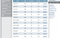
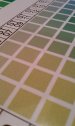
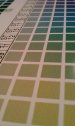
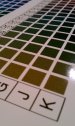
i found the roland color library in corel draw, so i decided to print it out. i exported it the same way as always and it came out terrible. the colors have small dots through out it, its never a true solid color unless its 100% of that one color and 0% of the rest.

so i did more research, and i found versaworks has its own color library, so i was hoping i could print that and have solid nice colors to look at but i was wrong, it might even be worse! if the color is mixed just a little, it looks like "snow" on a old t.v. its just terrible. look at the pics, and yes it looks just like that! that is right from the versaworks color library.

I downloaded, installed and printed with the 3165gra profiles. set my vinyl length, not sure what else there is to change when i'm printing right from versaworks.

as of now all i use is gloss oracal 3165ra vinyl. should i try other profiles? generic 1 was worse.


i would love for this to be a simple answer but i think it won't. i'm dying to get this going and customers are bugging me to get there jobs done! any help would be appreciated!!

thanks
Matt

Offsite pics replaced. Please observe our rules on photo posting.
 

Attachments

  • IMAG1075.jpg
    IMAG1075.jpg
    98.9 KB · Views: 205
  • IMAG1076.jpg
    IMAG1076.jpg
    98.7 KB · Views: 137
  • IMAG1077.jpg
    IMAG1077.jpg
    122.3 KB · Views: 178
Last edited by a moderator:

strypguy

New Member
Have you done a test print to see how your heads are firing? I use versaworks for all my printing and use the profiles, GCVP for calendered vinyl or PCV2 for cast vinyl.


John
 

Jack Knight1979

New Member
There are a few things that will help with this problem.

1) Carriage speed it a little too fast. I find that when I'm running small stickers, etc I need to turn the carriage speed to around 600mm/sec

2) You are running the wrong profile. *****

3) You need to do a bi-dir calibration

4) Your heads are out of alignment with each other and need to be dialed in physically and then calibrated in service mode.


Most likely if you change your profile you'll be fine, but if not the other items above will take care of this.
 

Turbophein

New Member
Have you done a test print to see how your heads are firing? I use versaworks for all my printing and use the profiles, GCVP for calendered vinyl or PCV2 for cast vinyl.


John

I did a full test print and alignment test. the heads are good and aligned as of the begining of april and i have only done test runs since. i will try the GCVP profile today and see if that helps. :thankyou:


There are a few things that will help with this problem.

1) Carriage speed it a little too fast. I find that when I'm running small stickers, etc I need to turn the carriage speed to around 600mm/sec

2) You are running the wrong profile. *****

3) You need to do a bi-dir calibration

4) Your heads are out of alignment with each other and need to be dialed in physically and then calibrated in service mode.


Most likely if you change your profile you'll be fine, but if not the other items above will take care of this.


What profile do you suggest i try? i will give the GCVP profile a try and if that doesn't work i will try the suggestions above!


thanks for the quick replies!:signs101::U Rock:


Offsite pic replaced. Please observe our rules on photo posting.
 

Attachments

  • profiles.png
    profiles.png
    99.7 KB · Views: 206
Last edited by a moderator:

animenick65

New Member
If all your doing is running regular vinyl, then low is fine. Not sure that it would cause all your problems, but its worth a shot to check out. What quality are you running at?
 

J Hill Designs

New Member
you also have to remember that these arent spot colors - it will never be "full" unless yeah you are using 100% something...otherwise you are using a % of a color, which is not full coverage...this technology uses dots to make the color up...not spot full coverage for each color...
 

Custom_Grafx

New Member
Have you played with your ink limits?

Try one of the "General Vinyl" profile templates to start again with your adjustments.

Could be not enough heat, or too fast head speed, or too fast printing (too much ink in too few passes).

Run the total ink limits test print and enter the % where you are getting good solids, but not too much to cause bleeding etc.

Try running high quality with W-Pass turned on - will make a huge difference.
 
Last edited:

Custom_Grafx

New Member
you also have to remember that these arent spot colors - it will never be "full" unless yeah you are using 100% something...otherwise you are using a % of a color, which is not full coverage...this technology uses dots to make the color up...not spot full coverage for each color...

That's true, but at high enough resolution and slow enough head speed, with the right ink limits, even on glossy material you can achieve almost solid colours with little or no grain.
 

Turbophein

New Member
i was just doing some reading and i read that i should adjust my heat settings... i believe as of right now its maxed out at 120... it might be drying the ink to fast adn not letting it settle in.
 

Turbophein

New Member
Have you played with your ink limits?

Try one of the "General Vinyl" profile templates to start again with your adjustments.

Could be not enough heat, or too fast head speed, or too fast printing (too much ink in too few passes).

Run the total ink limits test print and enter the % where you are getting good solids, but not too much to cause bleeding etc.

Try running high quality with W-Pass turned on - will make a huge difference.


well i am trying to reproduce the quality of graphic i bought for my bike last year, it was on oracal 3165gra, his colors are perfect! but they are what i am trying to achieve.

i have not played with any settings besides from the initial setup, test prints, calibration, etc.

when i select the 3165gra profile it does not allow me to change the quality, it just stays at good quality and it also won't let me print/cut on that profile.

i will try all these suggestions today.


:rock-n-roll:
 

toomeycustoms

New Member
I have the same problem as you with my Roland Sc-545. I'm printing on 3165 with the recommended profile from Oracal. I was getting grainy prints just like you. The only solution I found was to lower the head speed to around 500. It still prints grainy on a few colors, but is much more tolerable than the default head speed for that profile. I tried the GVCP profile, but it seemed to lay down too much ink and looked muddled.

Is there any media/profile combo that provides optimal quality prints?
 

Custom_Grafx

New Member
I have the same problem as you with my Roland Sc-545. I'm printing on 3165 with the recommended profile from Oracal. I was getting grainy prints just like you. The only solution I found was to lower the head speed to around 500. It still prints grainy on a few colors, but is much more tolerable than the default head speed for that profile. I tried the GVCP profile, but it seemed to lay down too much ink and looked muddled.

Is there any media/profile combo that provides optimal quality prints?

If you want photographic quality - you will need a high pass number. You can achieve good quality colour and results with standard quality thought, acceptable for most situations. I mean, how close up do you look at a bike sticker? Usually viewed by other people standing at least a few metres away...

The optimal quality... I've been studying for the last 6 months or so on my own, and unfortunately you need to get into creating your own profiles if you want predictable and reliable results. It really REALLY helps too, to understand the profiling system in versaworks if that's what you use.

In order, the following things need to be calibrated for each media/resolution combo you have.

1) individual ink limits/linearization
2) set total ink limits
3) create icc profile using an i1 or similar device/software.
4) DO NOT TOUCH any of the above once done otherwise the whole things is pointless and must be done from scratch.
 

Jack Knight1979

New Member
Switch to a totally different profile just to see if that helps.

Run a generic photo paper profile or something.

It's funny how some profiles are super grainy and others look like spot colors.

I have a four pass banner profile that produces gorgeous color.
Then I have a 12 pass profile I scrapped because it was terribly grainy.
 

bob

It's better to have two hands than one glove.
What are your rendering intents? If they're not 'No Color Correction' for everything except bitmaps, which should be set to 'Perceptual', then change them and try again.

You can futz around with profiles and maybe one day hit something close to what you want. Change your rendering intents to the above and see what happens.

There's two ways to approach this. Endless screwing around with an entire library of profiles or just going with these rendering intents and finding the one or two profiles that work the best.

With the former method you can quite possibly achieve actual color matching. It lets you talk in all kinds of arcane jargon and perhaps is spiritually satisfying but it's a massive time sink and tends to burn up a butt load of media and ink. I'd much rather be doing other things.

With the latter, print out a Pantone chart on the media you're using and match whatever colors you need to that chart. Regardless of what appears on your monitor, what comes out of the printer is the truth.

I have a few of these charts hanging on the wall, one on banner material and one each for a couple of different types of vinyl. All printed with the same profile and, with minor and trivial variation, functionally identical. When someone wants some specific color, I point them to the proper color chart and tell them to pick something off of that chart that matches or is close. If there's two colors that are close, pick the darker.
 

Tony McD

New Member
Up close, my Roland library print looks very similar to yours.

...there isn't a head height adjustment on the sp300v that I know of.

I set my heaters on 98 and 98 for calendar vinyl, and 112 and 120 for 3m180 cast.

Also, I print what I can in high quality mode if the profile permits,
unless it's just a quicky banner, etc...
It does take quite a bit longer, but looks much better.
 
yeam, on gloss my vp540i looks simular to those prints. on matte material they look much, much better. we print 99 percent of our stuff on standard print.
 

Turbophein

New Member
ok so i tried a bunch a things today and i did get the colors a lot better but still not where i would like it.

i started by doing all the tests. i did a test print and it was good, then a bi-dir calibration, and it was off on 3 of the 8 inputs. so i fixed that. i did another calibration but i forget the name, and it was good, no overlapping or gap but the actual print has lines running through it, it looked nothing like the pic in the book which had a nice and smooth print, pics below.

IMAG1079.jpg

IMAG1078.jpg

IMAG1081.jpg

i tried a few different vinyl profiles with different head speeds and did small color charts on them all. after printing at least 10 different charts the original GCVP 720 head speed, standard or high quality printed best. Better yet it gave me many more acceptable colors but its still not that nice crisp lines that i want.

Also noticed when printing the charts, that the black letters/#'s are bleeding a little bit, ugh i need to get this figured out! its all i dream about at night now! LOL

Offsite pics replaced. Please observe our rules on photo posting.
 
Last edited by a moderator:

Turbophein

New Member
What are your rendering intents? If they're not 'No Color Correction' for everything except bitmaps, which should be set to 'Perceptual', then change them and try again.

You can futz around with profiles and maybe one day hit something close to what you want. Change your rendering intents to the above and see what happens.

There's two ways to approach this. Endless screwing around with an entire library of profiles or just going with these rendering intents and finding the one or two profiles that work the best.

With the former method you can quite possibly achieve actual color matching. It lets you talk in all kinds of arcane jargon and perhaps is spiritually satisfying but it's a massive time sink and tends to burn up a butt load of media and ink. I'd much rather be doing other things.

With the latter, print out a Pantone chart on the media you're using and match whatever colors you need to that chart. Regardless of what appears on your monitor, what comes out of the printer is the truth.

I have a few of these charts hanging on the wall, one on banner material and one each for a couple of different types of vinyl. All printed with the same profile and, with minor and trivial variation, functionally identical. When someone wants some specific color, I point them to the proper color chart and tell them to pick something off of that chart that matches or is close. If there's two colors that are close, pick the darker.


Rendering Intents is found in the file format tab of versaworks setup screen correct? if so i have not change it from default yet.
 
Top