Turbophein
New Member
when the crop marks are printed for cutting are they on a double pass setting? my roland black does not look as good as the crop marks.
There are a few things that will help with this problem.
1)
2)
3)
4) Your heads are out of alignment with each other and need to be dialed in physically and then calibrated in service mode.
\
You're going to continue to waste material, ink, and time with the trial and error method. That costs money.
Think about having someone come in and properly profile your machine.
It may cost 2k up front, but it will save you more than that over the long run because you won't be wasting material, ink and time with every setup.
What are the temperatures on heater and dryer? Those are very important in the economy of printing process. If you are printing on vinyl it should be 37-38 on heater and 42-45 on dryer.
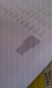
The feed calibration is that test in the pic above(the one with 2 black squares) and looks ok(I think).
Enter the Roland site in download section and you will find a lot of ICC profiles for a lot a materials. Just try some of them and see the difference. If it's not any difference, then you have to call someone to check you printer and see what's going on. Might be the ICC profiles or something else.
If you are using ESL-max inks, then something it's not ok, because you shouldn't have any kind of problems. IF you are using 3rd party inks then you need ICC profiles for it.
What kind of vinyl are you using(producer)?
One more thing...on SP-300 you have only one position for the head hight.
Hope that helps!

You're going to continue to waste material, ink, and time with the trial and error method. That costs money.
Think about having someone come in and properly profile your machine.
It may cost 2k up front, but it will save you more than that over the long run because you won't be wasting material, ink and time with every setup.
What are your rendering intents? If they're not 'No Color Correction' for everything except bitmaps, which should be set to 'Perceptual', then change them and try again.
You can futz around with profiles and maybe one day hit something close to what you want. Change your rendering intents to the above and see what happens.
There's two ways to approach this. Endless screwing around with an entire library of profiles or just going with these rendering intents and finding the one or two profiles that work the best.
With the former method you can quite possibly achieve actual color matching. It lets you talk in all kinds of arcane jargon and perhaps is spiritually satisfying but it's a massive time sink and tends to burn up a butt load of media and ink. I'd much rather be doing other things.
With the latter, print out a Pantone chart on the media you're using and match whatever colors you need to that chart. Regardless of what appears on your monitor, what comes out of the printer is the truth.
I have a few of these charts hanging on the wall, one on banner material and one each for a couple of different types of vinyl. All printed with the same profile and, with minor and trivial variation, functionally identical. When someone wants some specific color, I point them to the proper color chart and tell them to pick something off of that chart that matches or is close. If there's two colors that are close, pick the darker.
I have the same machine you do. As I stated before, I have used GCVP and PCV2 profiles in versaworks for all my printing. I've printed on mostly oracal vinyls,3M and Avery wall vinyl, all using the same profiles. Never had any color problems.
Most if any of my problems came from cross contamination of the colors from bad captops etc. Also, these machines seem to have a problem as the inks get lower in one or more of the cartridges causing a suction that can pull ink into the other damper and mix your colors. Make sure you do a test print before you start printing. I usually can run a medium clean to get my colors printing correctly. Hope this helps.
I also use versaworks color chart for my spot colors. Not sure what you are printing but it could be a color issue in your file.
John