• I want to thank all the members that have upgraded your accounts. I truly appreciate your support of the site monetarily. Supporting the site keeps this site up and running as a lot of work daily goes on behind the scenes. Click to Support Signs101 ...

HP's proposed new logo.

showcase 66

New Member
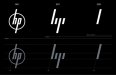
Curious to see if anyone has seen the new proposed HP logo. From the hp to basically 4 lines at an angle. I like the idea of it but the branding company wants the logo to become a single line by 2021. The "ultimate simplicity design".

http://www.engadget.com/2011/12/14/moving-brands-reveals-proposed-hp-brand-redesign-hp-remains-non/

I had to write a marketing paper about a branding change like this or another larger one. I actually wrote it about the new logo and branding the GAP was going to do but never did.

Just wanted to know your thoughts on it.
 

Attachments

  • hp2.jpg
    hp2.jpg
    25.6 KB · Views: 119

Locals Find!

New Member
What are they going to be known as the Brand formerly know as "HP"?? That is the stupidest thing I have ever heard of or seen.
 

Joe Diaz

New Member
I like the new change. Not the 2021 version though (which doesn't matter because the world ends next year anyway):Big Laugh
 

Bobby H

Arial Sucks.
I just saw this at the Under Consideration/Brand New website. While I admire the effort to reduce the "hp" logo down to its most simplistic visual denominator, the end result goes too far.

The problem: I can read those slanted lines as "bp" or "lip" just as easily as seeing it as "hp".

I doubt this concept will actually go into use.
 

Suz

New Member
I don't like the minimalist style of the new HP logo design. It doesn't give me the warm fuzzies, but maybe that is just because I have bought and loved so many products HP made with the older logo on it. I'm a creature of habit, don't take changes well, but sometimes I do force myself to change and love something new if it is better. I don't see this as better, looks too much like something you would see on a racetrack.:design:

By the way Stacy, you are an abstract thinker. Haha on the turning it upside down thing!!! Hopefully somebody from HP will see your quote here and they won't use that thing!!!
 
Last edited:

Joe Diaz

New Member
Like I said... I like it, but I can see what people are saying about it looking like bp.

When I first saw it, I recognized it as "hp" immediately, because it has a similar shape and slant compared to the old logo. I think they are attempting to move away from a monogram and towards a symbol or icon.

I wonder if they added a slight stylized serif to the strokes if that would help it read as "hp"
hp.jpg
 

signswi

New Member
They'll have to change it again in 5 years as it may look cool but it only functions for people who already know the brand really well. There doesn't seem to be a good reason for the redesign either and that's always an error. Who knows maybe a CEO really likes Black Flag.
 

signmeup

New Member
Like I said... I like it, but I can see what people are saying about it looking like bp.

When I first saw it, I recognized it as "hp" immediately, because it has a similar shape and slant compared to the old logo. I think they are attempting to move away from a monogram and towards a symbol or icon.

I wonder if they added a slight stylized serif to the strokes if that would help it read as "hp"
View attachment 71752
Nope. Still says "lip".
 

CentralSigns

New Member
Maybe BP has interests in HP and the logo change would suit both. Never know do ya. Don't really have a plausible conspiracy theory for the final one character line logo, that's just weird. Maybe it represents some oriental character text.

Oh I think the change sucks. The HP stands for them always
 
Top