• I want to thank all the members that have upgraded your accounts. I truly appreciate your support of the site monetarily. Supporting the site keeps this site up and running as a lot of work daily goes on behind the scenes. Click to Support Signs101 ...

Ice Cream Parlor Layout Critique

TheSellOut

New Member
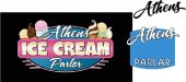
Well I got the OK on the oval background layout, #8, earlier today but after seeing all of the great suggestions and comments I couldn't help but go the extra mile! The mirror image of the cones seemed to bother a lot of people so I modified a "twist" out of the soft cone clip art, which BTW came from an "Art Explosion Image Library" and I tried to add some contrast with black outlines and a deeper blue oval. Also, I have tried other fonts and keep going back to the script...I did blow up the Athens a bit, per a suggestion, and like that. I really appreciate all the help...this is why I love Signs101!!
 

Attachments

  • Athens Ice Cream Parlor.jpg
    Athens Ice Cream Parlor.jpg
    46.6 KB · Views: 82
  • Athens Ice Cream Parlor2.jpg
    Athens Ice Cream Parlor2.jpg
    46.2 KB · Views: 73

Gino

Premium Subscriber
Good Grief.... that ice cream looks good enough to eat. I'm getting hungry for it now...................
 

JR's

New Member
The layout is looking really good.
That's what I meant by tweaking the script a little bit, the alternate S is the < sign
in a different font for Parlor, so it reads the name then ice cream parlor.

Just my two cents it looks cool just the way it is.

JR
 

Attachments

  • Ice Cream.jpg
    Ice Cream.jpg
    42.1 KB · Views: 75

Tiki

Font Sage
Maybe just have 2 cones to the side and make Athens just a little bit bigger :smile:
 

Attachments

  • 1a.jpg
    1a.jpg
    60.7 KB · Views: 82

TheSellOut

New Member
I always love your layouts Tiki, so I just might have to try one like that! Did you just draw in the white accents on the "Ice Cream"? This is the latest, and last, of the original! Thanks for the all your tips JR especially the one for the alternate!!
 

Attachments

  • Athens Ice Cream Parlor.jpg
    Athens Ice Cream Parlor.jpg
    48.7 KB · Views: 68

Jillbeans

New Member
Good reminder for all of us, JRs, to always check the alts!
I usually do, particularly on script Rs and Ss.
I use charmap but there are probably other ways.
Thanks for trying the pink, it's my fave color.
Tastes like strawberry.
 

SignManiac

New Member
Tiki's version is the direction I would have gone. The original version was too symmetrical and balanced and I didn't care for the script font separated on top and bottom. It should make for a nice sign when finished.
 

signgal

New Member
yeah, tiki zeroed in on what i was saying about the ice cream cones taking a back seat. your final is great though!
 

SignManiac

New Member
Not suggesting you use any of this at all, yours is fine, but I thought I'd sit down and see what I would come up with for an idea and not be too influenced by your concept.

Totally different look and feel. I guess there are hundreds of directions a sign like this could go. Anyway, here's another take on an ice cream sign. I think it still needs some tweaking but it's a starting point.
 

Attachments

  • Icehouse Shoppe-2.jpg
    Icehouse Shoppe-2.jpg
    123 KB · Views: 80

TheSellOut

New Member
This is what makes these design threads fun and interesting...when more and more members start throwing their ideas out there...it's gives us variety and sparks the imagination!!
 

Todd-sta

New Member
I like the idea of two ice-cream cones offset too.... although I like your original "ice cream" font better than anything I've seen,.....I do like it combined with Jillbeans font.

Here's something I did for another sign person about a year ago...for whatever ideas it may generate....may be another way of handling the ice cream image as it relates to the rest of the sign.... looking great though!
 

Attachments

  • Cone.jpg
    Cone.jpg
    41.4 KB · Views: 75
Top