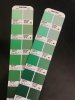
I recently made and printed a file of color samples for a client. I went to print the color they chose eyedropping from the section they liked the most, and the color came out a shade darker. There was black text printed on the color but it seemed way off.
A few things to note:
The sample I printed on was on a previous roll
The sample was a CMYK formula.
The sample had no black text in it.
The final print (the one that did not match the sample) was darker by enough to be noticable.
This has happened to me on more than one occasion and I am considering just not doing this anymore. Is this even possible? I heard a software called ONYX works well for this?