-
I want to thank all the members that have upgraded your accounts. I truly appreciate your support of the site monetarily. Supporting the site keeps this site up and running as a lot of work daily goes on behind the scenes. Click to Support Signs101 ...
You are using an out of date browser. It may not display this or other websites correctly.
You should upgrade or use an alternative browser.
You should upgrade or use an alternative browser.
IS COLOR MATCHING EVEN POSSIBLE??
- Thread starter depps74
- Start date
ColorCrest
All around shop helper.
Andy D, my background if enough to know that you, yourself, have a tremendous advantage of having the experience of color correction from a photo lab background and working with those glass filters you’ve mentioned. Not just any glass, but dichroic glass. You should have also dated “Shirley” quite regularly, or did you just print arcane color patches and let the machine have you believe it was calibrated?I have no idea of Colorcrests background. I started color correction 30 plus years ago at my family's custom photo business, when it was light going through Cyan, Magenta & Yellow glass filters
Can you imagine struggling as much as the OP does when reaching out to others for answers but not having enough background to even know where to begin to frame the question? (This thread began in this manner.)
You know the important foundation of R, G, B, as primary color and C, M, Y, as secondary colors and as opposites of the primaries. You know by dating Shirley regularly when, and if, you really need to go to the trouble and potentially hazardous exercise of actually linearizing a printer. (It’s not every roll as has been suggested.) If you know why the filters are dichroic, you know the vast difference in the cyan color of ink (or dye, or toner, or light) versus the actual color of cyan one is striving for in print. Knowing the desired color of cyan helps explain why to print without ICC output profiles ONLY when testing and not for actual production work. (As has been suggested.)
You’re in good company with your background, Andy D. Many of the top shops listed at the Wide Format trade magazine come from the same roots. Looking forward to seeing you on that list some day.
ColorCrest
All around shop helper.
I recommend you perform two approaches...I also just had image link issues come up with a recent project. The image is the same exact link, but color is blocked up and saturated from indesign. From Illustrator it’s less saturated with truer skin tones. We see this often. Color management is synched between apps. I don’t get it. Any ideas?
1) Isolate variables beginning in a heavy-handed manner. Create your own test document(s) using your own, known elements to see if the results mimic the customer’s. Results one way or the other will eliminate half of the variables. From there, try to exclude another large portion of the variables by using Photoshop as a test RIP, for example. Again, results may take a direction toward something such as disparate rendering intents or other software settings such as PDF options, etc. The point being another exclusionary test or two should zero in on the root problem.
2) When you and your cohort find the time, each of you create a list of all the individual variables you can find in the critical path that might affect the issue. Then compare your separate lists which may reveal something is being overlooked. Because you say the problem is on-going, it's important spend the time now to save time later.
ColorCrest
All around shop helper.
Long live Jellie.but that G3 sure looked pretty in the shop.
Attachments

This is the bad boy I had!We had a Splash running a Xerox 1250!
It was a lame duck compared to what we have now but that G3 sure looked pretty in the shop.
(You can own this one for only $450 off ebay...parts only...LOL!)
Attachments

Saw a jaz drive catch on fire once!!!Yes the Zip drive.
I really think it has something to do with the render engine. It has to be different then illustrator. The main clue for me here is when you get the "this pdf has rgb and cmyk objects" from a pdf created in indesign and opened in Illustrator. It seems to me indesign "bakes in" the working space profiles regardless if a link already has an icc embedded. I'm gonna dig though the preflight function of acrobat and see if I can find something/anything different from native illustrator pdf to exported indesign pdf.I recommend you perform two approaches...
1) Isolate variables beginning in a heavy-handed manner. Create your own test document(s) using your own, known elements to see if the results mimic the customer’s. Results one way or the other will eliminate half of the variables. From there, try to exclude another large portion of the variables by using Photoshop as a test RIP, for example. Again, results may take a direction toward something such as disparate rendering intents or other software settings such as PDF options, etc. The point being another exclusionary test or two should zero in on the root problem.
2) When you and your cohort find the time, each of you create a list of all the individual variables you can find in the critical path that might affect the issue. Then compare your separate lists which may reveal something is being overlooked. Because you say the problem is on-going, it's important spend the time now to save time later.
I want to meet this Shirley babe!!!Andy D, my background if enough to know that you, yourself, have a tremendous advantage of having the experience of color correction from a photo lab background and working with those glass filters you’ve mentioned. Not just any glass, but dichroic glass. You should have also dated “Shirley” quite regularly, or did you just print arcane color patches and let the machine have you believe it was calibrated?
Can you imagine struggling as much as the OP does when reaching out to others for answers but not having enough background to even know where to begin to frame the question? (This thread began in this manner.)
You know the important foundation of R, G, B, as primary color and C, M, Y, as secondary colors and as opposites of the primaries. You know by dating Shirley regularly when, and if, you really need to go to the trouble and potentially hazardous exercise of actually linearizing a printer. (It’s not every roll as has been suggested.) If you know why the filters are dichroic, you know the vast difference in the cyan color of ink (or dye, or toner, or light) versus the actual color of cyan one is striving for in print. Knowing the desired color of cyan helps explain why to print without ICC output profiles ONLY when testing and not for actual production work. (As has been suggested.)
You’re in good company with your background, Andy D. Many of the top shops listed at the Wide Format trade magazine come from the same roots. Looking forward to seeing you on that list some day.
Oh snap!We had a Splash running a Xerox 1250!
It was a lame duck compared to what we have now but that G3 sure looked pretty in the shop.
https://www.xerox.com/downloads/usa/en/b/brochure_splashg630901.pdf
ColorCrest
All around shop helper.
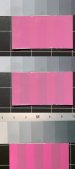
To be sure…There are light indicator strips available which helps to judge the light conditions.
Top is an example of metamerism, which is usually a good thing, at noon in full sunlight and as interpreted by my human and forgiving eyes.
Middle is the same example as interpreted by a digital camera at noon in full sunlight, an iPhone in this case, which is less forgiving. Most photography film would record the same.
Bottom is an example of “metameric failure” (for lack of any other term) and often mistaken as metamerism, made under a random office lamp.
This is not a complete description of the issue. One might learn more if they’re interested.
Attachments
Andy D, my background if enough to know that you, yourself, have a tremendous advantage of having the experience of color correction from a photo lab background and working with those glass filters you’ve mentioned. Not just any glass, but dichroic glass. You should have also dated “Shirley” quite regularly, or did you just print arcane color patches and let the machine have you believe it was calibrated?
Can you imagine struggling as much as the OP does when reaching out to others for answers but not having enough background to even know where to begin to frame the question? (This thread began in this manner.)
You know the important foundation of R, G, B, as primary color and C, M, Y, as secondary colors and as opposites of the primaries. You know by dating Shirley regularly when, and if, you really need to go to the trouble and potentially hazardous exercise of actually linearizing a printer. (It’s not every roll as has been suggested.) If you know why the filters are dichroic, you know the vast difference in the cyan color of ink (or dye, or toner, or light) versus the actual color of cyan one is striving for in print. Knowing the desired color of cyan helps explain why to print without ICC output profiles ONLY when testing and not for actual production work. (As has been suggested.)
You’re in good company with your background, Andy D. Many of the top shops listed at the Wide Format trade magazine come from the same roots. Looking forward to seeing you on that list some day.
ColorCrest, I'm 99% you're being sincere and not snarky, so thank you! Yes when I first started all of the equipment was manual, so having to learn to color correct thousands of times a day on the fly was a great learning experience.
Some rolls of film would literally have to be color corrected every other frame when the customer went from fluorescent lighting, to incandescent, to outside on the beach. Towards the end we did have a spectrophotometer / densitometer that helped, but you would need to reprofile every morning because the chemicals changed.
When I started in signs it was a "Mom-n-Pop" shop, then I start working for a national sign company that only did national corporation signs, my plant did all of the prototypes. I ended up being
over the graphic / pattern dept. Most signs had combination of printed graphics, cut vinyl graphics, & painted areas, the colors had to all work together, be exact PMS matches when the signs were backlit and when they were not.
During that time I was lucky enough to be trained by color techs on about five different occasions (everytime we bought a new printer) to create and tweek icc profiles.
When I moved I started to run a small sign shop (just me) and the most complicated color gets here is; a customer brings in a business card and wants the sign colors to be close,
we look at my handy-dandy printed out color chart and pick colors ... that works flawlessly 99% of the time.
ColorCrest
All around shop helper.
Be 100% sure.I'm 99% you're being sincere and not snarky,
ColorCrest
All around shop helper.
Understood.a customer brings in a business card and wants the sign colors to be close, we look at my handy-dandy printed out color chart and pick colors ... that works flawlessly 99% of the time.
The rub, however, is when operators have trouble with the variables of software features such as mixing raster and vector elements blending, tinting, masking, etc. Not to mention an elite artist or agency with all the money in world asking you to match 300 of the 1000+ Pantone colors for their project.
Back in day, I was using a similar chart method such as yours for a famous apparel company to match large display graphics immediately against the actual product at the retailer. Not too noteworthy because the designs were mostly solids. Then one day another famous apparel company learned who was doing the work and hired us except their designs were complex plaids and other elements. Fortunately, the timing was exactly when we could use true ICC profiles along with special Kodak soft proof plugin for Photoshop. It was before Adobe had the feature themselves.
There is still merit for your method. It could use some explanation for others is all, if you ever find the time.
Andy_Warp, so these file are from the customer or their designers, not your companies internal design department, correct?
And you're saying depending on the program they handle the embedded graphics and vector colors differently, correct?
I'm not savvy on Indesign, but can't you have your customers export their files as a TIFF? That was always what I pushed for because
EPS, AI & especially PDF files can do bizarre things, such as adding anomalies and thin lines that you don't see on the screen or small test prints.
I believe I've found proof...yes actual proof, where Indesign is closing my color management loop. What we surmise is that indesign is baking this info in to emulate what the user sees on their monitor, therefor closing the color management loop. Here it looks like it embedded AdobeRGB98 for no reason. Original link is srgb-Andy_Warp, so these file are from the customer or their designers, not your companies internal design department, correct?
And you're saying depending on the program they handle the embedded graphics and vector colors differently, correct?
I'm not savvy on Indesign, but can't you have your customers export their files as a TIFF? That was always what I pushed for because
EPS, AI & especially PDF files can do bizarre things, such as adding anomalies and thin lines that you don't see on the screen or small test prints.
I've heard Indesign has hooks in it to export seperations directly for heidleberg, engineered right in to the software. That is why I think it's a great tool...for press!
Indesign is a great tool...FOR PUBLISHING...we however are making signs...and not creating seperations.
We would love to have our clients output raster images from indesign...however...they have spot color matching demands...and never give us bleed!
Once in a blue moon Illustrator will do something we aren't anticipating.
We don't take pdf for production..unless it is solid fills and vector only with no raster elements or effects.
When we get indesign...we rebuild in Illustrator.
Attachments

dypinc
New Member
The difference between Indesign and Illustrator when it comes to output/export files is that Indesign will pass through all element profiles if its export dialogs are not set correctly. Illustrator will not. Obviously the ID export dialog should be set to convert to a output profile if you elements are using more than one.
With most designers talking color management to them, you might as well be talking to the wall. I have seen PDF files come in that have many different RGB or CMYK profiles. And the worst part you can't even get them to assign profiles so when they do that Acrobat tells you Device RGB or CMYK. How many different source profile they have in there who knows. In that case they will get what they get and just have to learn the hard way. Most of the time I get lucky because they don't know any better and just use Adobe's default settings so I can pretty well guess what they used.
I check every PDF that comes in in Acrobat's Convert Color dialog and convert when needed which usually catches everything. At least that way I know what to use as the source profiles in the RIPs.
We would love to have our clients output raster images from indesign...however...they have spot color matching demands...and never give us bleed!
Once in a blue moon Illustrator will do something we aren't anticipating.
We don't take pdf for production..unless it is solid fills and vector only with no raster elements or effects.
When we get indesign...we rebuild in Illustrator.
I know what you mean, my method was to always push for a TIFF (which could problematic due to them being huge files), ask them not to add bleed or crop marks,
& create bleed, change sizing, etc. in photoshop. Of any program I used, I found photoshop was the best at keeping the colors true.
As far as spot colors, I know you said you have built a spot color library in Onyx, I never really did that, anytime we started a new client, we would create an actual file
that would be put in a huge filing cabinet, with hard copies of printed proofs, notes of profiles used, color changes made and the CMYK formula for the spot colors...
and I would manually change them in Onyx.
Last edited:
dypinc
New Member
I believe I've found proof...yes actual proof, where Indesign is closing my color management loop. What we surmise is that indesign is baking this info in to emulate what the user sees on their monitor, therefor closing the color management loop. Here it looks like it embedded AdobeRGB98 for no reason. Original link is srgb-
If the ID doc is set for AdobeRGB and linked file is set for sRGB then both will be passed along. If they then create anything in ID then that will be AdobeRGB. If they don't make sure all links are set to the assigned document setting then they need to convert to an output profile when exporting to PDF, otherwise there you go with two RGB Profiles in the PDF.
In building a spot color library, there was just an option to save a corrected version that got applied when the named spot came through the rip. We are doing more or less what you're sayingI just have a list of known corrections. We check when a new job comes in. If we don’t have it, I look for an equivalent on my printed chart. If nothings in the ballpark we make a grid.I know what you mean, my method was to always push for a TIFF (which could problematic due to them being huge files), ask them not to add bleed or crop marks,
& create bleed, change sizing, etc. in photoshop. Of any program I used, I found photoshop was the best at keeping the colors true.
As far as spot colors, I know you said you have built a spot color library in Onyx, I never really did that, anytime we started a new client, we would create an actual file
that would be put in a huge filing cabinet, with hard copies of printed proofs, notes of profiles used, color changes made and the CMYK formula for the spot colors...
and I would manually change them in Onyx.
Photoshop IS great. I have a Nikon and the new raw importer is killer. I can’t stand jpegs, but they were very necessary 20 years ago. The way people defile their assets these days breaks my heart. I’ve run a 60” full color scanner. A sweet Contex, could scan up to an inch and a half thick. Color correcting and cleaning up those pigs taught me to take care of them. Slide scanning too, (oh the lint!)
The new filter called camera raw is sweet. If you have an rgb image you can shift by temperature and do all sorts of other tweaks.
Customers want me to give them a magic number for resolution, but the compression is what matters for grand format size images. Photo raw to psd gives the truest color and best quality compression and noise wise.
Vector just prints so much sharper, and with Photoshop I can’t dial in brand stuff. I only ever worked black and white photo before digital stuff came out. I worked at a color house in Sacramento, we had a Cruse camera. I’d never seen anything like it. It could make 48x96 color photo prints. Hearing your background I’m sure you’ve heard of it. Didn’t have enough demand, so I guess we sold it.
I want to share stuff I’ve learned, but always see the same questions here. I’ve done plenty of pdf mechanics, done the pitstop stuff...this grand format is just all about resolution...and everything is killed from being copied - pasted - converted - stretched - compressed - compressed again - compressed again. It hurts.
People are worried about space but my rip makes like 12 gig print files sometimes. The funny part is the client art will be say 2 gigs. Once my partner digs all of the garbage out of the native art, our production files are usually a third the size.
I learned all things related to a spectro on this forum. I’d used densitrometers before for calibration stuff.
I really appreciate some of you warriors from back in the day! I must sound to some of you like some millennials sound like to me!
Thanks all in the post for the time.