-
I want to thank all the members that have upgraded your accounts. I truly appreciate your support of the site monetarily. Supporting the site keeps this site up and running as a lot of work daily goes on behind the scenes. Click to Support Signs101 ...
You are using an out of date browser. It may not display this or other websites correctly.
You should upgrade or use an alternative browser.
You should upgrade or use an alternative browser.
Let me have it....
- Thread starter SignosaurusRex
- Start date

jwright350
New Member
really beautiful work... but it might be hard to read from a distance. just my 2 cents
Pat Whatley
New Member
I really like it, it almost glows.
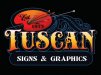
I think seeing it on a different colored background would help, the black and the dark navy are kind of clashing, that's nothing against the design, just the display.
I think seeing it on a different colored background would help, the black and the dark navy are kind of clashing, that's nothing against the design, just the display.
Travis Stanley
New Member
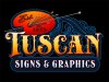
I like It. When is that font coming out? Been waitin for a while.
petesign
New Member
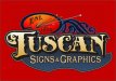
I really like where you are going also. I don't feel like my skills approach yours, so I hesitate to offer advice here.. maybe a little more contrast between your established 1972 text and the background.. and maybe fewer brushes, tools, etc. that part is a touch busy.
I love the gradient you used in the word Tuscan, it's warm and inviting, and gives it some nice depth.
I love the gradient you used in the word Tuscan, it's warm and inviting, and gives it some nice depth.
Jillbeans
New Member
I like it...but you asked.
Make the "T" bigger. Tighten up the kerning on Tuscan, on all but the last two letters.
Then tuck all those under the arm of the T.
"s" is kind of far from "E" in "Est."
Or better yet, use the script for "Est." and choose a plainer font for SIGNS & GRAPHICS
It's nice to have one plain font to offset the fancy-schmancy ones.
Love the colors.
Love....Jill
SignosaurusRex
Active Member
I think seeing it on a different colored background would help, the black and the dark navy are kind of clashing, that's nothing against the design, just the display.
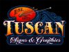
This version was started for my red truck. The black would be for my little PU I'm planning on painting black.
Attachments

SignosaurusRex
Active Member
I like It. When is that font coming out? Been waitin for a while.
Which one? "Tuscano Script" has been released early ahead of formal release to 101 members. The "Ace High" is still in the works.
Craig Sjoquist
New Member
First thing I saw was... the blue outlining inbetween the letters of Tuscan .. get rid of those just keep the blue to outline the whole and decor you have, that will help frame.
saw this on both versions first looks really tacky, on my windoiw splash I remove even when I have enough open space and it helps readability.
The next was Kerning on Tuscan needs improvement U-S & S-C open up a bit.
Next was the T should be taller then can be tighten up a bit towards U.
I really like this font, your design, layout, awesome image, colors ..But the red one well depends if you like harmony or contrast.
SignosaurusRex
Active Member
I like it...but you asked.
Make the "T" bigger. Tighten up the kerning on Tuscan, on all but the last two letters.
Then tuck all those under the arm of the T.
"s" is kind of far from "E" in "Est."
Or better yet, use the script for "Est." and choose a plainer font for SIGNS & GRAPHICS
It's nice to have one plain font to offset the fancy-schmancy ones.
Love the colors.
Love....Jill
Thank you Jill.
 I like those suggestions.
I'll wait for more input before making adjustments.
SignManiac
New Member
I was going to suggest pretty much the same thing Jill said. I think as it is, it's too overly ornate. Using a simpler font for the Signs & Graphics will contrast nicely with the main font. Colors are nice.

SignManiac
New Member
SignosaurusRex
Active Member
SignosaurusRex
Active Member
First thing I saw was... the blue outlining inbetween the letters of Tuscan .. get rid of those just keep the blue to outline the whole and decor you have, that will help frame.
saw this on both versions first looks really tacky, on my windoiw splash I remove even when I have enough open space and it helps readability.
The next was Kerning on Tuscan needs improvement U-S & S-C open up a bit.
Next was the T should be taller then can be tighten up a bit towards U.
I really like this font, your design, layout, awesome image, colors ..But the red one well depends if you like harmony or contrast.
I guess that I'm not quite understanding what your saying about the blue.
The red background version will be getting a color makeover later. Thanks for the input.