• I want to thank all the members that have upgraded your accounts. I truly appreciate your support of the site monetarily. Supporting the site keeps this site up and running as a lot of work daily goes on behind the scenes. Click to Support Signs101 ...

Logo Critique

Atomic DNA

New Member
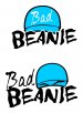
I developed this for a new business that will be focused on custom made beanies. Suggestions?

I'll will add a tag line eventually probably in the Blair font or something similar. Would you guys go with the red beanie or white. This logo is in the works and is not finalized, so critique away! Looking at it now, I may add a grey vector shadow to one far side of the beanie.

Thanks!!:signs101:
 

Attachments

  • Screen Shot 2013-01-28 at 6.33.06 PM.png
    Screen Shot 2013-01-28 at 6.33.06 PM.png
    91 KB · Views: 144
Last edited:

CanuckSigns

Active Member
I'm not sure about the graphic, i'm not quite sure what I'm looking at, and seeing how "beanie" is a regional term it could be confusing. (what you call a beanie, we call a touque. A beanie for us is one of those silly hats with the propeller on the top)
 

Atomic DNA

New Member
Never gave it much thought as far as the name goes. Around here in the midwest people call them beanies, beanie hats, skull caps. Guess it depends on what region you are from as was said by Watson Signs. Aside from that, I was wanting to do something that gave off a bad attitude or something to that nature. The icon is a beanie hat with mean looking eyes.

Pat, I don't know what you are referring to when you say skull/eye thingy. Are you talking about the stroke of white that is around the black? Like This?
 

Attachments

  • Screen Shot 2013-01-28 at 8.08.43 PM.jpg
    Screen Shot 2013-01-28 at 8.08.43 PM.jpg
    42.8 KB · Views: 106

Pat Whatley

New Member
You've got a horizontal line that goes right above one eye and behind the top of the other. It looks like the dividing line between a skull cap and a head/skull. Make the cap red and the skull white
 

Moze

Precision Sign Services
It looks like the eyes are trying to come "out" and extend above the bottom of the skull cap (that's what I've always called them - might be a NY thing). I'm wondering if it would look better if the tops of the eyes went under the beanie and you just added bulge lines to the beanie where the tops of the eyes are...?
 

bob

It's better to have two hands than one glove.
Lose the Serpentine-like type face. It was beyond passe 10 years ago. Nowadays it's the mark of the amateur. Or at least one of them.

If this is supposed to be a logo and not a sign you might consider losing a little detail on the illustration. Make it a bit more stylized. Iconic as it were. As it is, at sufficiently small but still useful sizes it will be indistinguishable from an enraged turtle. Or a meaningless blob.
 

Atomic DNA

New Member
Pat and Moze,

I should have stated in my original post that this beanie icon was supposed to be designed in a way that looks as though the beanie has eyes. It's not to be interpreted as a skull wearing a beanie. What I was originally going after was a "bad" beanie or a beanie with an attitude or something to that effect. I guess one would see this as someone wearing a beanie hat as this is the normal way of viewing this article of clothing. I originally had the eyes up in the middle of the hat but really didn't like how that was going. Moving it lower made it seem more natural. Moving it below the beanie makes the icon way too vertical for the stacked typeface. I'll have to tweak it I guess. I do think the hat definitely looks better red with the eyes contrasting.

Bob, this will not be a sign. It is designed for an ecommerce website and promotional items. The Serpentine font was not my original choice. I had originally went to the LHF website and viewed many fonts to no avail. I was wanting an impactish type of font, similar to LHF Convecta base. But both of those are overused as well. A modified Sofachrome font was used and I liked it. I happened to modify this Serpentine font and took a poll with a few of friends and the majority ruled on the latter. Again, if there is another font that is similar or is designed in this type of format, I'll change it up. Any recommendations on a font?
 

Jillbeans

New Member
I think the font is passe as well.
The beanie (just to the south of me they are called "toboggans"!) skull thing is not working, it does not look like it has eyes.
I know someone (hint hint) who could draw it up so it looks like a beanie with eyes not skull eyes or a bad "bad boy" knock off superimposed on a beanie.
Love....jill
 

Marlene

New Member
try some other ideas as this one isn't working. it does look like a skull, the idea of a hat of any kind isn't clear. the font is old and dated as stated in other posts. it doesn't convey "bad" in the way you intended. the colors also look old. do some R & R and look at logos that have the feel you are going for to see what is it about them that works.
 

steeltech

New Member
I know this would wipe the slate clean but I dont think the eyes go well with this concept. I would personally wrap a beanie over the word Bad, and not personify the item. Additionally, I know this has been done before, but Bad Beanies does incorporate the same idea that the "Bad Boy" sticker from the 90s incorporated - that the last letter of the first word can be the left eye, and the First letter of the second word can be the right eye. You can play off of that concept.
 

Atomic DNA

New Member
I appreciate all of the suggestions. I'll play around a little more with the hat icon, with and without eyes. Would anyone care to recommend a font?

Steeltech, I know what you mean about playing off of the Bad Boy logo. I wanted to stay away from that but I will try to go in that direction for a change up.
 

steeltech

New Member
This is just a quick stack of your beanie, with a crazy font. But the eyes are gone. Sometimes when I work on something, it helps if I can see someone elses version. When I was in high school and we would sketch still-life drawings, we would all get up and see what everyone else was doing from another angle. It helped to see others styles, and perspectives. You dont have to go this way, this is just another style. But you get the idea.
 

Attachments

  • badbeanie.jpg
    badbeanie.jpg
    114.9 KB · Views: 109
Last edited by a moderator:

steeltech

New Member
If you wanted shock value, you could have a vector face of Hitler wearing a beanie. Doesnt get much badder than that!
 

Atomic DNA

New Member
lol. I'm kind of the same way. It kind of helps to have a platform and then to improvise off of it. It gets the creative juices flowing. I like the grungy lettering.
 

Atomic DNA

New Member
I changed the "Bad" lettering up to a modified Mirage. Resized the eyeballs, moved one over the "i". I like the direction it's going, just need to find a font replacement for the modified serpentine.

I'm thinking I may add texture and tears to the serpentine font.
 

Attachments

  • Screen Shot 2013-01-29 at 4.16.39 PM.jpg
    Screen Shot 2013-01-29 at 4.16.39 PM.jpg
    38.4 KB · Views: 125
Top