• I want to thank all the members that have upgraded your accounts. I truly appreciate your support of the site monetarily. Supporting the site keeps this site up and running as a lot of work daily goes on behind the scenes. Click to Support Signs101 ...

Logo Critique

artbot

New Member
way way way too illustrative. the design looks mean but the name is "cute". at least start by cutting it down to some fundamentals. logos are not for showing off graphic skills. that is the worst thing you can do to a logo. it's my opinion that this logo, even if accepted by the client will kill sales. i did my best to break up what you have but it needs to be about 3x's simpler still.
 

Attachments

  • Screen Shot 2013-01-29 at 4.16.39 PM.jpg
    Screen Shot 2013-01-29 at 4.16.39 PM.jpg
    79.8 KB · Views: 103

Border

New Member
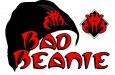
I changed the "Bad" lettering up to a modified Mirage. Resized the eyeballs, moved one over the "i". I like the direction it's going, just need to find a font replacement for the modified serpentine.

I'm thinking I may add texture and tears to the serpentine font.

First thing I thought of now is Mars Attacks~

...sorry, nice drawing and everything.
 

Attachments

  • mars.jpg
    mars.jpg
    61.6 KB · Views: 81

Atomic DNA

New Member
Laserman, I like how the 3/4 view looks. Actually never occurred to me.

Jill, I wanted a toned down word for "beanie". I like Steeltech's for sure. I was wanting a block style look for some reason (got it stuck in my head). I don't know. I'll play around with all of the concepts mentioned here. I appreciate all the help.
 
Top