-
I want to thank all the members that have upgraded your accounts. I truly appreciate your support of the site monetarily. Supporting the site keeps this site up and running as a lot of work daily goes on behind the scenes. Click to Support Signs101 ...
You are using an out of date browser. It may not display this or other websites correctly.
You should upgrade or use an alternative browser.
You should upgrade or use an alternative browser.
Logo Critique
- Thread starter qmr55
- Start date
SignManiac
New Member
Top left is the best so far. Contrast is 100% better than the others.
Locals Find!
New Member
needs a ladder

HulkSmash
New Member
needs a ladder
can't beat em, join em. I like your style.
qmr55
New Member
needs a ladder
???? lol no idea what this means
Locals Find!
New Member
I really hate that Green on the company name. Can you use another color or is that something they picked??
qmr55
New Member
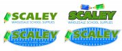
I highly dislike the pencil, customer provided the clipart for that as it was used in there other logo.
I am going to show them this version today I think, hoping they will go along with getting rid of the pencil as I think it ruins the professional clean look like Pat mentioned.
I am going to show them this version today I think, hoping they will go along with getting rid of the pencil as I think it ruins the professional clean look like Pat mentioned.
Attachments

qmr55
New Member
I really hate that Green on the company name. Can you use another color or is that something they picked??
As much as I'd like to, they want to stick with these colors as it corresponds with there old logo.
Locals Find!
New Member
As much as I'd like to, they want to stick with these colors as it corresponds with there old logo.
Well the last one isn't as bad with the green. The blue behind the green made the green worse on my eyes. This last one I like. Of course I am no designer so my opinion only counts from a consumer standpoint.
Marlene
New Member
since it is school supplies, the pencil isn't all that bad of an idea. it is school supplies and not a corporate type logo so it can have a fun element to it and doesn't need to be too professional looking like a lawyer's, doctor's or bank's logo. the last version is kind of plain and the what they do is too small. the name doesn't say what the business does so it needs the secondary copy to support the message
John Butto
New Member

SignManiac
New Member
notebook paper, keep the pencil and their old colors
Verrry Nice John!

phototec
New Member
Talked the customer into changing the green a little bit for the better!
This is our final design...doing trucks and business cards next!
Thanks for the help guys!
Don't like the GRAY swoosh in the background, doesn't add anything and it will only cause problems when trying to print with different print mediums. (new word, YUCKY).

Dave Drane
New Member
That is not the best logo presented here. John already had it nailed. it is too disjointed. "wholesale school supplies" needs to be in the same font in a single line.Talked the customer into changing the green a little bit for the better!
This is our final design...doing trucks and business cards next!
Thanks for the help guys!
Last edited: