• I want to thank all the members that have upgraded your accounts. I truly appreciate your support of the site monetarily. Supporting the site keeps this site up and running as a lot of work daily goes on behind the scenes. Click to Support Signs101 ...

Logo design feedback

Gino

Premium Subscriber
Not the most constructive advice, but I tend to agree. If the client dictates the font and you know it's not going to work, it's your job to convince them otherwise. Communicating effectively with your customer is key. If you let the customer dictate your job when you know you could do it better, you're never going to be proud of your work.


Sometimes, after doing this kinda stuff for years, ya get a feel for which customers are gonna yield to your expertise and which ones won't. If the job is gonna pay out in 5 or 6 figures, go for it, but why waste time barking up the wrong tree, if you know going in, you're just banging your head against the tree ?? :banghead:
 

ChrisN

New Member
However, like the others, I'm hung up on the font but don't have a solid solution for an alternative. ......

I like Neato's contrasting font layout. :thumb: (I don't like that script, either) That concept can give a nice upscale feel to the logo and offer an alternative type-only mark to the customer.

Yeah, I'm definitely going to try a contrasting layout.

Maybe rather than using a computer font you could take one of their pens and write out their name a couple dozen times on some clean white paper. Take the best one or the best elements of your preferred ones, scan 'em, clean 'em up, and you will have a truly custom script to offer them.

That's a good idea. I would do that if I were a better calligrapher....

Fountain Pen Collector, here.
Looks like this company: http://www.gouletpens.com/
Wow that's quite similar. I guess that means it's....:smile::glasses::Cool 2:....back to the drawing board.
Yowza........ someone is cheating, huh ?? :omg:

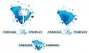
I will admit that is probably where the idea of an ink blot came from. However, this is a "custom" ink blot, rather than Goulet's "generic" blot.:smile:

Not the most constructive advice, but I tend to agree. If the client dictates the font and you know it's not going to work, it's your job to convince them otherwise. Communicating effectively with your customer is key. If you let the customer dictate your job when you know you could do it better, you're never going to be proud of your work.

:thumb:
 

Billct2

Active Member
I like the idea of the ink blot becoming the palmetto tree instead of it just dropping out of the other blot.
And I like Neato's take on the lettering.

Don't think anyones stealing a blot with script is probably the go to idea for pen companies, like a brush w/splat for painting compaies
 

ChrisN

New Member
Don't do this. Your branding should never look even remotely like another brand that sells the same product.

So, to use Bill's example, what about all the painting companies with brushes? Anyway, the companies are not really direct competitors. My client is a one-man hobby-turned-business. He makes custom high-end fountain pens, whereas Goulet sells various mass-marketed pens/inks/papers/writing supplies/etc. I'm not saying you're wrong, but making someone's logo not "look even remotely like" their competitor is, IMHO, very hard if not impossible. An ink-blot palmetto would look even more like a generic "round" ink-splash.
 

ChrisN

New Member
attachment.php


Solid palmetto tree - I like this better. It's less cluttered.
 

Attachments

  • cpc.PNG
    cpc.PNG
    31.1 KB · Views: 162

Gino

Premium Subscriber
So, to use Bill's example, what about all the painting companies with brushes? Anyway, the companies are not really direct competitors. My client is a one-man hobby-turned-business. He makes custom high-end fountain pens, whereas Goulet sells various mass-marketed pens/inks/papers/writing supplies/etc. I'm not saying you're wrong, but making someone's logo not "look even remotely like" their competitor is, IMHO, very hard if not impossible. An ink-blot palmetto would look even more like a generic "round" ink-splash.


Wait a minute..... you've been doing nothing but spouting off about a 'CUSTOM' pen company, CUSTOM branding and custom this and that all along. Now, your idea becomes suddenly quite evident, you are not making a CUSTOM logo, and your only comeback is that if paint companies can do it, then your client shouldn't mind ?? What kinda malarkey is that ?? Two wrongs make a right ??

Either you are making a custom logo regardless if this guy is doing it for a hobby or you are just putting in a little time, trying to copycat something which many not have been seen or heard of and getting paid for plagiarism.


This is the mindset I just cannot understand anymore. Neither do I want to understand it. It's just wrong on all counts.
 

Jillbeans

New Member
In your last example, if you simply eliminated the ink blot, you have a much stronger image than your first attempt. I think simple is always better.

I think the palm tree/state shape icon is a bit redundant if "Carolina" is in the company name.
Not every logo needs an icon.
And your ink blot will be hard to reproduce in some applications, having that auto-traced smeary kinda look.
 

SignManiac

New Member
Customer just supplied me with his logo. This was my reply. I don't tend to sugar coat crap anymore.

Your logo is horrible Chris. Just thought I’d give you my opinion. Was it created in the 90’s?

His reply:

Thanks Bob for making me feel better about myself, can I see the second Free Press logo I sent without the white background


He sent me the exact same logo back as the original. Even without the white background, it would still suck. I did what I think needed to be done, sent him my suggestions and he just replied back, Much better, go with your version.
 

Attachments

  • ZHFP.jpg
    ZHFP.jpg
    23.7 KB · Views: 141

SightLine

║▌║█║▌│║▌║▌█
The state outline and the palmetto tree (with or without the crescent) are very widely used by businesses throughout the state. If your customer is intending on mostly in-state business I'd maybe try to work one of them in if they really insist. Outside of South Carolina the state outline and/or palmetto will have no real meaning to most. Here in state the state design elements (outline of the state, palmetto tree, crescent, state colors) are really grossly overused in a huge way by businesses as part of their logo. I could probably dig through our client files archive and find at least a couple of dozen logos which incorporate one or more of the state design elements.....

At least the guy did not name his company Pen Island...... that makes for a pretty rough domain name. :omg: (do NOT try to go there, that at one time was a real pen company, I think the domain now is probably in not very good hands)

As far as the logo goes. I actually like Jills the best so far but the newest one from Neato is pretty slick too.
 

ChrisN

New Member
Latest version, taking some inspiration from Neato's designs. I cleaned up the ink blot a bit, made the tree larger, and added a small drop shadow to make it stand out a bit more.
attachment.php
 

Attachments

  • CPC.PNG
    CPC.PNG
    40.5 KB · Views: 148

Jillbeans

New Member
I'd still lose the blot, or do what Neato did with the Pen in the blot.
With the tree, it's really busy.
You need to fix your kerning on the black copy.
If you did what Neato did with the blot, I would extend your rule lines into it for continuity.
 

ChrisN

New Member
Thanks for catching that kerning! Here's 3 options I might present - I simplified the blot down to four colors in these versions.
attachment.php
 

Attachments

  • cpc_semifinal.jpg
    cpc_semifinal.jpg
    36 KB · Views: 170
Top