-
I want to thank all the members that have upgraded your accounts. I truly appreciate your support of the site monetarily. Supporting the site keeps this site up and running as a lot of work daily goes on behind the scenes. Click to Support Signs101 ...
You are using an out of date browser. It may not display this or other websites correctly.
You should upgrade or use an alternative browser.
You should upgrade or use an alternative browser.
Logo design feedback
- Thread starter ChrisN
- Start date
I agree with most of the suggestions being made and the basic concept is coming along, but I'm still struggling with the depiction of the ink blot. When I think of spilled ink or any liquid on a flat surface, I think of a slick, fairly consistently shaded moving object illustrating its thickness and liquidity. I understand the whole shape reference to the state but feel like the palmetto tree has no real relevance to the name, product being sold or branding effort.


Attachments


ChrisN
New Member
I agree with most of the suggestions being made and the basic concept is coming along, but I'm still struggling with the depiction of the ink blot. When I think of spilled ink or any liquid on a flat surface, I think of a slick, fairly consistently shaded moving object illustrating its thickness and liquidity.
You are right, as long as the ink is wet. Once it has soaked in the paper and dried, you will have darker ink around the edges (because of the pigment migrating out) and maybe a darker spot in the center (because that will most likely be the last to dry). Different inks will have different variations between the darkest and lightest parts. This effect is known as "shading". Also, your examples are what I would call "artist's depictions" of ink blots. Do an image search for "ink blot on paper" for some actual ink blots.
how are any of these new attempts going to fit on the nib of a pen ??
Same basic way as my first idea - the blot (with or without the tree) will be engraved. This is a future usage, mainly because of the large MOQs, but something that I have kept in mind.
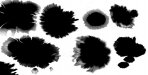
Ok, so I did what you suggested and came up with what I think are three realistic ink blots. Your representation of a "dried" ink blot doesn't look like any of these.
Just like everyone else, I'm attempting to help by making observations and offering suggestions on how to make your design more effective. I'm not here to quibble over dry vs. wet ink blots, how ink soaks into different kinds of paper differently, etc.
My basic premise is that if I'm using a symbol to illustrate a concept or evoke an image in the end user's mind, I'm rendering it accurately unless I'm attempting to only "suggest" the symbol and provoke the end user to fill in the image gaps in their mind.
Attachments

ChrisN
New Member
Ok, so I did what you suggested and came up with what I think are three realistic ink blots. Your representation of a "dried" ink blot doesn't look like any of these.
Just like everyone else, I'm attempting to help by making observations and offering suggestions on how to make your design more effective. I'm not here to quibble over dry vs. wet ink blots, how ink soaks into different kinds of paper differently, etc.
My basic premise is that if I'm using a symbol to illustrate a concept or evoke an image in the end user's mind, I'm rendering it accurately unless I'm attempting to only "suggest" the symbol and provoke the end user to fill in the image gaps in their mind.
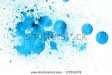
OK, I don't quite get what you are saying? Are you saying the shape is unrealistic? The shading? I know the shape is unrealistic - you'd be hard pressed to find an actual ink blot that just happened to be shaped like South Carolina. That's what makes this logo custom, IMHO. As far as shading, well, here is the actual blot that I based off of.
I appreciate your help, and I'm attempting to understand your suggestions.
Attachments

That splotch looks like it was made with watercolor paint on a coarse, open weave paper or watercolor block which will absorb all the water first and that sponging action will pull the pigment towards the edges as it dries.
When I think of "ink" from a fountain pen, I think black opaque or a nearly opaque liquid.
I don't know... Sorry, I might be the only one who doesn't think the ink blot you've created works that well.
When I think of "ink" from a fountain pen, I think black opaque or a nearly opaque liquid.
I don't know... Sorry, I might be the only one who doesn't think the ink blot you've created works that well.
ChrisN
New Member
That splotch looks like it was made with watercolor paint on a coarse, open weave paper or watercolor block which will absorb all the water first and that sponging action will pull the pigment towards the edges as it dries.
When I think of "ink" from a fountain pen, I think black opaque or a nearly opaque liquid.
I don't know... Sorry, I might be the only one who doesn't think the ink blot you've created works that well.
I guess it all depends on what paper is used as to how the pigments travel while drying. Good fountain pen paper will absorb ink quickly to prevent smearing. For me personally, when I think of fountain pen ink, I think of a rainbow of colors. That is my draw to a fountain pen - because of the variety of colors you can get. Right now, I have orange ink on one of my pens.
 Anyway, I know that not all logos appeal to all people. There's a saying, "You can please all people some of the time, you can please some of the people all of the time, but you can't please all of the people all of the time."
 I guess to me, the most important thing is if the customer is happy, second is if I'm happy, and third is if other people are happy.
Pete Moss
New Member
Neato's design is just plain neato, as is all of their work.
Probably later than you'd like to put a different spin on it. I agree with everyone's suggestions, it's coming along nice! This is just a really quick rendering, if I were to do something like this I'd spend forever on the colors to make the most impact for branding purposes.
Probably later than you'd like to put a different spin on it. I agree with everyone's suggestions, it's coming along nice! This is just a really quick rendering, if I were to do something like this I'd spend forever on the colors to make the most impact for branding purposes.