-
I want to thank all the members that have upgraded your accounts. I truly appreciate your support of the site monetarily. Supporting the site keeps this site up and running as a lot of work daily goes on behind the scenes. Click to Support Signs101 ...
You are using an out of date browser. It may not display this or other websites correctly.
You should upgrade or use an alternative browser.
You should upgrade or use an alternative browser.
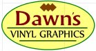
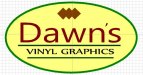
Logo for input
- Thread starter MikeSTK
- Start date

SignManiac
New Member
For starters, close up the space between the e and s. In fact, connect them and twiddle the apostle.
SignManiac
New Member
much better
mikey-Oh
New Member
Not sure if you need the black strokes on the text and bars... Maybe some bolder colour's should be explored? (check the palette sections for insp)
PromoGuyTy
New Member
Consider adding something, anything, of interest to this layout.
(You said don't tip-toe).
This layout makes me very sleepy.
(You said don't tip-toe).
This layout makes me very sleepy.
Mosh
New Member
make the "d" twice as big. nix the outliness. Let me guess, you just got a "sticker cutter" and is going into the sign biz??? Right? cause..... The Mosh can tell... look at the Kerning on the 's, you needs some skoolins on sign makinins Dawn fur sure! Yeah, what Mosh said, I agree! (please google kerning so you know what I am talikng about first off)
SignManiac
New Member
Jillbeans
New Member
If you want to only make signs for the wedding and hair salon crowd, keep on going.
Bob was right about the apostrophe but nothing makes this sign dynamic or makes me want to buy a sign off of you.
The weak script, the blah colors, it is just so bland.
You might like it but will a potential client?
(say a landscaper with a small fleet of 10 trucks who needs a logo and tons of signs)
I think you are trying for a classy look, but this looks very girly.
Yes the name is a woman's name, but a woman can be tough, colorful, and eye-catching.
Like me.
hahahaha
Design for who you are trying to sell to, not just to please yourself.
Love.....Jill
PS
Kudos on not spelling graphics with an X.
Custom_Grafx
New Member
Kudos on not spelling graphics with an X.
I wish I could change my nick...
MikeSTK
Dawns Vinyl Designs
Thank you for the input so far!
I have been reading as fast as I can regarding signs, maybe too much to digest. Tinkering and asking for input will only help me grasp important aspects quicker.
Here's what I am trying to obtain:
Large sign
Letterheads
Will work in a single color
The ability to recreate very tiny within projects
Readable in any size
Maybe say an electrician needs truck signs and business cards, but trying to work on vinyl or printing would require a much broader range of uses.
Am I at least glancing in the right direction?
John Butto
New Member
Am I at least glancing in the right direction?
You certainly are.
You certainly are.

CES020
New Member
If you want to achieve reading from a distance and reading when very tiny, as you said, you need to lose that font. Those fine lines in there will disappear from a distance and be too small to see when it's "tiny", will end up being a single strand of thread if you have it sewn on a shirt, etc.
I went to a quote a job about a year ago. They needed pan faces for their street sign, and then signs on their building. They handed me their card and the entire thing was in a font like that. They insisted on keeping the font. I insisted no one would be able to read it. I refused to quote the job for them in that style font.
Drive by there 3 months later, I see the sign, you can't tell the name of the place or what they sell. You literally can't read the sign while driving down the road. I've been by there many times since and I never see cars in their lot. Not because they don't have a good business, but because no one knows they are there because they can't read the freakin' sign!
Thicken it up!
Disclaimer: I'm not a graphics designer, don't know anything about graphic design, and don't pretend to be a graphic designer, but I can read from my car while driving down the road (if the sign is clear enough to read!).
CanuckSigns
Active Member
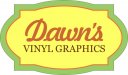
Too complicated for your stated uses. Here's a simple idea.
 Simple, easy to read and has some interest!
MikeSTK
Dawns Vinyl Designs
I follow the issues surrounding the font. I guess I was attempting "classy". I knew I didn't want something that had a cheap or inexpensive look.
Reflecting on it I guess I am trying for too much from a single design.
I am working on making it better and I will post as I "correct" it.
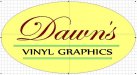
Maybe if I can get some thoughts from this standpoint. My plan was if I made it large for a storefront I could add some text to the bottom, maybe more detailed info on what is offered BUT if I needed it shrunk I could eliminate everything but the oval with Dawn's on it.
One last thought, I really do appreciate the examples but I am not trying to get someone to design it. All I am hoping for is explanation of theory so I can correct, post and get feedback from experienced people here.
Please comment on the next trial.
Reflecting on it I guess I am trying for too much from a single design.
I am working on making it better and I will post as I "correct" it.
Maybe if I can get some thoughts from this standpoint. My plan was if I made it large for a storefront I could add some text to the bottom, maybe more detailed info on what is offered BUT if I needed it shrunk I could eliminate everything but the oval with Dawn's on it.
One last thought, I really do appreciate the examples but I am not trying to get someone to design it. All I am hoping for is explanation of theory so I can correct, post and get feedback from experienced people here.
Please comment on the next trial.
MikeSTK
Dawns Vinyl Designs
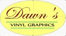
Is this getting closer to acceptable?
I am scared of going too crazy with color. I tried a number of combinations and although something seems wrong I just can"t place it.
I tried color sites to stay within the same family, think I will revisit that.
I am scared of going too crazy with color. I tried a number of combinations and although something seems wrong I just can"t place it.
I tried color sites to stay within the same family, think I will revisit that.
Attachments
GoodPeopleFlags
New Member
Sorry, but that's not better. Why "Dawn's"? I'm just not a big fan of business names that use a person's first name. Seems small-time, to me. Besides that, the font is too plain and too thin.
You should put what the business does larger than Dawn's. If I drove by that, I would see Dawn's and miss the rest and wonder what the hell Dawn was selling. By the first post, I would think clothes or flowers.
I used to own a sign shop and found that most of my customers were male and didn't give me alot of respect because I was a female. I could tell them the same info and say it came from my dad or husband and that carried more weight with them. Just sayin', the female name might keep some male customer's away.