-
I want to thank all the members that have upgraded your accounts. I truly appreciate your support of the site monetarily. Supporting the site keeps this site up and running as a lot of work daily goes on behind the scenes. Click to Support Signs101 ...
You are using an out of date browser. It may not display this or other websites correctly.
You should upgrade or use an alternative browser.
You should upgrade or use an alternative browser.
Logo for input
- Thread starter MikeSTK
- Start date
Gino
Premium Subscriber
If you want this to stand out in one color vs. large or small..... develop it in black and white first. Once you have a design that you like....AND works, then start adding your colors. So far, the colors you've chosen, are very weak and kinda passe'.
Whether you're using a girl's name or have a dainty name.... you don't choose your fonts based on gender, but what the business is all about. If you want to make a statement to someone, you don't whisper across the room to someone..... you puff up and speak out and loudly according to who all you want to hear you.
You do the same thing with type and colors. Remember, signs are a silent salesperson. They are making a statement and to get thoughts across, we must use tricks.... tricks of the trade. Color, type face, and spacing. Probably the three key elements of anything from a single word such in Colin's thread about a one word sign to the most elaborate logo to the most confusing layout of words and graphics. Type, color and spacing is what we all use to make main copy, secondary and so on down the line. With a word or name for a shingle, it's the same stuff, but you need honed skills to make it work.
Take a breather and look around at signs in your neighborhood or the local mall. Better yet, take pictures of them so you don't have to tax your memory. See what it is that draws your attention to this one and that one instead of the others.
Is it boldness of a font, colors, crazy background, swirlies, composition of various elements, balance of type and graphics as well as what the creator did with the tension created where nothing appears at all ??
There are lots of great designers here on :signs101:, but if you continue in this fashion of posting a picture every so often, you're not going to really learn with suggestions coming at you from all directions. You already said it 's becoming overwhelming for you and that's easy to believe. Just slow down, you've been without something for two years... a few more weeks won't hurt.
Take those pictures, read the Mike Steven's books, look at Dan Antonilli's website, look at Joe Diaz's website and after you wipe the drool from your face.... start analyzing what you do and don't like and start to create a style. A style is already in you. You have a way you like to dress, colors you like and some you dislike, shoes for doing various things, you drive the car you chose and you have a house decorated mostly the way you like it, perhaps the wifey had more say-so in that, but you see.... you already have a style. It just has to be pulled out of you and into your sign portion of your mind. Don't rush it into this one design. It will happen naturally.
SignManiac
New Member
What's wrong with the board? I'm not able to attach an image. The option isn't even here now?
SignManiac
New Member
Guess it's okay now?????
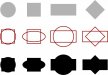
Don't limit yourself to a few basic shapes. Get creative. Mix and combine your shapes, then weld to create new and different shapes to use in your designs and layouts.
Mixing and welding the 1st and 2nd rows create the third row of shapes. Easy stuff.
Don't limit yourself to a few basic shapes. Get creative. Mix and combine your shapes, then weld to create new and different shapes to use in your designs and layouts.
Mixing and welding the 1st and 2nd rows create the third row of shapes. Easy stuff.
Attachments
MikeSTK
Dawns Vinyl Designs
I really appreciate the input.
To the last post it is a logo, although I will want to carry the design into a storefront sign.
I am going to agree that I need to look into exisiting logos and try to reverse engineer them. I know I am missing every basic concept other than it needs letters, lol. Also I will continue reading.....
I am very grateful for everyone's thoughts.
John Butto
New Member
here you go
just add copy at bottom
just add copy at bottom
