-
I want to thank all the members that have upgraded your accounts. I truly appreciate your support of the site monetarily. Supporting the site keeps this site up and running as a lot of work daily goes on behind the scenes. Click to Support Signs101 ...
Suggestions Logo opinion - WDRacing
- Thread starter Aver
- Start date
Johnny Best
Active Member
Only the respectful hogwash is used here.

Johnny Best
Active Member


JR's
New Member
I like the top right one.
Just a suggestion, pull the leg down from the g a little bit more.
And stretch it over to the left. The end angle make it correspond to the slant you have in your letters.
The bottom of the g you could make it look like a checkered flag or tire marks
or fade.
Just suggestions.
But if you'll hang around here you'll get a thick skin and learn a lot of stuff.
Good luck
oldgoatroper
Roper of Goats. Old ones.
shoresigns
New Member
Excellent adviceBut if you'll hang around here you'll get a thick skin and learn a lot of stuff.

Thank you for all the replays, you made my day!
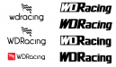
I tried to simplify the logo. In the attachment you can find some more version.
And with JR's comment in mind, it's awesome that you're learning to edit the letterforms in the type for your logo designs, but it's really obvious that you don't know what you're doing. The edits you made look awful. Keep learning, but don't make edits like this in a logo for a real company until you're experienced enough to look back and see what you're doing wrong now. Use a good-quality font that's appropriate for the design and leave it as-is.
Johnny Best
Active Member

Marlene
New Member
You know when you get a customer who has artwork from a nephew and you draw out an idea and he takes it back to his friends and they give him more advice. Well, this is one of those. So here's another idea for him.
wow, that one makes me feel like I have double vision. all most impossible to read.
Johnny Best
Active Member
Marlene, does that double vision also come with hot flashes.
S'N'S
New Member
wow, that one makes me feel like I have double vision. all most impossible to read.
Agreed Marlene, I'm blind in one eye and that really spun me out, took awhile for my good eye to focus.
Johnny Best
Active Member
So my customers are a dizzy lady and a one eyed Aussie. So which one does the driving on this racing team.
S'N'S
New Member
So my customers are a dizzy lady and a one eyed Aussie. So which one does the driving on this racing team.
ME, you's drive on the wrong side.