• I want to thank all the members that have upgraded your accounts. I truly appreciate your support of the site monetarily. Supporting the site keeps this site up and running as a lot of work daily goes on behind the scenes. Click to Support Signs101 ...

Logo Re-design

SlightlyChilled

New Member
Gino is now it my head....

I was thinking that as well but from the looks of the first logo they might need it to be cut vinyl.... but I have no clue
 

WildWestDesigns

Active Member
Like to see you embroider that on a shirt! :Big Laugh

I would too.

I think keeping the curtains, but have the name displayed within them (like signage did) would be a good route to take it. And still be able to embroider it on a shirt:Big Laugh

I do agree with the owners of the company and not to use the comedy/tragedy masks. That has been over done.

Too bad they wouldn't like the marquee idea. I do like the old style marquee.
 

Gino

Premium Subscriber
Like to see you embroider that on a shirt! :Big Laugh


Embroider - - scmoider...... I didn't know that was a pre-requisite. :covereyes:


Anyway, you can dumb-down any artwork on the planet to fit any needs for other mediums. You can turn it into one or two color to super simplified artwork. This was only an idea for a different direction, cause the others aren't working at all.

I'd really like to see how they intend to use any of this stuff for advertising a theater company before I would really get into anything serious with any client.... even family. Sometimes they're the worst ones to deal with. Something goes wrong.... they'll blame your stupid logo. If all goes well, it will be all of their expertise in the field. Ya never win with family.
Heck, had I listened to my family...... I'd be out of a job a lo-o-o-o-ng time ago. :banghead:
 

astro8

New Member
a couple of ideas...
 

Attachments

  • Brelby.jpg
    Brelby.jpg
    39.9 KB · Views: 97

Flame

New Member
The main thing that they wanted was the curtains as "B"s.


That's the point where, unless you're getting MUCHO dinero from this job....You either tell them to go your way or you're done doing business.

You're the professional, not them.

I'd 100% start from scratch. It's just a horrible idea to work with the curtains IMO.
 

BargainSigns

New Member
Brelby name should be spelled out on top. Use person in bottom logo with curtains on top logo, then mirror so you have two people bowing opposite directions on stage. Leave full name at the bottom. My $.02.
 

signswi

New Member
Seems like you need to inform them on the difference between a logo and branding elements. Many clients have a hard time grasping that until it's explained. This is why I'm a big proponent of doing full identity packages, not just logo one-offs.
 

DrCAS

New Member
I saw this thread and decided to come play. I worked up a design while listening to the hockey game on the Internet...

I think you can work an image into a letter form, like Joe Diaz said, if you can make it a legible letter. The problem with redesigning a logo that has been in use for awhile is that it becomes ingrained in the brain and gives people tunnel vision.

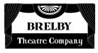
I reworked the curtain idea. I feel it only needs one "B" to be a curtain. I added a cordon to give the definition of the "B" a reason for being there. I build some letters to make up the name. I used a clean single stroke style letter for the sub copy that, I felt, kept a period feel that the name has.


picture.php


.
 

SignosaurusRex

Active Member
I'd say that if the customer is hell-bent on the curtain(s) being incorporated into the "B"(s), that there Doc is pretty much the best ticket one can expect.
 

Jillbeans

New Member
Clever idea, Brooce.
I'd like to see the "relby" part slightly skewed to flow with the curtain, or the B less skewed.
But your idea (as usual) is refreshing and new.
 
Top