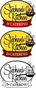
• I want to thank all the members that have upgraded your accounts. I truly appreciate your support of the site monetarily. Supporting the site keeps this site up and running as a lot of work daily goes on behind the scenes. Click to Support Signs101 ...

Logo thread revisited (Catering Company)

DesireeM

New Member
Great design! I prefer the green logo - it's more light, fresh and modern. I think the last one is nice as well if your intention is to give it a bit of a retro-50's look. I'm not sure about the first one - the outline makes it look quite heavy to me and cramped/busy around the veggies/steam of the skillet...
 

Jillbeans

New Member
So this is where I am today.
He really liked the one with the ribbon on the bottom.
So I've refined that and changed the transparent shadow to a vector one, and tidied things up a bit.
Here it is completed, also with a simple and a black and white version, and mocked up on his existing sign and van.
(the van I just guessed at the copy and that will change)
I may just put the logo, small, on the van doors or buy a huge honkin' print from D&T and apply that, recesses and all.
He'll outsource the pan face sign but I'll do the rest.
Thanks for all the input.
 

Attachments

  • skFINAL.jpg
    skFINAL.jpg
    349.6 KB · Views: 108
  • skversions.jpg
    skversions.jpg
    66.7 KB · Views: 91
  • signmock.jpg
    signmock.jpg
    76.9 KB · Views: 112
  • vanmock.jpg
    vanmock.jpg
    398.2 KB · Views: 110

SignManiac

New Member
Jill, on the black and white version, why not fill the ribbon black and reverse the catering copy to white?
Also, not fond of the script for the tag line on the van. With the name in script I think it's a bit too much...

Otherwise, it's shaping up to be a nice looking logo.
 

Jillbeans

New Member
I'll make the change, that's a good idea.
Like I said, the van is pretty much just goofing around to show the guy what it could look like in person.
Darlak I like what you did too.
 

WildWestDesigns

Active Member
This is a crude quickie, but that's a lot. You are looking at roughly 17k stitches. I would make sure that your client is aware that it's packing on a lot and that it might be better to go with a simpler pattern for embroidery.

The gradient had to be take out, because in stitches, blends look better when your base layer is the lighter color and the darker color is the one stitched in between the base layer.
 

Attachments

  • Catering.png
    Catering.png
    346.6 KB · Views: 102

wildside

New Member
looks good. only thing that keeps catching my eye, the K comes over the top of the ribbon, but the ends of the ribbon do not tuck behind the oval some, to me it throws the dimensional aspect off, or it could just be me:doh:
 

Jillbeans

New Member
Evan I'm trying to get him to order shirts from you...you should see the ones he just got.
I told him not to. (existing bizname)
I'll mess with the ribbon just a bit more.
Thanks again to everyone.
 

jkdbjj

New Member
So this is where I am today.
He really liked the one with the ribbon on the bottom.
So I've refined that and changed the transparent shadow to a vector one, and tidied things up a bit.
Here it is completed, also with a simple and a black and white version, and mocked up on his existing sign and van.
(the van I just guessed at the copy and that will change)
I may just put the logo, small, on the van doors or buy a huge honkin' print from D&T and apply that, recesses and all.
He'll outsource the pan face sign but I'll do the rest.
Thanks for all the input.
Good job, I like it!
 

SignProPlus-Chip

New Member
Jill,

Just a quickie idea. I know you like the skillet, and you have the oval background...kill two birds with one stone?

BTW please excuse the crude graphics work here...just trying to illustrate the concept in a few minutes time;)
 

Attachments

  • jillbeans-catering.jpg
    jillbeans-catering.jpg
    61.1 KB · Views: 99
J

john1

Guest
Jill,

Just a quickie idea. I know you like the skillet, and you have the oval background...kill two birds with one stone?

BTW please excuse the crude graphics work here...just trying to illustrate the concept in a few minutes time;)

When i seen this i go "oooooooh wow"

I like!
 

visual800

Active Member
Im going with the bottom right, i always like your layouts and maybe im not digging the soild background, layouts are cool though
 

Jillbeans

New Member
The cooking pot is a nice idea but he really liked the skillet.
I'll be relieved when this is all finished.
 

lexsigns

New Member
So this is where I am today.
He really liked the one with the ribbon on the bottom.
So I've refined that and changed the transparent shadow to a vector one, and tidied things up a bit.
Here it is completed, also with a simple and a black and white version, and mocked up on his existing sign and van.
(the van I just guessed at the copy and that will change)
I may just put the logo, small, on the van doors or buy a huge honkin' print from D&T and apply that, recesses and all.
He'll outsource the pan face sign but I'll do the rest.
Thanks for all the input.
why have him out sourse the pan and shirts? I take care of all I can (with subs) mark up a little and get paid for all the art work set up? Do you have anyone local that can make the pan for you? Just hate to see you loose out on anyof the work :) I am really lucky I have great local subs
 
Top