• I want to thank all the members that have upgraded your accounts. I truly appreciate your support of the site monetarily. Supporting the site keeps this site up and running as a lot of work daily goes on behind the scenes. Click to Support Signs101 ...

Looking for critiques of this sign frame

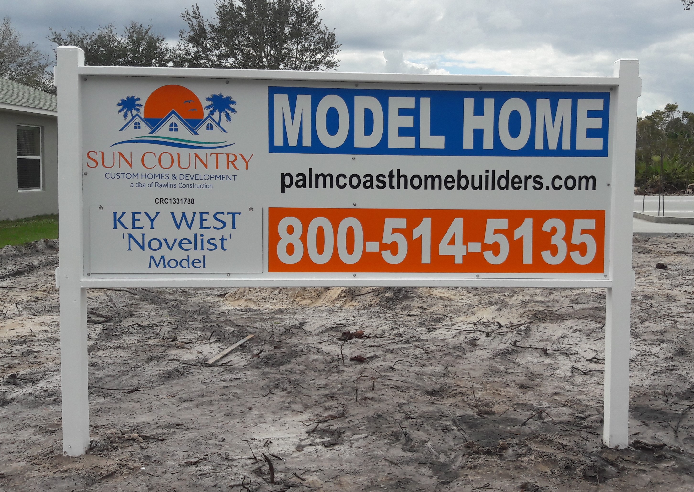
The layout of this sign isn't what we wanted, but the regulations gave us 24 sq. ft. and a max height of 5' so options were rather limited. On a budget of course, so no fancy post covers, just painted wood. Just wanting some honest feedback on how 'professional' it looks for a painted wood frame. Thanks all.
20180225_135558.jpg
 

Texas_Signmaker

Very Active Signmaker
I'm not a 60+ year sign designer like some others here claim to be...

For what the sign's purpose is it looks fine to me. I'd paint the screw heads white so they don't stand out so much. I usually use small painted white washers behind those hex screws to give them more grab.. but we have some windy conditions here in North Texas so it may be overkill for your area.
 
Last edited:
Yeah, I usually have white screws on hand, but unfortunately didn't for this one. I don't think the ACM needs the washers, but time will tell. Here's another small sign I did without screws. The sign is f'in ugly, but the frame looks good imho. (Other than that gap between the 2x2s)
20180402_160012.jpg
 

Rick

Certified Enneadecagon Designer
I've only been doing it for 39 years but I'll give it a try...

-- Wassup with the chunks of wood slapped on the sides... looks like an after thought...
-- The finials on the one don't seem substantial enough.
-- YIKES, Paint the attachments or, learn to build a sign where the attachments are hidden

-- On the layout... dude! stop abusing type - you squeezed and stretched it to death

-- The layouts have no rhythm.

-- Learn to K ER N

-- You can do without some information.

-- I googled the companies logo - I'm guessing you didn't find vinyl to match - not that it would have helped, the colors are really bad on the original.

-- Try staying away from primary colors... the reds and blues are too much for a sales sign.

-- Why white background? - I'm thinking you only do cut vinyl but you can layer it or paint the background.
-- Google "MODEL HOME SIGNS" and notice the use of color on most of the nice ones.
 
Last edited:
I've only been doing it for 39 years but I'll give it a try...

-- Wassup with the chunks of wood slapped on the sides... looks like an after thought...
-- The finials on the one don't seem substantial enough.
-- YIKES, Paint the attachments or, learn to build a sign where the attachments are hidden

-- On the layout... dude! stop abusing type - you squeezed and stretched it to death

-- The layouts have no rhythm.

-- Learn to K ER N

-- You can do without some information.

-- I googled the companies logo - I'm guessing you didn't find vinyl to match - not that it would have helped, the colors are really bad on the original.

-- Try staying away from primary colors... the reds and blues are too much for a sales sign.

-- Why white background? - I'm thinking you only do cut vinyl but you can layer it or paint the background.
-- Google "MODEL HOME SIGNS" and notice the use of color on most of the nice ones.
Thanks for the input on the Frame. The side caps were an afterthought of sorts. needed a way to access the lag bolts for when the sign gets disassembled and moved. As for colors not matching the logos, they are way closer than they appear. Funny how a cell phone pic in poor lighting can look so different than the actual colors, and also amazing how cut vinyl never seems to be available in web page colors. As for the layout on the real estate sign, that was probably the 9th(and by far the worst) layout. All I kept hearing was I need my name bigger, is there any way we can make my name bigger... The red? believe me, not my choice at all, but I'm sure that in your 39 years you have had at least one RE agent that believes Red is THE color for 'maximum visibility'. I will have to agree I should have used white screws, but those heads were painted after the pic was taken. I usually use white screws with the white background, But if not, at least I use stainless and not just drywalls that rust like a lot of others do. As for the white background on the Model sign, customer was on a budget, so cut vinyl, and fewer colors to save them some bucks.
 

Johnny Best

Active Member
They look like a lot of work, measuring, cutting, painting and assembly went into them. They look fine to me, good job. I would have like to see the backs of them and framing.
 

Rick

Certified Enneadecagon Designer
I'm sure that in your 39 years you have had at least one RE agent that believes Red is THE color for 'maximum visibility'..

Not in the last 20 - but yeah, I have heard some doozies in my day.

Except for the occasional quickie sign we can do in-house, we just design now... so the client comes in prepared to take "most" of our advice.
My largest client currently is a management company with 1400 properties. We deal with real estate agents all over the US. They occasionally get a sign shop to do the layout for them when it's our job to do it... being the gatekeepers of the brand, I get to reject most of the work...
If I had to deal with small time operators with bad ideas, I would most likely send them to a sign shop. I didn't get this far designing cheap cr@p all the time... though I have done my share when I worked for sign shops.

Theses developers/agents are obviously not reading about real estate marketing and branding... if their websites, social media and Instagram look like those signs, prospective clients may wonder about the quality of the home.
 

Texas_Signmaker

Very Active Signmaker
Not in the last 20 - but yeah, I have heard some doozies in my day.

Except for the occasional quickie sign we can do in-house, we just design now... so the client comes in prepared to take "most" of our advice.
My largest client currently is a management company with 1400 properties. We deal with real estate agents all over the US. They occasionally get a sign shop to do the layout for them when it's our job to do it... being the gatekeepers of the brand, I get to reject most of the work...
If I had to deal with small time operators with bad ideas, I would most likely send them to a sign shop. I didn't get this far designing cheap cr@p all the time... though I have done my share when I worked for sign shops.

Theses developers/agents are obviously not reading about real estate marketing and branding... if their websites, social media and Instagram look like those signs, prospective clients may wonder about the quality of the home.

Do you guys provide an outline or example to the sign shops doing the layout? I get these requests from National real estate brokers and they usually give me an example along with past layouts. I just change the text to their information and Presto it's good.
 

Rick

Certified Enneadecagon Designer
Do you guys provide an outline or example to the sign shops doing the layout? I get these requests from National real estate brokers and they usually give me an example along with past layouts. I just change the text to their information and Presto it's good.

No, the real estate agents tell us what they want as well as send us the survey and photos, we do the code research, then the layouts, and send the documents - with specifications to bid. The regional managers send them out to bid.

They used to have sign shops do them, but since there is no "standard" size because of sign code differences, or fabricating a sign varies from state to state, we designed one for them and make the sign shop stick to the specifications - you can't believe how many sign shops still try to cheap out on the signs.
 

Gino

Premium Subscriber
I tried this and came up with a different appraoch, but still using a white background. I think I would've put some color into the background.

I also don't understand the need for all that framework ?? I'd use 1/2" MDO and just rout the posts or use the end brackets. We just did some last week that way with the brackets. Painted them and you cannot tell a thing.

The copy and numbers are still large enough to see from at least 450' away. The logo is much larger and I didn't use so many colors. Personally, I don't like to see black copy on a sign, unless absolutely
sun country compar.jpg
necessary.
 

DerbyCitySignGuy

New Member
To stay on topic, I would have just gone with a straight painted wooden frame, no bells and whistles. No sense in trying to pass an inexpensive sign off as anything but an inexpensive sign (there's nothing wrong with that). It looks like it's in an area that's still being developed, so that thing is going to be dirty and nasty in a few days anyway.

Are there any rules about putting riders on the sign? A rider could help clean up the face a little bit and still relay web address and phone number.
 
I tried this and came up with a different appraoch, but still using a white background. I think I would've put some color into the background.

I also don't understand the need for all that framework ?? I'd use 1/2" MDO and just rout the posts or use the end brackets. We just did some last week that way with the brackets. Painted them and you cannot tell a thing.

The copy and numbers are still large enough to see from at least 450' away. The logo is much larger and I didn't use so many colors. Personally, I don't like to see black copy on a sign, unless absolutely View attachment 134477 necessary.
It's hard to tell from the pic, but the section with the model name is actually removable. it is on hooks and can be flipped over to say OPEN. It was a necessary part of the sign, otherwise regulations says they can put a 12x18 Model Open stake sign next to the large sign, which looks lame. So this is part of why the layout is done the way it is. The original idea had what was 2 4'x4' signs in a V, but not allowed by the city, so after a few go-arounds we got to this one. I do like the blue frame, but 3 of the 4 chiefs had specified they wanted white posts. You say you didn't use so many colors, but you actually did, lol. just different colors. As I said at the start, was on a budget, so... Anyways, I like your layout, and I wish I had the power to reject bad ideas from paying clients, lol. As for the framework, they originally wanted those plastic post covers, which are pricey, combined with what to do top and bottom to match. We used 1/8" acm for this job to keep costs down. As I said before, budget.
 
To stay on topic, I would have just gone with a straight painted wooden frame, no bells and whistles. No sense in trying to pass an inexpensive sign off as anything but an inexpensive sign (there's nothing wrong with that). It looks like it's in an area that's still being developed, so that thing is going to be dirty and nasty in a few days anyway.

Are there any rules about putting riders on the sign? A rider could help clean up the face a little bit and still relay web address and phone number.
Yeah, no riders on the Model Home signs, and a max height of 5', with decorative frame allowed to extend up an additional 6".
For what we had to work with, I think we did ok.
 
They look like a lot of work, measuring, cutting, painting and assembly went into them. They look fine to me, good job. I would have like to see the backs of them and framing.
The backside would show the 2x2s that are flush with the rear edge of the 4x4s and the 2x4s. There is one vertical 2x2 brace centered, then one horizontal one behind the top of the Key West section for the hooks to attach to. That section can be flipped over to say OPEN.
 

Gino

Premium Subscriber
It's hard to tell from the pic, but the section with the model name is actually removable. it is on hooks and can be flipped over to say OPEN. It was a necessary part of the sign, otherwise regulations says they can put a 12x18 Model Open stake sign next to the large sign, which looks lame. So this is part of why the layout is done the way it is. The original idea had what was 2 4'x4' signs in a V, but not allowed by the city, so after a few go-arounds we got to this one. I do like the blue frame, but 3 of the 4 chiefs had specified they wanted white posts. You say you didn't use so many colors, but you actually did, lol. just different colors. As I said at the start, was on a budget, so... Anyways, I like your layout, and I wish I had the power to reject bad ideas from paying clients, lol. As for the framework, they originally wanted those plastic post covers, which are pricey, combined with what to do top and bottom to match. We used 1/8" acm for this job to keep costs down. As I said before, budget.

I used the same yellow out of the logo and the same blue, just darkened, so I'm not introducing more colors. I didn't realize this was a single-sided sign. Rather than all that framework, couldn't you have just screwed a piece of 1/2 plywood to two post and fasten the 3mm ACM to it ?? The 'OPEN' part is an easy fix.

sun country compar 2.jpg
 
They wanted something with a somewhat fancy frame but on the cheap, lol. I put in way too much labor making the frame, but it was enjoyable compared to just popping 2 sticks in the ground. One of my earlier layouts had the Model Home in just text, but they wanted more pop. Like I said before, 4 chiefs, so gets hard to please them all. I really wish we could have done the V, or at least the 2 4'x4' sections side by side with the appearance of 2 separate signs. It looked pretty sweet. But regulations is regulations.
 
Top