• I want to thank all the members that have upgraded your accounts. I truly appreciate your support of the site monetarily. Supporting the site keeps this site up and running as a lot of work daily goes on behind the scenes. Click to Support Signs101 ...

Looking for inspiration...

GoodPeopleFlags

New Member
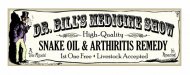
I have a banner to design, print and be ready for pick up Friday so this is a quickie. It's for "Dr. Bill's Medicine Show" and they want that old "vaudeville" (I guess you'd call it?) look. (He's actually a doctor - it's not a band name, although that would be cool...) I need some inspiration! Does anyone know where I can look for some nice examples of that type of design? Thanks!
 

GoodPeopleFlags

New Member
I know! I could spend many hours on it but I don't have time. It's due tomorrow along with a ton of other stuff. I'll post up something soon for suggestions.

In the google image searches, did you guys see all the stuff for Old Crow Medicine Show? Awesome band! Kinda draws the hippie crowd. :loveya:
 

GoodPeopleFlags

New Member
Here's what I came up with in the last hour. Like I said, I don't have much time to work on it. I wish I did - it has so much potential! I'm a little embarrassed to post it because I know there are so many here that could totally knock this one out of the park. Anything stick out that severely needs to be changed?
 

Attachments

  • DrBillsMedicineShow.jpg
    DrBillsMedicineShow.jpg
    51.8 KB · Views: 88

MikePro

New Member
think you nailed it! overthinking doesn't do this type of design any justice.
your client is going to love it.
 

Gino

Premium Subscriber
I really like it. I think you completely caught the era in your design and layouts.

One question...... when using ordinal numbers or indicators, I tend to put it smaller and towards the top. Not sure if that's common or just a personal preference.
 

Artildawn

New Member
I really like it. I think you completely caught the era in your design and layouts.

One question...... when using ordinal numbers or indicators, I tend to put it smaller and towards the top. Not sure if that's common or just a personal preference.


I think Gino's right, superscripting of the ordinal is more common.
 

Fitch

New Member
Great job!

I don't really like the white background with coloured border. Bring it to life !!!!!!!!!

Change it to coloured background with white border. Maybe the colour of one of those tarnished "WANTED - Dead or Alive" posters.

Good luck
 
Top