ForgeInc
New Member
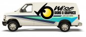
though I am not opposed to the concept of a mostly grayscale van as long as it has a bold color pop to set it off, not feelin the owl photo at all on either of 'em. It's too aggressive and even though I get the tie in to the name "wise signs" I just don't think it relates in any other way to what you do.
I think simple is better.
I think simple is better.