• I want to thank all the members that have upgraded your accounts. I truly appreciate your support of the site monetarily. Supporting the site keeps this site up and running as a lot of work daily goes on behind the scenes. Click to Support Signs101 ...

Looking for "Wow"... all I have is "ummm ok"

toucan_graphics

New Member
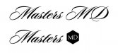
Customer wants a logo to brand himself. He is a cosmetic surgeon. His guidance to me was "It should say Masters MD" & "I am leaning toward something where the font itself makes up the logo. I really like script fonts like "kalligrand" and "Mon Amour script."

Here is a version that he liked, but says he wants something more.
 

Attachments

  • masters3.jpg
    masters3.jpg
    31.1 KB · Views: 122
Last edited by a moderator:
I'm not sure I understand why the M's are completely different in style from each other. Also, as has been said, the disjointed script doesn't work. It needs proper kerning. In my opinion, LHF Sofia script would be a winner here if he is so insistent on a script font.
 

sagesign

New Member
If that is the look that he wants, and he wants it for a logo, I would hire a professional calligrapher. I had saved on a previous computer a website for somebody in the sign industry that did just this, I believe he was Canadian with a last name that started with a B, I think. I know, not much help, but maybe somebody knows who I'm thinking of. I believe he's done work for Dan Antonelli.
 

toucan_graphics

New Member
He is pretty insistent on the Script font for "Masters" so I adjusted the kerning and moved some stuff by hand. I also added a photo he provided. Personally, I hate script fonts but the customer writes the check.
 

Attachments

  • masters-1.jpg
    masters-1.jpg
    19.3 KB · Views: 93
Last edited by a moderator:

Gino

Premium Subscriber
The two 'M' don't even match..... that's looks bad.
Your kerning is noted, but still bad.
Your flow is non-existent.
The picture should not be of a specific person. It would serve better being a generic symbol of a man or women.

Does he only do facelifts ?? The girls pictured looks far too young to be needing surgery. Does he do Liposuction or tummy tucks ?? Does he do arms, legs, butts and other things ?? If so, why just a picture of a young girl's face ?? Any why not pick someone with symmetrical lips ?? That one gives the wrong impression.
 
C

ColoPrinthead

Guest
The two 'M' don't even match..... that's looks bad.
Your kerning is noted, but still bad.
Your flow is non-existent.
The picture should not be of a specific person. It would serve better being a generic symbol of a man or women.

Does he only do facelifts ?? The girls pictured looks far too young to be needing surgery. Does he do Liposuction or tummy tucks ?? Does he do arms, legs, butts and other things ?? If so, why just a picture of a young girl's face ?? Any why not pick someone with symmetrical lips ?? That one gives the wrong impression.
Gino has a good point, you totally need a pic of a sweet sillycone rack to complete the logo.
 

Techman

New Member
gag
her eyebrows don't match either,.

Quit trying to use his misguided mind set an d use your own..
 

toucan_graphics

New Member
You all are correct. It sucks. He has rejected anything that doesn't match with his "vision". I hate it when a customer plays "designer". The whole point of seeking out a graphic designer is to get the best results over doing it yourself.

As for the woman, I'm thinking it is the "before shot". I saved the picture as "crooked lip".

This is my last round of turd polishing. If he still doesn't like it he can move on down the road to one of the other shops who have no problem regurgitating the bad ideas he is fixated on.
 

SignManiac

New Member
At least find a better script. I don't care for the MD done in upper case either. Should see if he will break it apart and use something else contrasting so the emphasis is on Masters.
 

Attachments

  • Masters.jpg
    Masters.jpg
    27.3 KB · Views: 95
Top