-
I want to thank all the members that have upgraded your accounts. I truly appreciate your support of the site monetarily. Supporting the site keeps this site up and running as a lot of work daily goes on behind the scenes. Click to Support Signs101 ...
You are using an out of date browser. It may not display this or other websites correctly.
You should upgrade or use an alternative browser.
You should upgrade or use an alternative browser.
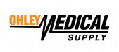
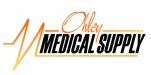
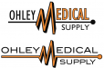
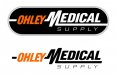
Medical Supply Logo Help
- Thread starter jas00n_86
- Start date
thinksigns
SnowFlake
Marlene
New Member
liking what tiki did as it looks like a logo for a medical store. the one you posted in #16 was a lot better than where you started from. when you have a big special effect like the pulse beat, it needs to stand alone and not be clutter up with overdone effects in the fonts and color shifts. everyone knows what that pulse thingy is so it works to help support the "what" in what this company does. does he really really want Halloween colors? try showing him some other chocies as most peoole think they know what thye want until they see some bette.
SignManiac
New Member
Good job Tiki!
John Butto
New Member
new tack
wind shift
wind shift
Wow I wasn't expecting all this! Thanks so much for all the great suggestions! I really like tiki's idea, the "M" is less radical which helps the eye from jumping around. Also everything stands out on the black background, which was not thought of. I'm going to give that a try!
