Now Mosh has a Point here. I think you should really think about This.
-
I want to thank all the members that have upgraded your accounts. I truly appreciate your support of the site monetarily. Supporting the site keeps this site up and running as a lot of work daily goes on behind the scenes. Click to Support Signs101 ...
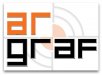
My logo
- Thread starter dusan
- Start date


Graf means graph in serbian. AR are firs letters of my home town.
BTW if you need a parts for Yugo, I'll get it for you. I have driven three of them and it's the worst experience I've ever had.
I have different vision of logo than you guys in USA.
My oppinion is that logo should be simple, not more than 2 colors, and no more than 2 fonts. It should have a application in any kind of graphic product including pens, lighters and similar small products. Many logos I have seen on this forum are not like that.
Please guys don't take me wrong, it's just my oppinion.
signmeup
New Member
I'm in Canada not USA.I have different vision of logo than you guys in USA.
My oppinion is that logo should be simple, not more than 2 colors, and no more than 2 fonts. It should have a application in any kind of graphic product including pens, lighters and similar small products.
I think your logo will fit on pens very well. On a T shirt you can stack it if you like as suggested here.
How about Skoda? Have you driven them?

iSign
New Member
um, yeah.. we can tell you like French carsFrench car arrrr

so, what does "graph" mean then?
not graphics? ..like graphs and charts?
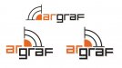
anyway, I agreed with someone that the F was too short and the g as well.
I also thought they were all a little stretched looking, so I redrew the letters, extended the F and g, and then condensed them all to have more similar stroke weights on both axis.. and then I played around with a few ideas for you.
(by the way, your definition of a logo is a good one.. we know better, but a lot of us don't abide by that, myself included, for whatever reason... like slang... a new form of expression is sweeping the commercial landscape, and it's not all good, but it starts to take root & carve out a niche... for better or worse)
Attachments

Craig Sjoquist
New Member
AR being home town your design makes even more sense and Mosh idea in post #10 top one I like the best, also Signmeup in post #9 is good mainly cause both are tight.
Your ideas on colors, fonts in design are right on, less is more indeed and easier to read.
Your ideas on colors, fonts in design are right on, less is more indeed and easier to read.
iSign
New Member

laserman70
New Member
Arranged a little closer together not stacked
I like these the best. Nice work Tiki