• I want to thank all the members that have upgraded your accounts. I truly appreciate your support of the site monetarily. Supporting the site keeps this site up and running as a lot of work daily goes on behind the scenes. Click to Support Signs101 ...

Need an opinion on R Mark Placement

Whats correct in the pic, A or B?

  • A - top of last letter

    Votes: 2 40.0%
  • B - top of tallest letter

    Votes: 3 60.0%

  • Total voters
    5

equippaint

Active Member
I have a customers logo that is bothering me. They have it like the first one which looks out of place to me so Ive been moving it like the 2nd one. I have seen it both ways on other logos but what's everyone's opinion or preference between the 2 pictured, A or B?
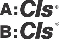
R Mark.jpg
 

unclebun

Active Member
It can go anywhere you want. I think on A, it's actually too low. It should be a little above the s, but not necessarily as high as B.
 

SignosaurusRex

Active Member
Not sure which is correct in this case. One of my clients called me and needed 200+ trucks and all signage changed. The ® needed to be changed from the bottom right positioning to the top left of the last letter. All future imaging needed to reflect this change as well. Go figure... :confused: Of course they paid for it seeing as how they supplied the original artwork for the logo. In your case 'equippant' ...cover your arse as best you can.
 
Last edited:

myront

Dammit, make it faster!!
Who else hates those things when trying to cut vinyl.
The main sign is fine then this stupid thing is way too small to cut/weed.

We keep on hand pre-printed clear reg decals in various colors & sizes to add if absolutely a must.
 
Top