-
I want to thank all the members that have upgraded your accounts. I truly appreciate your support of the site monetarily. Supporting the site keeps this site up and running as a lot of work daily goes on behind the scenes. Click to Support Signs101 ...
You are using an out of date browser. It may not display this or other websites correctly.
You should upgrade or use an alternative browser.
You should upgrade or use an alternative browser.
Need help with deciding on a logo
- Thread starter trimitbyrich
- Start date
signcrafters london
New Member
If those are the only 2 options, give me the first. The second is unreadable from a distance.
Marlene
New Member
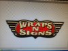
first one looks like a logo for a chicken wing restaurant (do a quick bing search for chicken wing restaurant logos) second one is strange and not very good as the "n" is just odd. the whole thing has too many shapes that just don't look right and it creates a weird overall look. if you have to jump off from one of these, I guess the chicken wings one is better only because the other one is really bad.
J Hill Designs
New Member
you do know there is an 'export' function in most software so you dont have to take a picture of your screen?
trimitbyrich
New Member
Yes I do know how to export. I did this quick from my cell phone.
Two different people in our shop designed these. Just having a contest to see which everyone would like better. Not looking for critiques as both need plenty of cleanup.
Two different people in our shop designed these. Just having a contest to see which everyone would like better. Not looking for critiques as both need plenty of cleanup.
Marlene
New Member
Two different people in our shop designed these. Just having a contest to see which everyone would like better. Not looking for critiques as both need plenty of cleanup.
neither of them have won, it just is a matter of which one sucks less. it's like would you rather die by hanging or by electric chair, both suck, neither are good
signcrafters london
New Member
Not looking for critiques
You are going to be disappointed, then.

SignManiac
New Member
I would blend the two together for an outstanding design.
JMPrinting
New Member
Clean your desk!
You should see mine...
nikdoobs
New Member
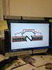
I would say the second one but without the car and squares. Make it two color. Lose the brushed metal.
You should be comparing these two as black and white versions. That way you are not distracted by the gradients, shadows, and other effects that should be left out of a logo.
You should be comparing these two as black and white versions. That way you are not distracted by the gradients, shadows, and other effects that should be left out of a logo.
AnthonyRalano
New Member
None of these.2 examples. Just need help with direction.
HDvinyl
Trump 2020
182 MB file size on the first one and it's only a contest?? I bet that person's processor hates them.Two different people in our shop designed these. Just having a contest
Pixels Are Bad Mmmkay?
New Member
The first one has too many competing elements. If you adjust the proportions so the elements contrast better, it would work okay. I'm posting my 10 minute version to better illustrate.
I like the modern feel of the second one, but the line drawing background imagery is weird and unfitting, not to mention it creates a bunch of negative space that draws you away from the focal point. With better contrast on the copy (ditch the effects) and tweaking you could make this work.
I like the modern feel of the second one, but the line drawing background imagery is weird and unfitting, not to mention it creates a bunch of negative space that draws you away from the focal point. With better contrast on the copy (ditch the effects) and tweaking you could make this work.
Attachments

Pixels Are Bad Mmmkay?
New Member
182 MB file size on the first one and it's only a contest?? I bet that person's processor hates them.
I can't believe you noticed that. What a hilarious response.

phototec
New Member
2 examples. Just need help with direction.
Yes I do know how to export. I did this quick from my cell phone.
Two different people in our shop designed these. Just having a contest to see which everyone would like better. Not looking for critiques as both need plenty of cleanup.
Well if you don't want any feedback, I don't understand why you posted?
But, I will give my opinion anyway, #1 is better, yet it's a little cluttered, the text is way to tight against the border, the text needs breathing room!