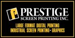
So we want to add a larger sign above our shop and have been kicking around ideas. We want to do a 4x8 sign on aluminum. This is the rough design that our designer came up with. Its ok but I was hoping to pick everyones brain. Our building is medium brown. We are not married to the color scheme either. I wanted something eye catching. Thank you for the help!
-
I want to thank all the members that have upgraded your accounts. I truly appreciate your support of the site monetarily. Supporting the site keeps this site up and running as a lot of work daily goes on behind the scenes. Click to Support Signs101 ...
You are using an out of date browser. It may not display this or other websites correctly.
You should upgrade or use an alternative browser.
You should upgrade or use an alternative browser.
Need some help/advice on a storefront sign
- Thread starter Naskhan
- Start date

Jillbeans
New Member
The spacing is definitely in need of help.
I'd be more inclined to not break it up into panels, and also mention the fact that you do industrial screenprinting. You don't want people coming in pestering you for T shirts.
You could also break it into a 2'x16' rectangle if space would allow for a more "storefront" type appearance.
I don't like having printing on there 3 times like I did but I don't know an alternative.
Love....jill
Attachments
jen.reelez
New Member
The spacing is definitely in need of help.
I'd be more inclined to not break it up into panels, and also mention the fact that you do industrial screenprinting. You don't want people coming in pestering you for T shirts.
You could also break it into a 2'x16' rectangle if space would allow for a more "storefront" type appearance.
I don't like having printing on there 3 times like I did but I don't know an alternative.
Love....jill
Now the storefront sign looks more attention-catching than before. :Big Laugh
The services offered are now clearer. Nice modification

Dennis422
New Member
Added jpg
Needs kerning, slight layout modifications and battery charging
Gino
Premium Subscriber
No matter how you fix the kerning or whatever, that sign is gonna look dead on a brown building.
Question for ya...... same question I ask all of our customers. Do you really have to put on your sign what you do ??
Is there a way you could make your sign, just a sign and put your laundry list on your front window, instead of wrecking a sign ??
When you have a truck or a sign which isn't at your shop, perhaps then you need to tell people who you are and what you do and even how to get a hold f you, but right in front of your store....... not so much. How 'bout a snapshot of your storefront. It will help tremendously in giving advice.
Rick
Certified Enneadecagon Designer
Why did your designer take liberties with your logo?
I would think keeping your logo/identity/brand consistent would be your first priority.
If you were going to mix your identity up, make it look nicer that your original identity or
redesign the logo.
blah!!!
I would think keeping your logo/identity/brand consistent would be your first priority.
If you were going to mix your identity up, make it look nicer that your original identity or
redesign the logo.
blah!!!
Attachments

Biker Scout
New Member
I agree, there's nothing really wrong with your logo. It's your identity after all. An aluminum sign with all that crap on there would look cheesy, and lowers the perceived class of the establishment.
I think maybe your square p logo should just be that... a black field with a raised P on some 2" thick black coated sign foam with a yellow acrylic face or even yellow aluminum face. Do the same with the Prestige letters too.
I think maybe your square p logo should just be that... a black field with a raised P on some 2" thick black coated sign foam with a yellow acrylic face or even yellow aluminum face. Do the same with the Prestige letters too.
")

Biker Scout
New Member
Good point... graphics is so over used, it's almost a cliché. Doesn't everyone do graphics now anyway? I think it would stand to reason that if a business said printing of any kind that graphics just naturally lended itself to the business model.
That being said, I'd not be surprised to see a business named, "Fried Chicken & Graphix"
That being said, I'd not be surprised to see a business named, "Fried Chicken & Graphix"