• I want to thank all the members that have upgraded your accounts. I truly appreciate your support of the site monetarily. Supporting the site keeps this site up and running as a lot of work daily goes on behind the scenes. Click to Support Signs101 ...

New Bar logo

forty9

New Member
Hey all,

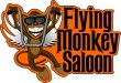
This is for a new Bar/Tavern in a nearby town called the "Flying Monkey Saloon." (Corny name, I know)

They wanted a happy monkey character hanging off of ape-hanger handlebars.
It is a biker themed bar, so they wanted to use Harley-Davidson colors (black & orange).

Any critique/comments/advice you can provide will be appreciated.

Fire Away!!!
 

Attachments

  • flymon_101.jpg
    flymon_101.jpg
    704 KB · Views: 166

John Butto

New Member
rough with harley orange and black shape logo and a biker monkey, not one that is on my granddaughter's backpack.
 

Gino

Premium Subscriber
Well, I think there is way too much orange in there, but then that would be the case whatever color was in that panel area. Lose the outline.
With the handles like that at the ears area, he looks a little more like a bat than a monkey at a glance.
Last, is his smile supposed to be representing the Harley logo ??
 

visual800

Active Member
I would add a thin white outline around lettering and then a darker orange drop shadown behind letters and kill some of the orange
 

Suz

New Member
I like the font you picked. I agree with above, too much orange and needs some white around the lettering. Your logo is cute, but busy. John, I like the way you organized the elements in the design, it's a bit easier on the eye... not so much jumping around.
 

Marlene

New Member
agree with the white around the letters.e you going to make the sign? this would look really great as dimensional sign
 
Top