-
I want to thank all the members that have upgraded your accounts. I truly appreciate your support of the site monetarily. Supporting the site keeps this site up and running as a lot of work daily goes on behind the scenes. Click to Support Signs101 ...
You are using an out of date browser. It may not display this or other websites correctly.
You should upgrade or use an alternative browser.
You should upgrade or use an alternative browser.
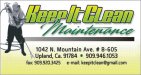
New customers card design
- Thread starter artsnletters
- Start date

SignManiac
New Member
It's actually very nice! Sorry I can't rip you a new one 
vinylbarry
New Member
I am not a expert and it looks good, but I do have a eye problem and it seems the zip and the phone number runs together the bullit dont break it up enough.
Just my 2 cents.
and it seems the zip and the phone number runs together the bullit dont break it up enough.Just my 2 cents.
washingtonsignguy
New Member
I think the contact info below is alittle distracting from the logo and name, keep the number in a bolder text and reduce thickness on the rest of the contact info. Although business cards are alittle different in that the customer has alittle longer to look it over for info, compared to driving by a sign. So maybe that doesnt matter as much. Thats just what i would do, it is a very nice design though.
"Deposit Please"
New Member
Limit yourself to 2 typefaces, i think i counted 4. Not a big fan of yellow for cleaning, try a more subtle color.
AznSensation
New Member
It's ok.
Try different colors. Try blue.
Try different colors. Try blue.
Craig Sjoquist
New Member
1st thought
It's not very clean looking at all.
when looking at thumbnail ..I had enlarge it to see name .. then the 1st thought.
do not use yellow very dirty without blue and still is.
below copy competes with main copy.
It's not very clean looking at all.
when looking at thumbnail ..I had enlarge it to see name .. then the 1st thought.
do not use yellow very dirty without blue and still is.
below copy competes with main copy.
Sign_Boy
New Member
Like Jill said flip the guy.
I'm not crazy about the color scheme - yellow and green for a power washing company.
I would try to use cleaner looking colors.
I do like the top part just not the colors.
I would also change the font used for the contact info.
It's a too bold JMO. I would use the same font you used for "Pressure Washing ...." and shrink it down between 8 (min) - 11 pt (max)
On a side note - I was talking to a buddy of mine not that long ago about business cards and sign makers.
I said it's kind of easy to tell when a sign guy lays out a business card (not always but a good amount of the time)
They often look like a shrunken down version of a sign.
Bold fonts and the contact info tends to be larger than it needs to be. (Not knocking you artsnletters just making an observation)
GoodPeopleFlags
New Member
I like the colors. I don't like the photo of the guy, tho. And I think it looks like a little sign instead of a business card. I think "Keep It Clean" will be hard to read on a sign; make adjust the kerning a bit? But I like it - it's not quite "there" yet but it can be.
artsnletters
New Member
Thanks for the input, guys & gals. As far as the guy in the card goes thats all the customer supplied. The colors he wanted green (as in GREEN), cause somehow he is doing "environmentally friendly" pressure washing, and his existing cards had yellow & green. On the contact info, i guess as i'm getting older, i find the smaller and less dominant fonts are hard for ME to read (i'll be 49 in a few days), i hate it when i cant read someones info. On flipping the guy, you mean, inverting and going black background? I'll try that and try a different font on contact info , Thanks again. I wanted to post this as i join in the discussion critiquing others and wanted same for my work.
Tim
Tim
Sign_Boy
New Member
On flipping the guy, you mean, inverting and going black background?
Tim
Nope have the power washing nozzle on the right side facing the copy.
artsnletters
New Member

Sign_Boy
New Member
The power wash guy looks better. Now what if you made it look like the washer gun was in front of part of the M? (where it sits behind it)
As for the contact info... Still not crazy about it.
Maybe it's me but I prefer to have it organized a bit more.
Address on one side
Contact info on the other
or Contact info above the address to the left or right of the card.
I'm assuming this is a generic card due to the lack of a name?
As for the contact info... Still not crazy about it.
Maybe it's me but I prefer to have it organized a bit more.
Address on one side
Contact info on the other
or Contact info above the address to the left or right of the card.
I'm assuming this is a generic card due to the lack of a name?
GypsyGraphics
New Member
Not sure i like the oval around the guy or the photo, but i'm sure the guy likes his photo so maybe he'll like it even bigger.
i'm always trying to get client to agree to make things smaller, but in this case maybe bigger is better (even for a so-so photo).
the clean oval serves three purposes, obviously a place holder for info, a visual of the service he provides and a place to anchor the figure, so he's not floating in space.
artsnletters
New Member
thats a neat idea! Looks like he blasted the oval...we'll see what he likes in a few minutes...Not sure i like the oval around the guy or the photo, but i'm sure the guy likes his photo so maybe he'll like it even bigger.
i'm always trying to get client to agree to make things smaller, but in this case maybe bigger is better (even for a so-so photo).
the clean oval serves three purposes, obviously a place holder for info, a visual of the service he provides and a place to anchor the figure, so he's not floating in space.
View attachment 53299
Tim
Flame
New Member
maybe Shrink down maintenance with no black outline
I like this.
It's a good start. I'd still go with a blue theme, but not bad bro.
artsnletters
New Member
i like that too A LOT...what script did you use for "Maintenance"?maybe Shrink down maintenance with no black outline
Tim