• I want to thank all the members that have upgraded your accounts. I truly appreciate your support of the site monetarily. Supporting the site keeps this site up and running as a lot of work daily goes on behind the scenes. Click to Support Signs101 ...

New logo

dean.templeman

New Member
Hi everyone. I run my own business in Australia, called De-Sign & Apply, and am currently experimenting with a new logo for my business. I have been in the sign industry for some time, but have just started a graphic design course to get my certificate and am enjoying that so far. Logo design is something I would like to get into more in the future.

I got some advice from Dan Antonelli @ Graphic D-Signs on my current logo, he basically pointed out that the font didn't really flow that well, and it just looked a little dated in general.

I want my logo to have a clean professional image, yet still engage the viewer. I also would like to have a logo where I can simply utilise an 'icon' as the logo in some applications, instead of always having to use the complete logo.

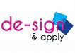
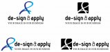
I have attached an image of my current work in progress. The symbol I have created, was a hand drawn graphic, a sort of signature, which incorporated a 'd' an '&' and an 'a' and I quite like the way this has turned out. I am really liking the overlap and gradient effect I have done with it, but I also like the cutout in the icon form. I can't really decide what I like better? Is it possible to use both? Maybe the ribbon/blue graphic in the main logo, and use the icon when using it on its own?

I think I am just stuck on the font side of things. The main heading type I am fairly happy with, but I've looked at it for too long so I'm not sure anymore. I also am unsure what to do with the & sign, it just feels awkward to me. And the subheading, I really don't know what to do with it so I just have a serif in all capitals for now. Looking for input here.

I'm looking for any opinions, critique or advice any of you may be able to offer. I would really appreciate any help you may be able to give me.

I have also attached a picture of my old logo, which is the pink text.

Thanks guys, looking forward to your input.

Dean.
 

Attachments

  • old-logo.jpg
    old-logo.jpg
    91.1 KB · Views: 126
  • concepts.jpg
    concepts.jpg
    33.3 KB · Views: 100

Craig Sjoquist

New Member
Well they all are clean looking & all look ok

Always like the name de Sign in any form 1st time I seen that used was here as D sign or De Sign does not remember been awhile

Anyway likes your icon & what your doing with it just sit back play with it more not sure what needs done here, my only thought is ..- ..the dash does not loo like it belongs.
 

Jillbeans

New Member
I'd scrap them and begin again.
The ampersand for an icon might be OK if it was an attractive one.
Too much space between the de the dash and the sign in all examples, makes it read weirdly.
Love....Jill
 

TyrantDesigner

Art! Hot and fresh.
Dude I'm going to be completely honest, starting from the get go ... your logos are crap. Drop the photoshop effects, take what you have, delete it completely (what ... 5 minutes worth of work?), start over, and sketch out some ideas. what you have there is bad design, covered in weak sauce filters, and presented with a side of lack of thought process.

http://lmgtfy.com/?q=How+to+design+a+logo

That might help.
 

Marlene

New Member
the ampersand between the de-sign and apply has a stroke width that is totally different from the rest of the copy. it looks like you took an ampersand from another font and shoved it in there and it doesn't work. the squiggle thing looks kind of like a ribbon for something and not like a any letter combo as intended. it draws attention to it but doesn't serve to support the message. don't bring up Nike...everyone with a crappy logo does to defend what they did. the tag line "your image is our business" is like wearing a shirt that says "best looking person ever", you better be the best looking person ever as now, people are going to judge you. in your case, the first thought is, "why isn't their own image really great?". not a good idea to throw out to the public a less than great image and then tell them you will do the same for them.
 

dean.templeman

New Member
Cheers for all the input everyone. Definitely constructive and a lot of it makes sense, guess I just needed things to be pointed out to me :) Will take things back to the drawing board.

@TyrantDesigner - My new work in progress has no photoshop filters, at all. No 'weak sauce filters'. Being a smart *** and giving me a link on how to google something, is hardly constructive and helpful. If thats the only feedback you want to give, don't bother.
 

TyrantDesigner

Art! Hot and fresh.
Cheers for all the input everyone. Definitely constructive and a lot of it makes sense, guess I just needed things to be pointed out to me :) Will take things back to the drawing board.

@TyrantDesigner - My new work in progress has no photoshop filters, at all. No 'weak sauce filters'. Being a smart *** and giving me a link on how to google something, is hardly constructive and helpful. If thats the only feedback you want to give, don't bother.

:goodpost:

Only, don't expect to throw out sub par work for a 5th grader and expect people to swoon at your lack of creative skill. Start over, suck it up ... do better.

You'll get no sympathy from me, hoss.
 

TyrantDesigner

Art! Hot and fresh.
I like you, you know that right? You my felonious friend are a prime example of most designers out there. Overly sensitive, and will spend more time being a pissy peggy on a forum than to spend the time to start over on a bad idea.

Good luck, you'll need it.
 

Gino

Premium Subscriber
Whoa........... this isn't working on any level for dean. Maybe we should start again and re-critique this stuff with a more responsible eye and really let him know where he stands ??
 

Marlene

New Member
Being a smart *** and giving me a link on how to google something, is hardly constructive and helpful. If thats the only feedback you want to give, don't bother.

did you bother to click on any of the links that came up? how was that not constructive? there were some there that might have helped you. what you posted totally sucked, plain and simple. most of us did our best to help but there's no making that turd look good and if you can't see why, maybe try clicking on some of links. what you see as someone being a smart*** is just someone doing their best to help you out. go ahead and use what you have if all you want is to be stroked and pampered. it is stunning! I love the swooshy thing, it really works. love the fonts, they rock! that better?
 

Williams Signs

New Member
If you want to incorporate the ampersand then incorporate it. Don't just let it hang out there like a afterthought. Try something like this.
 

Attachments

  • design.jpg
    design.jpg
    44.6 KB · Views: 102

qmr55

New Member
Start fresh, let's see some new ideas. Criticism should only be given on a design that has potential and so far I don't see any potential in these!
 

TyrantDesigner

Art! Hot and fresh.
Constructive criticism doesn't need to be harsh at all. But sometimes you can't just say 'bad dog' you need to rub their nose in their own mess. Like I said, no sympathies from me. In college I had a professor that called me on my artsy fartsy crap, saw the huge pile of poo I threw up in front of everyone and said things that would probably make the OP cry. Did I call him a smart ***, no. I said thank you, sat down, and decided to do it all over again. That was in college ... now, I still will look at my own work and say 'hmm ... is this crap?' and if that answer is anything less than "hell no, it's awesome" I work to do better.

Throwing work up on a forum of professionals will encounter someone like me who doesn't give a flying **** about his feelings and will state things how they are. If we say it looks like a big steaming pile of donkey flop and he gets overly emotional about it ... he needs to consider another profession since customers won't put up with temper tantrums about his mediocre attempt at wowing them. And I get it ... he did the work, so it's precious to him ... but ... it's not anything special that I don't see any flea market vinyl jockey with a clipart book doing. Your own logo should try to break the mold of what you normally do and be an initial showcase to what your skills are. ... anything less ... start over ... do better ... suck it up ... and don't expect praise when you eye ball torture people with such a flop design.

I think I've been saying that since I started here on this forum, correct?
 

Gino

Premium Subscriber
Constructive criticism can be given without being harsh. ;)

You might be right, but usually given lightweight remarks is generally just overlooked as meaning...... it's almost on the money.

Most people coming here are looking for a 15 minute crash course on design, logo construction, how to install or what do I need to be in this business kinda questions. I'm not omitting the OP in this one either, but unless you give someone something right between the eyes or drop it like a feather.... which one is gonna get the quickest and best results ??

Well, Johnny, that looks nice, but you could really do better by tweaking this, making that smaller and this over here brighter. Remove the negative space, don't use so many fonts and your kerning needs quite a bit of fine tuning. Oh, you don't know what kerning or negative space are ?? That's easy, but before we get into that, you're gonna have to lose all those effects and work in black & white while choosing better type faces. These are far too prissy and don't fit the clientele you're pursuing. Maybe you want to define your targeted market, so we can educate you better on how to project that image. What's that ?? You don't have a plotter or software and you want to know what you should get and keep it under $3,500 ?? No problem. Just wait til we get you all set up with the other basic components of forming a business and then we'll work on your business plan. That shouldn't take more than another 5 or 10 minutes.

Gee, we'll have you set up by 3:30 this afternoon and have a few nice large contracts waiting for you by 9am tomorrow.

Thanks for stopping in and remember our motto.... ya gotta start somewhere and jumping in feet first is the real gutsy way of doing it. Don't think for a moment that learning the trade piece by piece the way most professionals did is the real way to go.... because it isn't. Just gyp your way in line and head straight for the front and start lowballing your way into business.


Yeah, that's much better than just saying..... start over, that stinks. :clapping:
 
Top