• I want to thank all the members that have upgraded your accounts. I truly appreciate your support of the site monetarily. Supporting the site keeps this site up and running as a lot of work daily goes on behind the scenes. Click to Support Signs101 ...

New name, logo.....opinions, kicks in teeth requsted.

Master's Touch

New Member
Hey gang,

The last two years have been none too kind to the economy of my little hometown. I've seen the writing on the wall for some time but hoped I was wrong. Now I can't wait any more, and I have decided to change everything:new shop name, new town, thirty miles down the road. A less than pleasant commute but tolerable.

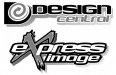
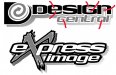
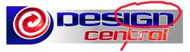
Which is where you all come in. I am down to two names for the fresh start: Express Image, and Design Central. I have reasons to like both, and to feel bleeah for both. I am pretty committed to using the LHF Cool Blue. Give me opinions on the logos and rationale for your name preference. Obviously color is my least concern at the moment, hence the B/W layouts

thanks!
 

Attachments

  • logooptions.jpg
    logooptions.jpg
    54 KB · Views: 105

Circleville Signs

New Member
Really dont' like either. The font choice is fine, but the way it is being used isn't. Of the two, the top concept is better, but neither one conveys that you are a sign shop.

The use of the grungy "X" element in the bottom is TOTALLY OVERDONE. Unless, of course, your biggest market is moto-cross racers.

The icon in the top design is sort of non-sensical as it doesn't relate to anything. I would personally try to come up with a hand drawn element that uses the "D" and "C" together somehow, and then use a simple font for the name, underneath that.
 

BROWNDOG

New Member
i feel your pain, i'd love to start all over, all the things i would do different. For the logos above, neither one tells me anything about you other that quick designs. Looks like your going for the one and done customer. Think about your new location, your new customers, how and why they are going to trust to spend thier hard earned money with you, put together a name and logo that better describes what you sell and how you operate.
 

qmr55

New Member
As Gary said, the grungy over sized "X" is overdone, even now in the motocross community. I can see the top one becoming something with a little bit of work. What does the icon symbolize? It doesn't make much sense in regards to your logo. What exactly does your company do? I dislike the big dark gray shadow, I honestly think it looks stupid. Once you figure out just exactly what your company does you can better create an icon to go with your design. Until you tell us what exactly you do and give more details about your company it is hard to judge whether your logo is going to be a service or a disservice to your company.
 

Marlene

New Member
As Gary said, the grungy over sized "X" is overdone

and dated. I did a logo for a sign for a strip joint back in the early 90's and used the big "X" in the word Extreme back when it was the trend.


the top one isn't bad. try it without the shadow as it creates some strange shapes in the letters that make the whole thing look off. some letters have no inner shadow pieces, some have a big blob, some have little chunks (see areas marked in red)

some times, it's the little stuff like this that makes a design look off
 

Attachments

  • logooptions.jpg
    logooptions.jpg
    150.4 KB · Views: 101

signmeup

New Member
I think you should use italics on both elements.... or not ... either way. Just not italics on one word and not the other. Looks funny.
 

Master's Touch

New Member
Thanks for paying attention to the teeth kickin' part---lol

No I guess I should've given a more complete version of things for you all to see. I lean toward the top logo more as well. Attached is a more current version of the design. I still have yet to add any of the secondary copy to complete the design. I'll be adding bullet points to the actual sign layout, when you see the color scheme and the overall package of the building and signage, there won't be any doubt about what we do.

As for the icon. It was originally hand drawn, and it is meant to be a stylized "C", as well as showing motion and directing the eye to the main copy. I like it.
 

Attachments

  • DC modded.jpg
    DC modded.jpg
    25.8 KB · Views: 98

Marlene

New Member
the letters in the word design look like the "n" stopped quick and the other letters are starting to run into each other. the word start off OK, then all of a sudden, you have the letters crashing into each other. the word central also has something going on that looks wrong. this all may seem to be picky, but it is the little things that really make a design look off. there are fonts that don't have a nice flow from certain letters to letter. you might have to do some clipping and fixing to make it look right or try another font.

As for the icon. It was originally hand drawn, and it is meant to be a stylized "C", as well as showing motion and directing the eye to the main copy. I like it.

I like it too. I'm not sure that you need all the photoshop effects in the letters and icon and it may look better with it.
 

Attachments

  • DC%20modded.jpg
    DC%20modded.jpg
    113.9 KB · Views: 102

ddarlak

Go Bills!
sorry, but design central doesn't do it for me.

design what? signs, kitchens, homes, landscapes?

too bland.

how about combining the two, Design Image
 

Circleville Signs

New Member
The color version is worse than the black and white. You've got so many fills and gradients happening that it is all just lost. The idea of the swirly arrow thing being a stylized "C" is only seen by you - I can promise no one else will see it.

For a small business, the icon needs to be related to what you actually do. You don't have millions of dollars to create a brand - read some of Dan Antonelli's blogs...
 

Master's Touch

New Member
ddlark and tech--re-read my posts. Once I finalize the look I want, I will add descriptive points to the SIGN LAYOUT. The overall look of the ACTUAL PLACE of BUSINESS will make it CLEAR what we do.
 

Master's Touch

New Member
I'm planning on changing plenty. Constructive comments like those Marlene has given has already helped. I'm not gonna lie and take advice I plainly disagree with. But I said "thank you". Lol
 

Circleville Signs

New Member
I guess a lot of this goes back to some of the most basic parts of logo design.

What you like means exactly JACK SH!T. That's a fact.

I'd encourage you to show that icon piece and joined text to 100 strangers who have no idea who you are and what you do, and then ask them to give a guess as to what it is you do. I'm guessing that 90%+ will have no idea whatsoever. If you just show them the icon piece alone, 100% will have no idea what you do.

PS - I made constructive comments too :smile:
 

Circleville Signs

New Member
How long did it take you to see the 31 in baskin robbins? Or the Arrow in FedEX? Sometimes subtlety is the point.


1. it didn't take me long.

2. Those companies have MILLIONS OF DOLLARS that are spent solely on advertising and branding. They can afford to have abstract shapes, subliminal copy because they are getting millions of impressions/day based on their business model.....You aren't. You are likely going to have 1 or 2 drive by's before you just become another part of the landscape for your local customers. You must make those 1-2 drive by's count.

Of course, what do I know. This stupid piece of paper hanging behind me from that dumb college that I learned marketing from is just part of my landscape now.....
 
Top