-
I want to thank all the members that have upgraded your accounts. I truly appreciate your support of the site monetarily. Supporting the site keeps this site up and running as a lot of work daily goes on behind the scenes. Click to Support Signs101 ...
You are using an out of date browser. It may not display this or other websites correctly.
You should upgrade or use an alternative browser.
You should upgrade or use an alternative browser.
new name - new logo
- Thread starter toucan_graphics
- Start date
rushworks graphics
New Member
HulkSmash
New Member
Good for you, anything constructive?
The point is an update with bright colors and modern-retro typefaces. Bebas Neue fits the task quite well, the graphics face I'm not too fond of but it was a quick deal to get something up before I continued with my day. The bill I quite like as a logomark though I'd probably play with the colors and integration if it was in any way a client job. Spacing I'm not big on either but again...30 seconds to throw an idea at the guy. Care to be contributive at all or just pithy?
you're right it is good for me. You asked what the issues were. I respect that you submitted something to help, just don't think it works.

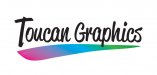
you dont always have to use the beak or the actual image. you could always use the feather. a quickie
This is better, however when reduced Graphics is hard to see and you would run into issues if you were limited to Black and White .
Remove the colored background and make Graphics in white with a Black drop perhaps.
separate the feather so it can be black and white or color.
deemphasize (SP) TOUCAN and draw more attention to Graphics IMO
If however the type of work you focus on is sandblasting and 3 dimensional work, your current logo is good to go.
The age of "but what if you need to print it b&w" is quickly coming to a close -- it's still a good tool for critiquing as you go but it's not really a hard rule anymore for the finished result. Brands are eager to appear current and the cost of four+ color is negligible compared to single color runs now in almost any format.
ucmj22
New Member
The age of "but what if you need to print it b&w" is quickly coming to a close -- it's still a good tool for critiquing as you go but it's not really a hard rule anymore for the finished result. Brands are eager to appear current and the cost of four+ color is negligible compared to single color runs now in almost any format.
when designing an icon or logo with mass appeal, I dont think that relying on the basics of form, proportion and focus will come to a close.
when designing an icon or logo with mass appeal, I dont think that relying on the basics of form, proportion and focus will come to a close.
Might want to reread what I said. We're seeing now many more brands with which their main logo cannot be printed b&w, what happens is a separate version is created for those situations. Generally a simplified, often silhouetted version. That doesn't mean they're ignoring form, proportion, or focus. It just means that brand designers and agencies are no longer constraining brand appearance to contrasts stark enough to work, without modifications, in b&w--and that's due in large part by the massive drop in the price of printing and the growth of brands in which the screen is their primary market face.
It's still a great idea to go b&w during the design phase as a tool, no one is saying it's not. Just like viewing at multiple distances, against different backgrounds, etc. are all good ideas during refinement.
edit: That doesn't mean it's the right approach for everyone but it's a trend worth noting that developed in the last 7 years or so.
SignManiac
New Member
I'd more than likely go with the obvious and something colorful and playful. I bet Dan Antonelli could work up an awesome logo like he did for WSGRAPHIX...
This is my halfassed fifteen minute concept. Although I try to go for the less is more approach, this could have some nice leaves incorporated into the design and give it a jungle feel if done carefully.
This is my halfassed fifteen minute concept. Although I try to go for the less is more approach, this could have some nice leaves incorporated into the design and give it a jungle feel if done carefully.
Attachments

HulkSmash
New Member
Anyway I liked your feather idea Colorado, here's another 30 second idea.
Have a good 4th!
Love this idea Jess, simple clean - surely better than mine
OhioSignShop
New Member
Mutoh has had the Toucan color printer line since at least 2003, nor sure sure if that would be an issue or not as I can't remember if their advertising used the same bird graphics or not.