• I want to thank all the members that have upgraded your accounts. I truly appreciate your support of the site monetarily. Supporting the site keeps this site up and running as a lot of work daily goes on behind the scenes. Click to Support Signs101 ...

New sign for my shop...finally

klemgraphics

New Member
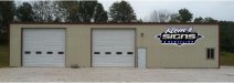
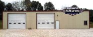
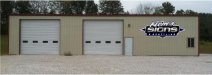
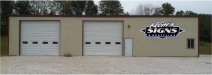
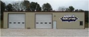
Finally getting around to working on a proper sign for my shop, been almost 4 years since I built this building and I think making my own sign is way overdue.

Size of the sign is rougly 8' x 21'.

My thought at the moment is to build it out of dibond and pvc with about a 1.5" aluminum tube frame behind so it stands off the wall nicely. I would cut the letters of Klem's, SIGNS, & RESTYLING from 1" pvc for some dimension. Also the diamond shape and the rectangular shape would be separate with some spacers between for some added depth.

I thought some sort of flourescent flood lighting from above might look good.

Then when I finish this I plan on putting a lighted cabinet or channel letter sign of some sort by the highway.

Any and all thoughts, criticism, ideas, good bad and ugly are greatly appreciated! I've only been doing this type of work for 10 years and I have a lot to learn still, so I look to the masters of the trade for any advice I can get.
 

Attachments

  • shopsign.jpg
    shopsign.jpg
    46.5 KB · Views: 121

Myte

New Member
Can't help but smile of the name.. Klem in norwegian means "hug". Makes me read "embrace graphics" which really isn't a too bad doble meaning ;)

I think the sign looks good. Very masculine, though and stylish :)
 

GypsyGraphics

New Member
looks great!
i like it higher too, it shows better and breaks the line of the flat roof.
in proportion to the first two words, i think "& restyling" could be a bit larger.
 

Ken

New Member
Can I assume your name is Klem?
The idea of extending the sign above the roofline is not all that appealing to me.
It does, however, leave a lot of space on the wall for other stuff.
What I dont like about the sign going higher than the roofline is the exposure to wind and snow accumulation. ( Not sure if wind and snow are an issue in So. Indiana?)
I agree that Restyling could be slightly larger.
Perhaps consider LED lighting...lower power cost and less maintenance.
Cheers!
Ken
 

klemgraphics

New Member
Klem is my last name. I'll try enlarging restyling some also. My concerns with extending it beyond the roofline would be wind & snow load, a ton of blank "canvas" below the sign, and the roof sticks out probably 4-6" past the wall so the bottom of the sign would have to be that far off the wall too. Maybe if I just raise it up closer to the trim?
 

Attachments

  • shopsign2.jpg
    shopsign2.jpg
    39.4 KB · Views: 88

fmg

New Member
Looks pretty nice that does.Would look real sharp with some LED going on somewhere in there.
 

MikesSigns

New Member
Congratulations on finding time to do your own sign. Took me a few years also. Would had been quicker to have someone else do it .I like it peeking up over the roof line also.You should consider maybe painting the front of building with a color that makes your work pop. Take advantage of the garage door space as well, lettering your services,web site, and phone number. ENJOY
 

phototec

New Member
I like the idea of raising the sign, however with the tree line in the background it makes it hard to read.

If you added a background panel behind the graphics, it might help (examples)?

:wavingflag:
 

Attachments

  • shopsign (mod1).jpg
    shopsign (mod1).jpg
    116 KB · Views: 98
  • shopsign (mod2) copy.jpg
    shopsign (mod2) copy.jpg
    115.7 KB · Views: 157

visual800

Active Member
Why did you raise it? I liked it down in center of building like you first had it. When you raise something over roof you have to consider the colors of sign will now clash with backgrounds of scenery and possibly not show up, That building is out in open land it does not need to be at top on on top of building IMO.

Bring it back down and dont add anything else to it, we already know your a sign company no need in placing 15 bullet items on building and trashing it
 

Jillbeans

New Member
Keep it below the roof so it's "framed" by the negative space of the building.
Try A&S Truckin' Thick and Thin for the SIGNS, its G is more G-looking.
Love....Jill
 

signswi

New Member
Paint the building and put in some nice landscaping while you're at it, looks like a generic storage rental box.
 

klemgraphics

New Member
Paint the building and put in some nice landscaping while you're at it, looks like a generic storage rental box.
Guess I should have picked some different colors when I built it as I really don't feel like painting a 4yr old building. Landscaping was always the idea, maybe next spring we can make that happen. For now it will probably have to stay a rental storage box.

I think I will lower it back down to where I had it and try Jill's suggestion on the font of signs, I may be wrong but it just doesn't look right to me being above the roof line.
 

k.a.s.

New Member
I liked where you had it first. I think the "Klem's" name could actully be a bit smaller. Should look really nice, good job!

Kevin
 

klemgraphics

New Member
I'm going to tweak on it a little when I get home. The majority of my customers know the shop as "Klem's", so I though it would be a good idea to keep that pretty good size.

Any thoughts on lighting? I almost like the idea of led's around the edges to give it a glowing effect, but then maybe I need the words to be channels or reverse channels also? I don't get into a lot of electric signs so I'm really don't know what would look the best.
 

Ken

New Member
A spotlight ( LED or not) above the door..another above the window..directed towards the sign could be cool.
Ken.
 

klemgraphics

New Member
Here are the last 2 that I came up with, one is with Jill's font suggestion for signs. What I meant by LED's was putting them around the perimiter of the entire sign making the wall glow. I would probably do them in blue but I really don't know if it would look right or even show up if I have spotlights on it also.
Just a thought, maybe a dumb one at that.
 

Attachments

  • shopsign3.jpg
    shopsign3.jpg
    40 KB · Views: 166
  • shopsign4.jpg
    shopsign4.jpg
    40.8 KB · Views: 87
Top