• I want to thank all the members that have upgraded your accounts. I truly appreciate your support of the site monetarily. Supporting the site keeps this site up and running as a lot of work daily goes on behind the scenes. Click to Support Signs101 ...

Newbies Only....#2

Dave Drane

New Member
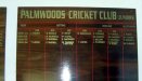
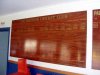
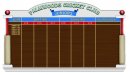
Here is the scenario: You have to meet with the president of a local sports club to discuss some honour boards. He is disappointed (someone has been putting the names on themselves) with what they have and asks for suggestions on how they can be made to look better. There is nothing to do except turn them around and start over. One board is
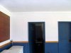
8'x4' and the other one is 4'x4'. Also as they share the clubhouse with another club, wallspace is at a premium, (See the wallspace beside door) and suggestions are required for some small boards to accomodate life members and annual achievers.
As last time I think newbies with up to 3 years in business only need reply and no artwork is required unless you want to, but a oral description of how you would approach the job. I have already finished the job a while back and I have pics of finished job which I will put up in a couple of days.
Go for it guys and gals and let us know what you could do to make the members happy!!:thankyou:
 

Attachments

  • pcc1.jpg
    pcc1.jpg
    45.8 KB · Views: 81
  • pcc2.jpg
    pcc2.jpg
    50 KB · Views: 68
  • pcc3.jpg
    pcc3.jpg
    28.2 KB · Views: 75

Dave Drane

New Member
hahahaahha, good one Mark. Maybe it could be the end of Signs101!!. well when they come here wanting some help?????
 

SebastienL

New Member
Put a glass or plexi over so no one can add there own name...
Don't use serpentine... if you wan't it to look good!!
:popcorn:
 

richevalenz

New Member
whitewash that pos

Dave,
First I would pull down the current lacquered plywood crap, take a chainsaw to them so they would never offend anyone again, and use the scraps for kindlin. Next I would suggest using stainless steel backed dry erase substrate for the new signs. I would use magnetic nametags, and give them a much more presentable design. I would also frame out the new signs and paint an appropriate color. Before any installation, I would ask that the members clean and paint those filthy walls get rid of the crappy 1x4 molding and take a little pride in their club. I bet the toilets reek as well. Once the clubhouse was cleaned, painted and new magnetic signboards were up, then I would discuss having a couple small achievement plaques constructed with nice engraved nametags and space for future members. I wouldn't bother with those items until the rest of that shithole looked presentable.
 

Dave Drane

New Member
Dave,
First I would pull down the current lacquered plywood crap, take a chainsaw to them so they would never offend anyone again, and use the scraps for kindlin. Next I would suggest using stainless steel backed dry erase substrate for the new signs. I would use magnetic nametags, and give them a much more presentable design. I would also frame out the new signs and paint an appropriate color. Before any installation, I would ask that the members clean and paint those filthy walls get rid of the crappy 1x4 molding and take a little pride in their club. I bet the toilets reek as well. Once the clubhouse was cleaned, painted and new magnetic signboards were up, then I would discuss having a couple small achievement plaques constructed with nice engraved nametags and space for future members. I wouldn't bother with those items until the rest of that shithole looked presentable.

Good points Rich. The clubhouse is shared between a cricket club and a football club. I did re-use the back of the boards and stained and varnished them. In pre computer days these "honour boards" were hand written using gold leaf, so these days it is mostly matt gold vinyl, so a darker stain is preferable. Rich I don't think magnetic name plates would be appropriate as the players win an award that they want left there peremanently. The engraved tags could work but after each year it would have to look the same so in 20 years time the engraving could change whereas a vinyl letter could be matched by anyone. I don't expect I will be putting the last names on the board lol!!
Pat White, you are most welcome to play... and Sebastian, the Serpentine, was most innapropriate especially since it was scrunched up so much, but i think it was originally done by a vinyl jockey with no idea, who didn't know of a site like Signs 101 for help. What style of font, would you have used?
Mark, you are right, I will do the next one in "Classroom assignments". :thankyou:
 

GB2

Old Member
Actually I think this is a great idea Dave. A design challenge is one thing but working out real world problems like this is relavent and interesting.
 

richevalenz

New Member
Dave,
Having looked closer at the boards I see what you mean. At first glance I thought the boards had changing information and names. My bad. If that were the case magnetics would work, I do a lot of sales posting boards and the names and numbers change every day. However, given your instructions and using just the back side of the boards, I would do exactly the same. I'm still not sure about gold vinyl lettering on such a dark, stained background given the godawful blue and white paintjob they have going on, (I hope you at least got the guys to clean up a bit). As for font usage... Since its a sports board maybe something in the copperplate family at least in the header, sans serif staples Helvetica or Futura for the names so they can match them easy enough.
 

Dave Drane

New Member
Dave,
Having looked closer at the boards I see what you mean. At first glance I thought the boards had changing information and names. My bad. If that were the case magnetics would work, I do a lot of sales posting boards and the names and numbers change every day. However, given your instructions and using just the back side of the boards, I would do exactly the same. I'm still not sure about gold vinyl lettering on such a dark, stained background given the godawful blue and white paintjob they have going on, (I hope you at least got the guys to clean up a bit). As for font usage... Since its a sports board maybe something in the copperplate family at least in the header, sans serif staples Helvetica or Futura for the names so they can match them easy enough.

Rich, you're on the right track in mos ways but magnetics are not the way because they win an annual event and their name is to go up on the board for posterity. I have seen some old hand written boards here that go back for over 90 years at golf and bowling clubs etc. Some are so old that they were french polished and the finish has turned into "crocodile skin". Your font choices are quite good, but as I said I will give this another day or 2 and post pics of what I did.:thankyou:
 

richevalenz

New Member
Dave,
As with all design assignments, they are what you make them. After I thought about this for a while I came up with the idea of using cricket equipment as design elements in the new sign. I understand that for your real life assignment this may be over the top in work and budget, but for all you other's new to design and signage this is one way to go about an assignment. Sometimes if you show the customer more than what they expect or want, you can upsell them on your ideas.
 

Attachments

  • CRICKET.jpg
    CRICKET.jpg
    49.2 KB · Views: 89

Dave Drane

New Member
WOW!! Rich you blew the socks off me.. That is fantastic.. How long have you been in bisiness. I wish I put this up before I did the job, I woulda ripped your design off lol!!! Thanks for the interest, and you are certainly on the right track.. I'll give it one more day and then put my effort up tomorrow.
 

richevalenz

New Member
Thanks guys I appreciate the positive feedback. Dave you could still sell them on the frame, it would be pretty easy to build. Get some old/vintage cricket bats and go to town. I am looking forward to seeing your pics, boards like this are usually pretty fun to work on. I've been doing graphic design since college (about 25 years). I have been following the signs 101 forum now for a few months and I am really impressed by the diverse and versatile talent on this board. I also enjoy reading the newbie threads just for the laughs. Sometimes you guys are a little hard on us, but after seeing these posts repeat themselves over and over I totally understand. :thankyou:
 

Jillbeans

New Member
Love the bat idea but not the fonts.
Very clever way to spice up a traditional look.
I remember seeing some honours boards Stewart McClaren did in Scotland, they were breathtaking. I have also seen pix of some of Arthur Vanson's boards.
I did Google some honours board pix but am not certain that it is OK to link to the website of someone I don't even know.
:)
 

richevalenz

New Member
Love the bat idea but not the fonts.
Very clever way to spice up a traditional look.
I remember seeing some honours boards Stewart McClaren did in Scotland, they were breathtaking. I have also seen pix of some of Arthur Vanson's boards.
I did Google some honours board pix but am not certain that it is OK to link to the website of someone I don't even know.
:)

Yeah, Copperplate is way overdone, its good for beer labels and sports logos at times but it was a quick comp, I didn't experiment with using different fonts on this. I'm sure there are others here who are much better with typography than I am. It would seem that being a good typographer is a requirement to be a good sign pro.
 
Top