-
I want to thank all the members that have upgraded your accounts. I truly appreciate your support of the site monetarily. Supporting the site keeps this site up and running as a lot of work daily goes on behind the scenes. Click to Support Signs101 ...
You are using an out of date browser. It may not display this or other websites correctly.
You should upgrade or use an alternative browser.
You should upgrade or use an alternative browser.
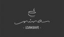
nina kafe logo design
- Thread starter No Name
- Start date
Gino
Premium Subscriber
Kinda agree, it's all just too lightweight and frilly for my tastes. When you go to duplicate that in a newspaper ad, internet or just about anywhere, it won't be visible without studying it and most people gaze at things, they don't ponder on it. They're all in a hurry and if it doesn't hit them instantly, they're off to the next thing.
Johnny Best
Active Member
I like it, leave as is, it's finnished.
JR's
New Member
I like it. and I agree with everyone else's statement.
Bob has some really good insight once you get past(get off my front lawn personality) he seems to really grasp what's going on.
My two cents for what it's worth.
Tighten up the graphic so the negative space isn't stronger than the elements.
The name is on a somewhat of a slant increase it a little bit more so it looks like it was done intentionally and not nudged by accident.
The bottom line give it some weight to the lettering this might anchor the logo a little bit.
The steam that is coming off of the cup Incorporated to the ends of the name. On that swirl from the A have the steam on the bottom and the swirl from the N have some steam on the top of it, if that makes sense just slightly so you be pulling pots of the graphic into the name.
Or you could leave it as is.
Johnny Best
Active Member
Marlene
New Member
I like it. and I agree with everyone else's statement.
Bob has some really good insight once you get past(get off my front lawn personality) he seems to really grasp what's going on.
My two cents for what it's worth.
Tighten up the graphic so the negative space isn't stronger than the elements.
The name is on a somewhat of a slant increase it a little bit more so it looks like it was done intentionally and not nudged by accident.
The bottom line give it some weight to the lettering this might anchor the logo a little bit.
The steam that is coming off of the cup Incorporated to the ends of the name. On that swirl from the A have the steam on the bottom and the swirl from the N have some steam on the top of it, if that makes sense just slightly so you be pulling pots of the graphic into the name.
Or you could leave it as is.
agree with all of the above. if you do nothing else at least pull it all closer together as it looks disjointed. try moving the steaming bowl/cup of coffee (?) around as everything doesn't have to be centered as it is now. just curious, what does this do? is it a coffee shop? a cafe? if not, it sends the wrong message no matter what part of the globe you are from.
No Name
New Member
First of all that's a sign, not a logo. Nevertheless, tighten it up a bit. You have three separate and unrelated elements sort of floating around. Then do something with the line of text at the bottom. Right now it has all the weight.
First of all that's a sign, not a logo. Nevertheless, tighten it up a bit. You have three separate and unrelated elements sort of floating around. Then do something with the line of text at the bottom. Right now it has all the weight.
I see your point but the wishes from the client were very specific and I followed them as much as possible. Original iea was given to meKinda agree, it's all just too lightweight and frilly for my tastes. When you go to duplicate that in a newspaper ad, internet or just about anywhere, it won't be visible without studying it and most people gaze at things, they don't ponder on it. They're all in a hurry and if it doesn't hit them instantly, they're off to the next thing.
As I said, it´s the first draft and I¨was thinking to work on it still but if the client is happy...I like it. and I agree with everyone else's statement.
Bob has some really good insight once you get past(get off my front lawn personality) he seems to really grasp what's going on.
My two cents for what it's worth.
Tighten up the graphic so the negative space isn't stronger than the elements.
The name is on a somewhat of a slant increase it a little bit more so it looks like it was done intentionally and not nudged by accident.
The bottom line give it some weight to the lettering this might anchor the logo a little bit.
The steam that is coming off of the cup Incorporated to the ends of the name. On that swirl from the A have the steam on the bottom and the swirl from the N have some steam on the top of it, if that makes sense just slightly so you be pulling pots of the graphic into the name.
Or you could leave it as is.
I agree on the slant of the nina, I should give it a few more degrees.
Can you clarify what you mean by"
The steam that is coming off of the cup Incorporated to the ends of the name. On that swirl from the A have the steam on the bottom and the swirl from the N have some steam on the top of it, if that makes sense just slightly so you be pulling pots of the graphic into the name"?
(Not to talk about this specific design but) It´s interesting how much cultural roots / surroundings influence on ones way of thinking and seeing things. The aesthetics differ greatly depending on where you are. Asians, americans, africans, europeans and us here in scandinavia see things very differently.agree with all of the above. if you do nothing else at least pull it all closer together as it looks disjointed. try moving the steaming bowl/cup of coffee (?) around as everything doesn't have to be centered as it is now. just curious, what does this do? is it a coffee shop? a cafe? if not, it sends the wrong message no matter what part of the globe you are from.
Johnny Best
Active Member
I think what Marlene was saying is, about your cup, I am assuming a cup and not a bowl. Picasso, who was Spanish, started the art movement with drawing things in simple line form. Yours does have a bowl look but if you do tweek it that will probably make it like the other thousands upon thousands of coffee cup logos. We don't see things differently, we just accept things in a different way. Leave it the way it is and move on.
bob
It's better to have two hands than one glove.
Looks good.
Not sure what Bob meant by calling it "a sign, not a logo". Care to expound?
A logo is a symbol, a sign is exactly that, a sign. Something that says "Bob's Bank" is a sign.The farther a 'logo' moves from symbol to text the more sign it becomes.
No Name
New Member
Bob, actually you are very wrong.A logo is a symbol, a sign is exactly that, a sign. Something that says "Bob's Bank" is a sign.The farther a 'logo' moves from symbol to text the more sign it becomes.
If you want to be exact, the original meaning of a logo is unique and identifiable text (for example Coca-Cola ). When you add a symbol to that text (or loose the text altogether) it becomes symbol (like Puma).
Logos Vs. Symbols
Although most people call any emblem that has been designed to visually represent a brand a logo, “logo” is usually taken to be short for “logotype,” which literally means “word imprint” in Greek. This is why we sometimes call logotypes “wordmarks.” According to this line of thinking, the only true logos are the ones that contain nothing but stylized letters, representing the literal name of a company. In its curlicue cursive, the distinctive Coca-Cola emblem is a logo. So is Paul Rand’s Venetian Blind IBM wordmark . Other logos include CNN, Sony, Samsung, Ray-Ban, Dell, NASA, Fed-Ex, and even Fast Company. Basically, if you see something in a company’s emblem that can’t be read, it’s not strictly a logo.
Anyway, that has nothing to do with this design, I´m just saying...
Gino
Premium Subscriber
And you know this to be true........ why/how ??
To me what you're saying is just an opinion based upon some ancient use of a word, which....... don't you think the word might've evolved over the centuries ??
In ancient Greece, they were modern for their time, but as of today.... words lose their initial meanings almost daily. I hafta be careful how I use the word black or around who I use it. When I was young to be gay meant a
I was happy, now I'm something different if I were gay. Words just like their meanings and people themselves are everchanging, so please don't get stuck in ancient languages which don't matter today.
What you have is a sign or better known as an advertisment. Debating words and their meanings on a sign forum is kinda senseless. About 95% of the people on this forum can barely put a sentence together , let alone give 2 sh!ts about an ancient definition.
When you look at a logo or branding, you are supposed to quickly know the product, while a sign tells a story. Therefore, a logo will most likely form a picture in your mind. If I say Coca-Cola, you don't picture an elephant in your mind, or do you ?? When you look at a sign or advertisment you generally think of the business it reflects and the story it tells, basically...... this is McDonald's and here we are, by the way, we sell food.
No Name
New Member
Yes Neato, these are a good example of a logo. Purely text that has a specific character that differentiates the business from others.Signs?

Not signs... Definately they can be used as a sign.
JR's
New Member
I think both of you guys are right. It's just a matter of perspective.
What I was trying to say is to incorporate some of the name into the artwork or vice a versa. In the cup I have some elements of the a and n added. Doesn't make yours right or wrong, it was just my idea.
And if the customer said they like it and it's doing its job. Whatever the client wants the artwork to do. In this case I assume to bring customers into a establishment?
Then you are good.
Let's face it there is a lot of ways to make a cup of coffee. Some people might say if you add milk or cream that's a abomination to coffee. Or five sugars, Yuck but it's still a cup of coffee.
Attachments
Gino
Premium Subscriber
So any design that is words without a symbol is a sign? That's just not true. Sorry.
So, where was that said ?? How did you come up with that perception ??
Yes Neato, these are a good example of a logo. Purely text that has a specific character that differentiates the business from others.
Not signs... Definately they can be used as a sign.
No one said a logo can't be a sign, but what you showed in your first post... to most people is a sign and not a logo...... unless like you said, your customer is happy, so be done with it and just call that a logo and collect your money. Who really cares ??