-
I want to thank all the members that have upgraded your accounts. I truly appreciate your support of the site monetarily. Supporting the site keeps this site up and running as a lot of work daily goes on behind the scenes. Click to Support Signs101 ...
You are using an out of date browser. It may not display this or other websites correctly.
You should upgrade or use an alternative browser.
You should upgrade or use an alternative browser.
Ok Have at it
- Thread starter laserman70
- Start date
Rick
Certified Enneadecagon Designer
I am working on a bunch of different designs.
What do the other ones look like?
J Hill Designs
New Member
good ol' serpentine
SignManiac
New Member
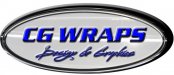
You might want to start with just black and white. Using every effect in the book makes it kind of hard to see what's underneath the bells and whistles.
Pat Whatley
New Member
It doesn't matter how many effects you throw at a bad design it will still be a bad design. Keep working with it. Like Rick said, I'd love to see the other ones.
Craig Sjoquist
New Member
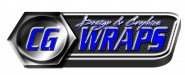
1st thing is ..design & graphics script is ok but no effects just plain color will read better
2nd thing it reads CG WRAPS but it looks like a button to push and a dashboard
Your looking for what a business identity would look like not a surf boaard
2nd thing it reads CG WRAPS but it looks like a button to push and a dashboard
Your looking for what a business identity would look like not a surf boaard
laserman70
New Member
Yeah, I know that is why i'm asking.. lol
laserman70
New Member
speedmedia
New Member
Yes, you don't want either one of those. No offense but in terms of readability and creativity they lack. You are trying to sell a creative service to your clients so you should really put some research into what you want your logo to tell your potential clients. This one scream "I just bought Photoshop and Aurora Graphics"
I am not saying this to be mean but more for "tough love" We have all been there and done that so if you take some advice and criticism well you can go a long ways and get some very valuable help. Keep plugging away at it and posting your work, there are some very good people on here that will help you achieve your goals if you put the effort into it.
Thanks,
Kurt
Williams Signs
New Member

Jillbeans
New Member
Take away all the special effects and you still have kind of a squishy looking dated font, with a weird scripty tagline hovering above Wraps.
Re-think everything.
Serpentine had its day and everyone loved it, but now it's kinda like a well used cheerleader under the bleachers.
Think clean.
I'm not sure which fonts you like best but MyFonts has several alternatives to Serpentine.
Here's a 30-second suggestion.
Love....Jill
Re-think everything.
Serpentine had its day and everyone loved it, but now it's kinda like a well used cheerleader under the bleachers.
Think clean.
I'm not sure which fonts you like best but MyFonts has several alternatives to Serpentine.
Here's a 30-second suggestion.
Love....Jill
Attachments

laserman70
New Member
Without all of the computer effects, all you essentially have there is an oval with the dreaded Serpentine font for the title and a script underneath. As a lure for wraps, it doesn't work.
And all those effects on the script renders it illegible.
My thoughts exactly, i threw that one together in 2 mins. to show what I dont want. Anyone can create an oval and add effects and I see so much of it.
I agree it does need to be simplified.
The name of the company is CG Wraps.. No, we do not only do wraps.. We do graphics, advertising setup and the normal sign shop items.
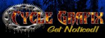
We started out just doing motorcycle graphics and named the company Cycle Grafix.. I was doing alot of airbrushing. We started designing graphics that could be applied for those who did not have the money to pay for airbrushing. We outsourced all of our graphics to a local company.
The company ran into trouble, we bought their machines and started doing them ourselves. Then it started, people wanted graphics for trucks, signs, and everything else.
So we decided to call the other company CG Wraps, using the two first letters of our business Cycle Grafix.
Was not well thought out but it happened quickly..
Here is where it started to where we are now. We are going to rewrap all vehicles, calming things down, but hoping to still have some edge due to the amount of cycle graphics we do.
Thanks for the help..
It is amazing how easy it is to do for other companies, but for my own I have such mental blocks lol...
1st is Cycle Grafix
2nd First logo for CGwraps
3rd is what have been using (just lettering)