-
I want to thank all the members that have upgraded your accounts. I truly appreciate your support of the site monetarily. Supporting the site keeps this site up and running as a lot of work daily goes on behind the scenes. Click to Support Signs101 ...
You are using an out of date browser. It may not display this or other websites correctly.
You should upgrade or use an alternative browser.
You should upgrade or use an alternative browser.
Ok Have at it
- Thread starter laserman70
- Start date
Craig Sjoquist
New Member
Post #15 is alot more readable then 1st
These last 3 are well not sure what they are.
Start with post #15 use the oval as background and expand your name over the border of oval.
These last 3 are well not sure what they are.
Start with post #15 use the oval as background and expand your name over the border of oval.
Jillbeans
New Member
Something along the line of the typography in these.
Attachments
-
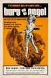 angel.jpg77.1 KB · Views: 130
 -
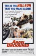 angel-unchained.jpg92 KB · Views: 125
 -
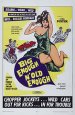 big.jpg39.9 KB · Views: 133
 -
 cycle.jpg71.9 KB · Views: 148
 -
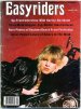 easy.jpg45 KB · Views: 139
 -
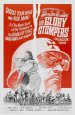 glory-stompers.jpg85.4 KB · Views: 123
 -
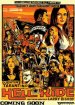 hellride_poster.jpg89.4 KB · Views: 101
 -
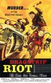 murder.jpg42.5 KB · Views: 112
 -
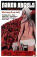 naked.jpg169.2 KB · Views: 121
 -
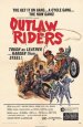 outlaw.jpg73.7 KB · Views: 119
 -
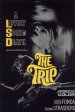 trip.jpg64.9 KB · Views: 123
laserman70
New Member
Of this latch batch, all are virtually illegible.
You are relying too much on fills to try and tart up what is essentially a poor layout.
Try scrapping those fonts for a start.
What about something retro biker looking? Kind of old school?
Jill, I agree on your thoughts. That is why we need to change everything. Business continues to get better and we want to appeal to all not just one segment of the population.
I like the retro thought, I will have to look for some decent fonts and keep it simple. Like I said above, time for paper and pencil.. Back to what I do when I paint..
JR's
New Member
but now it's kinda like a well used cheerleader under the bleachers.
Love....Jill
man Jill you really know how to paint a mental pitcher, now I just have to get that image out of my head. ;-}
JR

Joe Diaz
New Member
I have a challenge for you. Try starting over from scratch but this time do a design ONLY in vector. No gradients, no textures, no chrome effects, no flares.. just vector shapes and lettering. Think Contrast. Don't put two equal value colors next to or on top of each other. It helps me to just start with black and white then add color.
Challenge yourself to make a design that is exciting and memorable but not because of effects, because at its core it is great design. You don't need effects to stand out. What you will find is that in the process you have also created a much easier to read and a cleaner design. Because what good is all of those effects if the message is lost?
Challenge yourself to make a design that is exciting and memorable but not because of effects, because at its core it is great design. You don't need effects to stand out. What you will find is that in the process you have also created a much easier to read and a cleaner design. Because what good is all of those effects if the message is lost?
Colin
New Member
IMO, all three of those (in post #20) are a disaster.
I imagine that you will warm to my following recommendation as much as you would to an ice-cold bath plunge, but I suggest that you ought to have your logo designed by a professional logo designer. Even going to 99designs would result in a logo a thousand times better.
I imagine that you will warm to my following recommendation as much as you would to an ice-cold bath plunge, but I suggest that you ought to have your logo designed by a professional logo designer. Even going to 99designs would result in a logo a thousand times better.