-
I want to thank all the members that have upgraded your accounts. I truly appreciate your support of the site monetarily. Supporting the site keeps this site up and running as a lot of work daily goes on behind the scenes. Click to Support Signs101 ...
You are using an out of date browser. It may not display this or other websites correctly.
You should upgrade or use an alternative browser.
You should upgrade or use an alternative browser.
one last shot lol
- Thread starter Warlick Designs
- Start date
Fred Weiss
Merchant Member
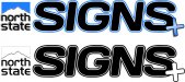
It's much better than previous versions but consider this as you look at the thumbnail of your latest design:
1. Can you read North State and easily identify the mountain in the overall piece?
2. Is your company name SIGNS or is it North State SIGNS?
3. Do you want to be remembered simply as SIGNS generically or do you want to be known as North State
signs?
4. If North State Signs is your aim then you should enlarge North State so that your logo reads as North State Signs and not just a generic SIGNS being all that is seen and remembered. In that fashion you establish your singular identity and that you are not just one in one hundred sign shops.
OldPaint
New Member
the worse thing i see.......is the BAND-AID on the S))))))that what it looks like....
iam with fred......who do you want to be.......NORTH STATE or SIGNS? or try making the 2 the same size?????
mountain??? is that what the squiggly line is? chalk this one up to a prelim to something better......
as most will tell you.....DESIGN IN BLACK AND WHITE, work the basic design. then try adding junk.........you might just find a nice font....that works better then then adding crap to it......or a nice small shadow...its why they call it designing......keep trying different things till you get a suitable look......this aint it...
this why i say BAND-AID..
https://www.google.com/search?q=car...nGtTdoATokYL4DA&ved=0CCoQsAQ&biw=1811&bih=879
Warlick Designs
New Member
the worse thing i see.......is the BAND-AID on the S))))))that what it looks like....
iam with fred......who do you want to be.......NORTH STATE or SIGNS? or try making the 2 the same size?????
mountain??? is that what the squiggly line is? chalk this one up to a prelim to something better......
as most will tell you.....DESIGN IN BLACK AND WHITE, work the basic design. then try adding junk.........you might just find a nice font....that works better then then adding crap to it......or a nice small shadow...its why they call it designing......keep trying different things till you get a suitable look......this aint it...
this why i say BAND-AID..
https://www.google.com/search?q=car...nGtTdoATokYL4DA&ved=0CCoQsAQ&biw=1811&bih=879
thanks guys.. & I didn't like the "+" either already removed it
")
Biker Scout
New Member
Your mountain icon thingy looks like a pack of Marlboro's

shoresigns
New Member
should I work with this or am I on the wrong track..?
Quit using all those crappy effects. They're not crap when you use them properly, but you can't put a shadow on one thing, a gradient on another, and an outline on another, all in the same logo.
Gino
Premium Subscriber
I'm using a totally different approach, since.... not you war, but the other members here, most can't take honesty. You've proven to be thick-skinned and eager to learn. You're not gonna learn here, but you might pick up some pointers from several members that you might wanna hold onto for future things.
You don't wanna go the route of getting a professional to do this for you and you've kept up with the DIY logo mentality, so evidently you really wanna learn something.
So, why not use some standard strong type face for whichever word you want seen/noticed first and not use any effects on it. Serifed or not, it doesn't matter. Just have it stand up on it's own. It becomes the pillar of your name, reputation and integrity. Does a bear help do that ?? Does a little mountain ?? Probably not, unless like in a sports mascot, it's just that.... a mascot and the actual symbol for the team. In other words, it's kinda a logo, huh ?? Now, back to the name...... whichever word is left after you pick the main [focal] point, that name can be the same font, just smaller, less weight of slightly a different color, just more to the background without becoming the background.
Remember, something always has to be first and something has to be last. Sign people and fine artists, not designers or graphic artists, do this through size, colors, boldness or some combination of two or all three possibilities.
Last, if you want the bear on there, put it on. But not a bear, the mountains, a +sign and crazy effects. It tends to become sensory overload and then nothing sticks to the viewer's retinas and all's lost for nothing more than a jumbled mess. Other than personal reasons though, either make it [graphic/icon] there or don't use it all. Something creeping in from a corner does not count as part of anything. That's an afterthought. In layout, design, composition or whatever..... you don't make sketchy things. It either exists or it doesn't. It has to have a distinct purpose or it doesn't get used.
Do yourself a favor and search out logos around the world being used and see what it is you do and don't like about them. Pull from other professional's jobs and create your own model. Don't copy any of them, but learn from them. This will eventually become your style and then you'll have some meat & potatoes from which to serve.
Fred Weiss
Merchant Member
I'm using a totally different approach, since.... not you war, but the other members here, most can't take honesty. You've proven to be thick-skinned and eager to learn. You're not gonna learn here, but you might pick up some pointers from several members that you might wanna hold onto for future things.
You don't wanna go the route of getting a professional to do this for you and you've kept up with the DIY logo mentality, so evidently you really wanna learn something.
So, why not use some standard strong type face for whichever word you want seen/noticed first and not use any effects on it. Serifed or not, it doesn't matter. Just have it stand up on it's own. It becomes the pillar of your name, reputation and integrity. Does a bear help do that ?? Does a little mountain ?? Probably not, unless like in a sports mascot, it's just that.... a mascot and the actual symbol for the team. In other words, it's kinda a logo, huh ?? Now, back to the name...... whichever word is left after you pick the main [focal] point, that name can be the same font, just smaller, less weight of slightly a different color, just more to the background without becoming the background.
Remember, something always has to be first and something has to be last. Sign people and fine artists, not designers or graphic artists, do this through size, colors, boldness or some combination of two or all three possibilities.
Last, if you want the bear on there, put it on. But not a bear, the mountains, a +sign and crazy effects. It tends to become sensory overload and then nothing sticks to the viewer's retinas and all's lost for nothing more than a jumbled mess. Other than personal reasons though, either make it [graphic/icon] there or don't use it all. Something creeping in from a corner does not count as part of anything. That's an afterthought. In layout, design, composition or whatever..... you don't make sketchy things. It either exists or it doesn't. It has to have a distinct purpose or it doesn't get used.
Do yourself a favor and search out logos around the world being used and see what it is you do and don't like about them. Pull from other professional's jobs and create your own model. Don't copy any of them, but learn from them. This will eventually become your style and then you'll have some meat & potatoes from which to serve.


Warlick Designs
New Member
I'm using a totally different approach, since.... not you war, but the other members here, most can't take honesty. You've proven to be thick-skinned and eager to learn. You're not gonna learn here, but you might pick up some pointers from several members that you might wanna hold onto for future things.
You don't wanna go the route of getting a professional to do this for you and you've kept up with the DIY logo mentality, so evidently you really wanna learn something.
So, why not use some standard strong type face for whichever word you want seen/noticed first and not use any effects on it. Serifed or not, it doesn't matter. Just have it stand up on it's own. It becomes the pillar of your name, reputation and integrity. Does a bear help do that ?? Does a little mountain ?? Probably not, unless like in a sports mascot, it's just that.... a mascot and the actual symbol for the team. In other words, it's kinda a logo, huh ?? Now, back to the name...... whichever word is left after you pick the main [focal] point, that name can be the same font, just smaller, less weight of slightly a different color, just more to the background without becoming the background.
Remember, something always has to be first and something has to be last. Sign people and fine artists, not designers or graphic artists, do this through size, colors, boldness or some combination of two or all three possibilities.
Last, if you want the bear on there, put it on. But not a bear, the mountains, a +sign and crazy effects. It tends to become sensory overload and then nothing sticks to the viewer's retinas and all's lost for nothing more than a jumbled mess. Other than personal reasons though, either make it [graphic/icon] there or don't use it all. Something creeping in from a corner does not count as part of anything. That's an afterthought. In layout, design, composition or whatever..... you don't make sketchy things. It either exists or it doesn't. It has to have a distinct purpose or it doesn't get used.
Do yourself a favor and search out logos around the world being used and see what it is you do and don't like about them. Pull from other professional's jobs and create your own model. Don't copy any of them, but learn from them. This will eventually become your style and then you'll have some meat & potatoes from which to serve.
:U Rock:
Last edited by a moderator:
Warlick Designs
New Member

Biker Scout
New Member
Still looks like a pack of smokes to the left of the word signs.
Biker Scout
New Member
Here's your logo... Pay me, and you can have the .eps file. Then you can get on with running your business.


Here's your logo... Pay me, and you can have the .eps file. Then you can get on with running your business.
View attachment 98895
View attachment 98896
Thank you. Whew...