• I want to thank all the members that have upgraded your accounts. I truly appreciate your support of the site monetarily. Supporting the site keeps this site up and running as a lot of work daily goes on behind the scenes. Click to Support Signs101 ...

Opinons on our logo

ForgeInc

New Member
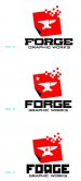
Wanted to offer up these logo options for feedback. We are starting a new design/large format printing shop and will hopefully be catering to fairly young, progressive, "hip" clients. The variations are quite subtle and am open to feedback on type, etc. but am looking more for "overall" feedback. Are they appropriate for this type of business? Do they relate well to our name? Too aggressive?

Also wanted to mention that our marketing materials, website and collateral may have a similar old-style "constructivist" look and feel, so the logo is kind of a launching point for future stuff.

Bring it!
 

Attachments

  • option1.jpg
    option1.jpg
    590.3 KB · Views: 138
  • option2.jpg
    option2.jpg
    599.8 KB · Views: 135
  • option3.jpg
    option3.jpg
    591.7 KB · Views: 147

artsnletters

New Member
I kinda like the top one. Dont think the bottom one conveys the right message, maybe too euro looking? The top one portrays both simplicity and strength to me. Meaning 1a , 2c and 3b...
Tim
 

Letterbox Mike

New Member
I like version 1b, but lose the star, it looks out of place. We cater heavily to your target clientele and I can see them responding positively to that version. The others (2 and 3) to me look a little to "structured" and traditional, I feel like the lack the edge of v1.

Are you dead set on red? I only ask because it seems really trendy right now, at least in our neck of the woods. We have 5 clients within a 3 mile radius of each other, all agencies, with a red box (of some sort) for a logo. If it's not so common place then I dig it, but I'd stray away from it if it's as trendy there as it is here.
 
W

wetgravy

Guest
1a and 2c stand out the best to me. 3b works if you get rid of that fake drop shadow effect and make if flat like the other 2. 2c still needs the star on the anvil, keep the 2 stars at the bottom, gives the logo some common repeated shapes ... better eye appeal. and if you have the star on one anvil, 1a should have it too. I would also test colors, blue or green would probably make that design pop without looking too propaganda based.
 

Dan Antonelli

New Member
Nice job - like 1A. Might suggest you slightly change your proportions, and reduce icon size, maybe by 30%, and get a little more separation from main copy and and secondary.

My only trouble with typography on 1A is at a quick glance it can also read 'FORCE'. Maybe pull you horizontal stroke on the G a bit more in....

I also like 2a.

Good stuff.
 

TheSellOut

New Member
Very nice work Forge! I like them all and my favorite is 1b., without the star and with Dan's advice to extend the G stroke!
 
Sweet ideas... I like the Russian cold war kinda feel to them. Very hip as you said...

my fav's 3b and 2c

I say leave the stars, and the backwards r can work in a different font.

Good luck!
 

Jillbeans

New Member
1a with a black star in the anvil.
You need to be careful, when choosing your font, to make sure that you select one with a G which looks like a C.
And no cutesy stuff with the R. No matter what.
:)
Love....Jill
 

thinksigns

SnowFlake
The first group remind me too much of the Xerox logo. I prefer 2a or 3b
 

Attachments

  • Screen shot 2011-01-21 at 7.01.12 AM.png
    Screen shot 2011-01-21 at 7.01.12 AM.png
    102.5 KB · Views: 173
Top