• I want to thank all the members that have upgraded your accounts. I truly appreciate your support of the site monetarily. Supporting the site keeps this site up and running as a lot of work daily goes on behind the scenes. Click to Support Signs101 ...

Our First Wrap - partial on an HHR

ddubia

New Member
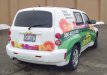
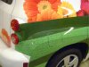
I'm more than a bit excited about having finished our first wrap. Although it's only a partial I feel I got a good workout on the installation proceedure. I had some great results on difficult areas and made a few small mistakes as well. Whatever good came out of it is the result of a ton of reading on here and the great advice I've received through it. Overall am well pleased with the result.

Most importantly, the customer loved it!

This was printed on an HP 8000 using 780 inks.
3M 180CV3-10 with 8518 laminate

Installation was done in our shop that was a bit cooler than I'd have liked for my first attempt at this, but that's our shop here in Ohio in the winter. ;) Used a Wagner heat gun with a felt and a white squeegee.

The door handles came off so easily we didn't even have to remove the interior door panel. We found this out after removing 2 interior door panels. lol

At any rate I'd appreciate a critique from the pros here. You can hit it hard, I can take it.
 

Attachments

  • DeHoff_LS.jpg
    DeHoff_LS.jpg
    51.1 KB · Views: 196
  • DeHoff_3-quater-rear_LS.jpg
    DeHoff_3-quater-rear_LS.jpg
    57.2 KB · Views: 114
  • DeHoff_3-quarter-rear_RS.jpg
    DeHoff_3-quarter-rear_RS.jpg
    63.1 KB · Views: 138
  • DeHoff_RS.jpg
    DeHoff_RS.jpg
    57.4 KB · Views: 168
  • DeHoff_RR-close-up.jpg
    DeHoff_RR-close-up.jpg
    54.2 KB · Views: 141

Craig Sjoquist

New Member
Assuming these are the customers colors ... great job

any errors that I see not worth mentioning.. for being your 1st

like ...area code to heavy
pass side rear panel the 3 lines of copy use a right flush instead of left
DeHoffs better contrast ....MAYBE
we deliver ... stronger
 

ddubia

New Member
Craig,

Thank you. You're comments are what I was looking for.

I hate having to use area codes. That's something that back in the day we never needed to include. I haven't found nor seen a treatment for them that I really like. Probably because I resent having to include the dang things at all. lol I usually do them in the same size and weight as the rest of the number. Have sometimes put them in parentheses.

Regarding the colors, the logo was existing. The flowers are what they are. I chose the greens. It was a badly overcast day when the job was done and the pics were taken so the colors look kind of dull and lifeless in the pic. Not nearly as rich and vibrant as they really are, but maybe that was not your issue.

Understand about the right flush rather than left. I looked at that, almost did it, then didn't. Now wish I had ::forehead slap::

Really now see how "We Deliver" could have been stronger. That will help my design thoughts in the future.

Thank you for your critique.

Thank you all for your comments.
 

BEL Signs

New Member
I think you've done fine, the application looks tight which is the most important thing from your point of view.

Take a look at this site:

http://www.raccoon.co.uk/colour-change.aspx

They do a lot of wraps for the Gumball Rally among other things like wrapping the London Eye!

I used to work there but got bored just wrapping all day. I'm not taking credit for this work, there was about 15 of us there so we all played our part. There's some interesting projects on there and its a great reference site for design ideas and the creative use of the different films available on the market today.

Being a UK based company the designs might not hit the spot for the U.S. market, as I feel Europeans and Americans tend to like slightly different things when it comes to design, anyway it might be of interest.

keep at it and don't compromise on materials, time or price and just go for it

Daz
 

Malkin

New Member
I wish I had researched how to take the handles off the one that we did a few months back. We wrapped the handles right in place. :doh:
 

Jillbeans

New Member
Their name would have looked better in white rather than yellow.
I like the back best, and would have usen that web addy font for the list of services on the sides, and made them in green and center-justified.
The black looks too harsh.
Lots of blocky looking fonts on there for something soft like flowers.
But all in all, it's better than any wrap I would do. (I don't do them)
Love....Jill
 

ddubia

New Member
Thanks Jill

I was stuck with the yellow.

Your points on the fonts are well taken and now that you mention them I see it. Likely I should have run this by you guys first for a critique before following through with it.

You're one of my favorite designers on here. If you did a wrap it would be bada$$ like all your other work.
 

ddubia

New Member
BEL Signs, thanks for the link. There's a lot of good wraps there. Good inspiration too. I think I'd have gotten bored doing wraps all day as well. I like bouncing around screwing up all sorts of things on a daily basis. lol
 

jiarby

New Member
I think it was a great job, and even more so because it was your 1st one... very ambitious 1st job... you couldn't start with an Scion xB or something!
 

LMHConcepts

New Member
I really like it! I agree with jiarby, that was an ambitious first job, but it turned out amazing!

Only small problem I see is the readability of the website on the rear bumper. Other than that, good job!
 

Fatboy

New Member
You know .......? I find the crits on lots of stuff on the site very,very interesting ! I don't mean bad with this but I can not see how this specific rap can get any better...?The customer loves it....it looks excellent......so what is better? I did a little experiment a wile ago and posted some artwork on another site. That specific job attracted quite a bit of negative critisism.Designers then came up with ideas. At the end the customer still chose my "inexperienced" design. Critisism is very important.....but in my opinion the customer is king. Give him what he wants.Only you sat down with them....only you know his bussiness.......

p.s I think your wrap is absolutely fantastic. I hope that I can do something like that someday soon.
 

ProWraps

New Member
install looks good. no ghosting which is a problem with eco sol prints on an hhr. lots of potential to ghost in the recesses on the pop out fenders.

the other bad part about the hhr is the tities on the bumpers. there is no good way to go about them.
 

Premier Wraps

New Member
I think you've done fine, the application looks tight which is the most important thing from your point of view.

Take a look at this site:

http://www.raccoon.co.uk/colour-change.aspx

They do a lot of wraps for the Gumball Rally among other things like wrapping the London Eye!

I used to work there but got bored just wrapping all day. I'm not taking credit for this work, there was about 15 of us there so we all played our part. There's some interesting projects on there and its a great reference site for design ideas and the creative use of the different films available on the market today.

Being a UK based company the designs might not hit the spot for the U.S. market, as I feel Europeans and Americans tend to like slightly different things when it comes to design, anyway it might be of interest.

keep at it and don't compromise on materials, time or price and just go for it

Daz


OK. Just checked out the site. The Chrome Maclaren is off the hook.
 

THE SIGN MAN

New Member
Hhr wrap

Hhr for the first wrap? Thats impressive. I have been wrapping vehicles & boats for about 5-6 years now and i have just recently figured out how much easier a torch is for wrapping instead of a heat gun. Just thought you might want to know.
 
Top