• I want to thank all the members that have upgraded your accounts. I truly appreciate your support of the site monetarily. Supporting the site keeps this site up and running as a lot of work daily goes on behind the scenes. Click to Support Signs101 ...

Our New Sign Proposal

Rising

New Member
Hey fellas and lasses. Happy new year to you all.

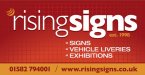
Here goes, we have drawn up a new sign for our building, which is very different from what we have done before, always kept it simple and easy to read. Now though we have incorporated a digitally printed background.

I might add, our corporate colours are usually all dark blue letters with three shades of orange on the curves above the 'R'. but have simplified it to accommodate the new background.

Fire away my arms are open and I'm looking you all straight in the eye. :glasses:

Steve
 

Attachments

  • RisingSignsFascia.pdf
    482.7 KB · Views: 159
Last edited:

Gino

Premium Subscriber
Looks more like a business card than a sign. There's no 'Oomph' in my opinion.


....and I don't get the 'Eye' relationship to your sign ??
 

Marlene

New Member
I really don't like that background as I'm not seeing "rising" in it at all. it looks way too generic and cliparty. there also is something not right about the lower case rising leading into the word signs. It kind of reads "r" "i" "sing" "signs". maybe on a less complex background, it looks OK but it all just too much for a set of eyes to take in.
 

Rising

New Member
Love the pixelation.


Thanks I thought it added pure quality. Clearly (no pun intended) its for web, zoom out it looks better.

Gino. Thanks for the input, see where your coming from on a B card , need to tweak possibly there. I was hoping some umph was coming from the background. We were after some sort of digital b/g. The eye does relate to the trade I feel, as everything we do is visual.

Flame. thanks for the warmth man, it is cold here in blighty, snowing a lot too.

Steve
 

HaroldDesign

New Member
The background is making it look more like a billboard ad than a company sign. Make the copy able to stand on it's own, and then go for background colors, etc...
 

Jillbeans

New Member
With a name like that and if doing full color I would put in a glorious sunrise, cliche as it sounds.
Love....Jill
 

Gino

Premium Subscriber
There's always something rising with this theme......


risingsigns sign.jpg
 

rjpjr

New Member
Looks more like a business card than a sign...

Yea, I agree with what Gino said.

IF you decide that you are going to use that background, I would definitely darken the red behind the "Rising". Since "Rising" is thin stroked it is already a little difficult to see standing next to the bolder "Signs". Therefore the brighter red behind "Rising" hurts its legibility since there is not as much contrast.

IMHO, I would tone down the background a bit...
and I might even lose some of the text...
 

Attachments

  • Rising-Signs.jpg
    Rising-Signs.jpg
    42.7 KB · Views: 99
  • Rising-Signs-2.jpg
    Rising-Signs-2.jpg
    30.5 KB · Views: 95

astro8

New Member
Those are pretty good ripjr, the original background image was horrid.
I'm thinking that the small 'crescenty logo graphic' thing could be refined, enlarged and put to more use..as it is now, what's the point of it?
 

Rising

New Member
Thanks for the feedback all.

Nice to get your opinions and some good feedback.

Gino.

Thanks for the design mate, very Disney haha.

RJP. Liking the first layout.

Astro. The point of the crescent has always been a small take on the sun. Hence in our original colours it is three shades of orange, although I know you have not seen it. I dont want these larger really, there are supposed to be subtle. Thanks for the feedback, much appreciated.

Here is our natural logo, although we do change the strapline from time to time.

Steve
 

Attachments

  • RisingSignsLogoApril2009.jpg
    RisingSignsLogoApril2009.jpg
    26.1 KB · Views: 99
Last edited:

Vinylman

New Member
Thanks I thought it added pure quality. Clearly (no pun intended) its for web, zoom out it looks better.

Gino. Thanks for the input, see where your coming from on a B card , need to tweak possibly there. I was hoping some umph was coming from the background. We were after some sort of digital b/g. The eye does relate to the trade I feel, as everything we do is visual.

Flame. thanks for the warmth man, it is cold here in blighty, snowing a lot too.

Steve

Steve:

Just a little heads up on layout & design.

BACKGROUND is just that! BACKGROUND.

Using it to "umpf" your design runs totally against any training you will ever receive in the real world.

If your sign does not create attention in a basic BLACK & WHITE layout then all the background, bells and whistles, because I can do it in Photoshop® special effects that are thrown {and I do mean thrown} into the mix will NEVER improve on just a good clean READABLE layout.

That is why you are attracted to what RJPJR posted above. He started with a clean fresh layout, and then colored it with your color choices. If it was just Black& White it would still look great.
 

astro8

New Member
Hi Steve

I still think you can put your graphic to better use.

I went with the blue and Gills theme you have been using.
 

Attachments

  • rising1.jpg
    rising1.jpg
    36.9 KB · Views: 93

signgal

New Member
My two cents... I like the use of the "graphic" by astro and concur with k.a.s. about rjp's second design. The burnt orange background is up to date and "sunrise" feeling (where Jill was going; I always love her opinions)
 
Top