• I want to thank all the members that have upgraded your accounts. I truly appreciate your support of the site monetarily. Supporting the site keeps this site up and running as a lot of work daily goes on behind the scenes. Click to Support Signs101 ...

Pantone Colors and Matthews Paint Matching

Bigdawg

Just Me
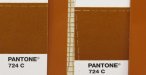
We are having some issues with the color of some dimensional letters we ordered from one of the big boys in the game.

They said they could match to the PMS color... but when we got them and installed, the customer said the paint isn't a match and provided a color chip from Pantone to show the difference. We sent a color chip photo next to the letters and there is a difference. The first response from our Vendor was that the color chip "had to be at least 15 years old" because Pantone doesn't make those any more. They do. That was from their veteran production manager. Which doesn't give me a lot of hope :smile:

So how close should we expect the matching to be? This is the first time we've had a color issue using PMS color matches with Matthews paint matching. Are we expecting too much?

Any insight anybody???
 

Rick

Certified Enneadecagon Designer
What color?
How much of a difference?

This is what i have been told a few times, Matthews has done a great job of PMS color formulas but I believe they were formulated using gallons as the standard, when you start cutting down the color into quarts or pints, that is where the color can get thrown off.

What you can do is call up a Matthews rep, they can spray up a color panel of the PMS color to see how much they can match it.
 

daveb

General Know-it-all
We've had a Matthews mixing station for about 15 years, PMS matches with their formulas are almost always right on unless is a red or burgundy. We usually mix the color and then start adding the right colors until we get it right, our paint guy keeps track of what he adds and has his a pretty good handle on it now (if we loose him we're in trouble).
 

Marlene

New Member
I expect close but never exact

me too. some colors like blues are hard to match as they get muddy looking. how far off is it? shades of the same color or a totally different color?
 

Bigdawg

Just Me
Their complaint is that it is too orange

attachment.php
 

Attachments

  • 724compare.jpg
    724compare.jpg
    34.4 KB · Views: 3,533

SignManiac

New Member
I'm about to find out soon enough. We just had our Matthews mixing station installed yesterday. I too was wondering how close their paint can get to my Pantone swatch book? Keep in mind that they are comparing a ink sample that's been printed on paper to actual paint. There is going to be a difference.

Time will tell I suppose.
 

Marlene

New Member
in my Pantone bok the break out is 8 pts of 021 orange, 1.5 pts black, 9.5 pts trans white. the main color is orange so it may, when mixed with paint pigments come out so the orange isn't as toned down as it would be in a print
 

Gino

Premium Subscriber
Based upon what I'm seeing on the screen vs. what my chart indicates.... it's wa-a-a-ay too orange. I'd be a little more than upset. My color chart looks like an old vinyl color called 'Terra Cotta' where yours looks to be a dark orange.
 

SD&F

New Member
We have used Mathews for years and if the customer wants an exact match they have to send us the PMS color. My paint guys are usually dead on and can match it. We have had maybe one issue this year on color match. It's a great system.
It seems everyone on here knows Mathews.
 

cajun312

New Member
I installed some formed plastic letters yesterday for a State Farm Insurance agent. State Farm specifies Pantone 485 for the red.
When the letters came in I opened the box and the red was more orange than I expected. I borrowed a pantone chart and to my surprise they were a match.

But you put them next to anything in that guys office and they are too orange. I showed him the letters and the pantone chip, told him I didn't think Gemini would repaint them as they matched the chip, but that I could get them painted locally.

He decided to use them as is, sure doesn't look right though. If I print Pantone 485 on my printer it has more red in it than the paint.
 

SD&F

New Member
I don't ever print on my printer or match off my computer. I actually need the PMS to match. Printers, monitors, etc....they always print differently and colors are not the same on each one.
 

visual800

Active Member
tell them matching is not 100%. Printing, magnets, signage, door lettering...NOTHING is all going to match. thats just the way it is. I dont see an issue with the above colors. I can tell they are the in the same orangey family but the only way to tell is to hold a damn PMS color next to it

I would suspect someone is being a pickya$$ and there is no call in that.
 
unfortunately when you work with the big dogs..saying 'it's not all going to match 100%' ... Doesn't go over well in my xperience.. I assure you that harley's orange on their business cards matches the orange on their window graphics and that 'pepsi' blue..has got to be 'pepsi' blue & if they aren't the job gets rejected & you replace it or they move on to the 'next guy' ..and as we all hear all the time there is a 'Mosh'ter (haha I'm claiming the rights to that one the Mosh Monster...The Mosh'ter'..i need to hire Deaton to create an infamous caricature..i can see the TV show already).

If you hadn't included a color chip,it could be debateable imo... 'IF' they noticed a color difference between the pms #, your supplied chip (if it was aged or not) & the color produced they should have picked up the phone.

if the glove doesn't fit you must aquit...if the color doesn't match (and you paid for a match) you must repaint.

I understand that many if not most customers will accept a close match but there are clients that expect a match & major corporations who will accept nothing less..and IF they are willing to pay for a match..it has to match..'suggested shades' / 'pleasing color' / and other feel good creative writing for 'random results' are simply not acceptable to many customers..which is why we have tools such as the pms system so that we can communicate color accurately..i understand all of the challenges of accurately reproducing color consistently and it is possible, most are just unwilling to invest the money to have someone do it for them or unwilling to invest the time to learn how to do it themselves.

the Mathew's system is the best option out there imo but as noted there are a few common 'comments' with having to eyeball & make minor adjustments for various shades of reds/blues/purples but mostly in earlier evolutions of the system,there really is nothing quite like it but in a high paced , high volume, production shop it is very common to 'trust the tools' versus taking the time to paint a test piece/quickly curing it/ & verifying the dry painted sample prior to painting the entire job. I've seen it in every high production facility that uses the system, because it is 'that accurate'..most of the time, I thought there was something like 40,000 colors but I just checked their site & it is now over 70,000 sign paint colors. so from a hands on 'been in the working environment' of a high volume, quick turnover shop I can see how it can happen, but imo you buck up,take your lumps, & redo/repaint the job...and bummer too bad - so sad you the painter missed the mark

if You told your client you'd come as close as possible..I'd say it's close. If You told them it would match, nope it's not a match. If your sub told you it would be close, it's close. If you paid for it to match,nope it's not a match.
 

signage

New Member
unfortunately when you work with the big dogs..saying 'it's not all going to match 100%' ... Doesn't go over well in my xperience.. I assure you that harley's orange on their business cards matches the orange on their window graphics and that 'pepsi' blue..has got to be 'pepsi' blue & if they aren't the job gets rejected & you replace it or they move on to the 'next guy' ..and as we all hear all the time there is a 'Mosh'ter (haha I'm claiming the rights to that one the Mosh Monster...The Mosh'ter'..i need to hire Deaton to create an infamous caricature..i can see the TV show already).

If you hadn't included a color chip,it could be debateable imo... 'IF' they noticed a color difference between the pms #, your supplied chip (if it was aged or not) & the color produced they should have picked up the phone.

if the glove doesn't fit you must aquit...if the color doesn't match (and you paid for a match) you must repaint.

I understand that many if not most customers will accept a close match but there are clients that expect a match & major corporations who will accept nothing less..and IF they are willing to pay for a match..it has to match..'suggested shades' / 'pleasing color' / and other feel good creative writing for 'random results' are simply not acceptable to many customers..which is why we have tools such as the pms system so that we can communicate color accurately..i understand all of the challenges of accurately reproducing color consistently and it is possible, most are just unwilling to invest the money to have someone do it for them or unwilling to invest the time to learn how to do it themselves.

the Mathew's system is the best option out there imo but as noted there are a few common 'comments' with having to eyeball & make minor adjustments for various shades of reds/blues/purples but mostly in earlier evolutions of the system,there really is nothing quite like it but in a high paced , high volume, production shop it is very common to 'trust the tools' versus taking the time to paint a test piece/quickly curing it/ & verifying the dry painted sample prior to painting the entire job. I've seen it in every high production facility that uses the system, because it is 'that accurate'..most of the time, I thought there was something like 40,000 colors but I just checked their site & it is now over 70,000 sign paint colors. so from a hands on 'been in the working environment' of a high volume, quick turnover shop I can see how it can happen, but imo you buck up,take your lumps, & redo/repaint the job...and bummer too bad - so sad you the painter missed the mark

if You told your client you'd come as close as possible..I'd say it's close. If You told them it would match, nope it's not a match. If your sub told you it would be close, it's close. If you paid for it to match,nope it's not a match.


:goodpost: This is true about any paint matching job!
 

Bigdawg

Just Me
We told them we could color match after our vendor told us they could color match. The color chip shown in the photo is fairly new.

So that's what the customer expects. If the vendor had said there would be variations in the color from the PMS color - we would have told our customer that.

This is a high-end law firm... with their own interior designer. Color is important to them - we knew that going in. The question now is how to achieve the color. The vendor sent us their Matthew's mixing formula - but that means nothing to us. What we need is the color matched, and how to get there if the Matthews formula isn't working for the amount of paint they are mixing.

With a vendor this size, I would expect SOMEBODY there to be able to eyeball the paint to get it right. You don't work in color without having to do that sometimes - whether it's print or paint. But they seem VERY unwilling to do that.

I think at this point they are going to send a revised sample to check color. My fingers are crossed...
 

genericname

New Member
I installed some formed plastic letters yesterday for a State Farm Insurance agent. State Farm specifies Pantone 485 for the red.
When the letters came in I opened the box and the red was more orange than I expected. I borrowed a pantone chart and to my surprise they were a match.

I hate Pantone 485 for exactly this reason. It's a great colour, but every single time we print it, it's somehow a huge surprise that it's a little more on the Orange side of things. That's what it is though, and the only reason this doesn't click with people before they do their logo or get their banners printed, is because 485 sits between a salmon-like colour, and a wine-like colour in the book.
 

crollyson

New Member
Maybe I can help you with the Pantone color bigdawg? We match 100's of these a year at Matthews. Where r u located?
 
Top