CSOCSO
I don't hate paint, I just overlay it.
Its funny that some of you mentioned that colors pop better in RGB.
My boss yelled my face off when I accidentally designed something in CMYK.
When he took some time off (2 weeks) I had a project where the customer asked me to print something pink. It had to be super bright popping pink.
So first I designed it in RGB. When printed the file it looked awful. I couldn't figure it out why the pink came out ugly red so I tried something new. Converted to file to CMYK. Right off the bat the whole picture turned from vivid pink to dull pink on my screen. But I printed it anyway. BOOOOOOM it was sooooo pink I had to put sunglasses on.
-whereisyourGODnow.jpg-
By the way I think the trick to print gorgeous CMYK is to:
click on file in versaworks
quality tab
color management on the bottom
in Presets chose MAX impact
this will change the cmyk settings from USWebCoatedSwop to RolandCMYK
I think I also chose use primary colors
I do have a few question:
1)If your roland printer has a black, magenta, cyan and yellow ink cartridges why would you print an rgb file?!
2)If your roland printer is in CMYK mode why would you print in RGB?!
[there is a way to set your printer to rgb or cmyk mode. I think its in the technician menu which you can only bring up with some secret code on the keypads-pretty sure every printer is set to cmyk by default]
3)Its funny how the colors lose vividness as soon as you convert them from RGB to CMYK. But isn't that only on our screen and it will print differently?
4)If you get a cmyk AI file from a 3rd party designer and you import the layers in to photoshop so you can save them to tiff then make sure you create a new document in PS with CMYK settings.
I had a file where i imported from CMYK AI to RGB PS document and the colors where dull and ugly. Then I converted the pic to cmyk and everything was more vivid.
5) also when I had to print something gray I saved the file in cmyk and chose max impact and preserve primary colors and the grey actually came out good and not greenish gray.
Basically what I recommend is that if you need to print something and test it how it would look like print it in 10th scale and print something in rgb then cmyk then chose the preset to max impact and print both files again. now try max impact with embedded icc option and print both files then max impact again and just chose preserve primary colors.
Post results.

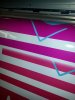
see the color differences??
the bottom lines are anything but nice pinks.
My boss yelled my face off when I accidentally designed something in CMYK.
When he took some time off (2 weeks) I had a project where the customer asked me to print something pink. It had to be super bright popping pink.
So first I designed it in RGB. When printed the file it looked awful. I couldn't figure it out why the pink came out ugly red so I tried something new. Converted to file to CMYK. Right off the bat the whole picture turned from vivid pink to dull pink on my screen. But I printed it anyway. BOOOOOOM it was sooooo pink I had to put sunglasses on.
-whereisyourGODnow.jpg-
By the way I think the trick to print gorgeous CMYK is to:
click on file in versaworks
quality tab
color management on the bottom
in Presets chose MAX impact
this will change the cmyk settings from USWebCoatedSwop to RolandCMYK
I think I also chose use primary colors
I do have a few question:
1)If your roland printer has a black, magenta, cyan and yellow ink cartridges why would you print an rgb file?!
2)If your roland printer is in CMYK mode why would you print in RGB?!
[there is a way to set your printer to rgb or cmyk mode. I think its in the technician menu which you can only bring up with some secret code on the keypads-pretty sure every printer is set to cmyk by default]
3)Its funny how the colors lose vividness as soon as you convert them from RGB to CMYK. But isn't that only on our screen and it will print differently?
4)If you get a cmyk AI file from a 3rd party designer and you import the layers in to photoshop so you can save them to tiff then make sure you create a new document in PS with CMYK settings.
I had a file where i imported from CMYK AI to RGB PS document and the colors where dull and ugly. Then I converted the pic to cmyk and everything was more vivid.
5) also when I had to print something gray I saved the file in cmyk and chose max impact and preserve primary colors and the grey actually came out good and not greenish gray.
Basically what I recommend is that if you need to print something and test it how it would look like print it in 10th scale and print something in rgb then cmyk then chose the preset to max impact and print both files again. now try max impact with embedded icc option and print both files then max impact again and just chose preserve primary colors.
Post results.
see the color differences??
the bottom lines are anything but nice pinks.


")
